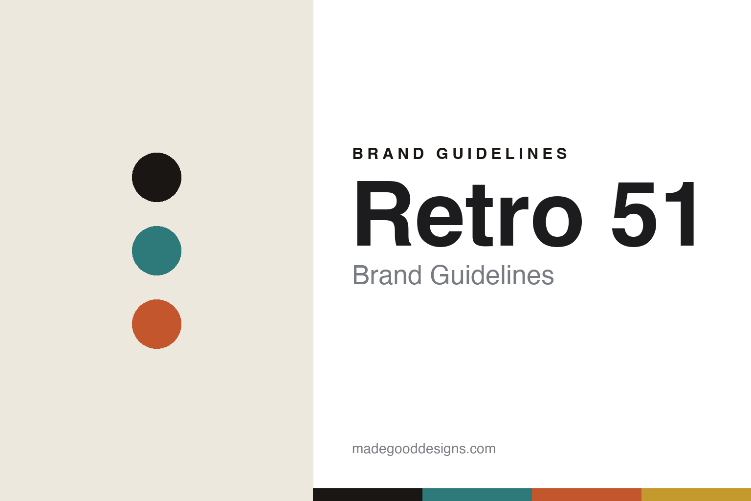
Retro 51 Brand Guidelines
The Tornado.
Aa
Two constants: a turquoise-and-orange palette and a retro sans register. Abstract homage — not the Retro 51 pen or packaging.
The Tornado
Retro 51 built its identity on one playful, collectible rollerball.
Retro 51 is a lesson in a playful icon as identity. A Texas-based company founded in 1990, its name nods to a mid-century aesthetic rather than a founding year, and its whole world revolves around one pen.
Its identity is the Tornado: a twist-action, capless rollerball introduced in 1997 — “our signature, game-changing pen.” Around it Retro 51 built a famously playful, themed and collectible program of limited editions — Classic Lacquers, Vintage Metalsmiths, the Space Series and ColorWave — plus officially licensed tie-ins with the Smithsonian, the Imperial War Museums, Lionel Trains and Pan Am. The whole brand voice is captured by its tagline: “Life is too short to carry an Ugly Pen!”
(Honest notes: “1951” is a mid-century aesthetic reference, not the founding year (1990). The founder retired in 2021 and a group of collector-fans took over stewardship — so the brand continued rather than closed, and today it’s a Writeside Holdings company. We don’t assert the founder’s name. There’s no official brand hex, so these tones are an unofficial interpretation. This is design commentary and does not promote any product.)
Colour
Retro 51 lives in a turquoise-and-orange palette. Click a swatch to copy the hex.
Retro 51’s identity is playful, retro and collectible — a retro turquoise, an ink, a retro orange, a mustard, and a cream. The palette pairs a retro turquoise with a retro orange — the register of mid-century, playful graphics. It signals fun and nostalgia rather than luxury. The honest caveat: with no published brand hex, these tones are an original, unofficial interpretation, not first-party values.
The lesson is a turquoise with an orange signals a playful, collectible brand. Retro 51’s world is a colourful, themed rollerball. For designers, it is a reminder that a bright, mid-century palette reads as fun and collectible — right for a brand that refuses the “ugly pen.” Because bright turquoise and orange fail as small text, keep type dark and let the loud hues live in the accents, palette and band. The takeaways: keep the palette bright and retro; make one form iconic (the Tornado); theme the editions; and treat any single hex as unofficial.
Typography
The register is a retro sans — playful, friendly, mid-century.
Retro 51’s identity carries a playful, friendly, mid-century spirit — a colourful pen and a witty tagline. A friendly geometric sans captures the mood: it is warm and approachable, the register of a fun consumer brand. Set in a turquoise-and-orange palette, the retro sans feels playful and friendly — exactly the personality Retro 51 carries. It is approachable rather than precious, mirroring a collectible rollerball. (Retro 51’s real pens and wordmark are works we describe but do not reproduce, and the exact typeface is not ours to use.) Because it is not ours to use, the honest description is “a retro sans spirit,” shown here in a stand-in. The type behaves like the brand: playful, friendly and mid-century.
Aa
A retro sans spirit — playful and friendly. (Specimen set in Poppins, a friendly geometric sans STAND-IN; NOT the Retro 51 packaging.)
A playful icon as identity
Retro 51 stands for the fun, collectible pen.
Retro 51 is a lesson in making a playful icon the identity. A turquoise-and-orange palette, a retro sans and the Tornado rollerball make a playful icon the whole brand — playful, friendly, mid-century. The Tornado is the differentiator. The differentiator is a fun, collectible identity.
For designers and brand-builders, Retro 51 offers a clear takeaway: make one fun object endlessly collectible. The lessons: perfect one form (the Tornado); theme the editions; license great partners (Smithsonian, Pan Am); and keep the voice playful. It is also a reminder to stay accurate: it was founded in 1990 (not 1951), it continues under new collector-owners, and the palette here is an unofficial interpretation. Retro 51 made a playful pen the brand — proof that fun and collectibility can be the difference.
Explore & save
Keep Retro 51’s identity on hand — save it to a board in the Made Good inspiration library.
Retro 51 identity set
Pin the turquoise-and-orange palette and the retro-sans register to your own board.


