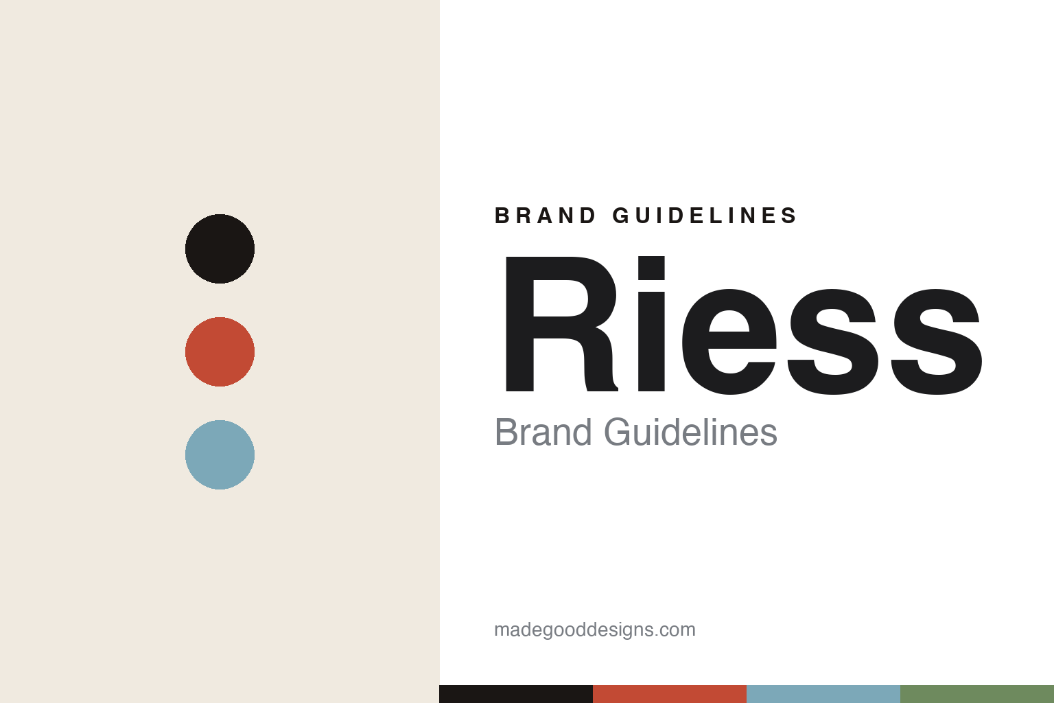
Riess Brand Guidelines
The enamel colour.
Aa
Two constants: an enamel-red-and-blue palette and a warm sans register. Abstract homage — not the Riess cookware or packaging.
The enamel colour
Riess makes enamel-on-steel a colour story.
Riess is a lesson in colour and material as identity. A 10th-generation Austrian family firm in Ybbsitz, Lower Austria, its metalworking lineage runs deep — but the cookware that carries its name is enamelware from around 1922. It is worth keeping the dates apart: the family traces metalworking to 1550 and the firm to 1690, but the glazed enamel cookware is a 20th-century story.
Its identity is enamel on steel — an iron body fused with silicate glass at around 850°C, handmade in Austria, in “over 500 forms.” And the identity is colour: glossy pastels, black, white, blues, reds and greens, with a reportedly signature dotted (“Pünktchen”) decor. The material and the colour together are the brand: a warm, glazed, unmistakably coloured pot.
(Honest notes: the four dates — 1550 lineage, 1690 firm, 1922 enamelware, 1926 hydropower — must stay separate, so we don’t call the cookware “founded 1550.” The green-production, own-hydropower story is the company’s own claim; the dotted decor and the Kelomat pressure-cooker connection are reported. There’s no official brand hex, so these tones are an unofficial interpretation. This is design commentary and does not promote any product.)
Colour
Riess lives in an enamel-red-and-blue palette. Click a swatch to copy the hex.
Riess’ identity is colourful, warm and Austrian — an enamel red, an ink, a pastel blue, a leaf, and a cream. The palette pairs an enamel red with a pastel blue — the register of glossy, glazed enamelware. It signals colour and craft rather than novelty. The honest caveat: with no published brand hex, these tones are an original, unofficial interpretation, not first-party values.
The lesson is an enamel red with a pastel blue signals a colour-led enamel brand. Riess’ world is a bright, glossy pot. For designers, it is a reminder that a glazed, colour-forward palette reads as warm and crafted — right for enamelware. Because a bright enamel red fails as small text, keep type dark and let the colour live in the accents, palette and band. The takeaways: make colour the identity (the glaze); pair the material with the palette; keep it warm; and treat any single hex as unofficial.
Typography
The register is a warm sans — friendly, colourful, Austrian.
Riess’ identity carries a friendly, colourful, Austrian spirit — a glossy enamel pot in a family workshop. A warm, rounded sans captures the mood: it is approachable and modern, the register of a colour-forward homeware brand. Set in an enamel-red-and-blue palette, the warm sans feels friendly and colourful — exactly the personality Riess carries. It is welcoming rather than austere, mirroring bright enamelware. (Riess’ real cookware and wordmark are works we describe but do not reproduce, and the exact typeface is not ours to use.) Because it is not ours to use, the honest description is “a warm sans spirit,” shown here in a stand-in. The type behaves like the brand: friendly, colourful and Austrian.
Aa
A warm sans spirit — friendly and colourful. (Specimen set in Rubik, a warm rounded sans STAND-IN; NOT the Riess packaging.)
Colour as identity
Riess stands for colourful enamel on steel.
Riess is a lesson in making colour the identity. An enamel-red-and-blue palette, a warm sans and a glossy enamel pot make colour the whole brand — friendly, colourful, Austrian. The colour is the differentiator. The differentiator is colour-led enamelware.
For designers and brand-builders, Riess offers a clear takeaway: let material and colour carry the brand together. The lessons: commit to a material (enamel on steel); make colour the identity; keep the type warm; and be honest about the dates and claims. It is also a reminder to stay accurate: the enamelware is a 1922 story (not 1550), a 10th-generation family firm, the green claims are the brand’s own, and the palette here is an unofficial interpretation. Riess made colour the brand — proof that a glaze can be the difference.
Explore & save
Keep Riess’s identity on hand — save it to a board in the Made Good inspiration library.
Riess identity set
Pin the enamel-red-and-blue palette and the warm-sans register to your own board.


