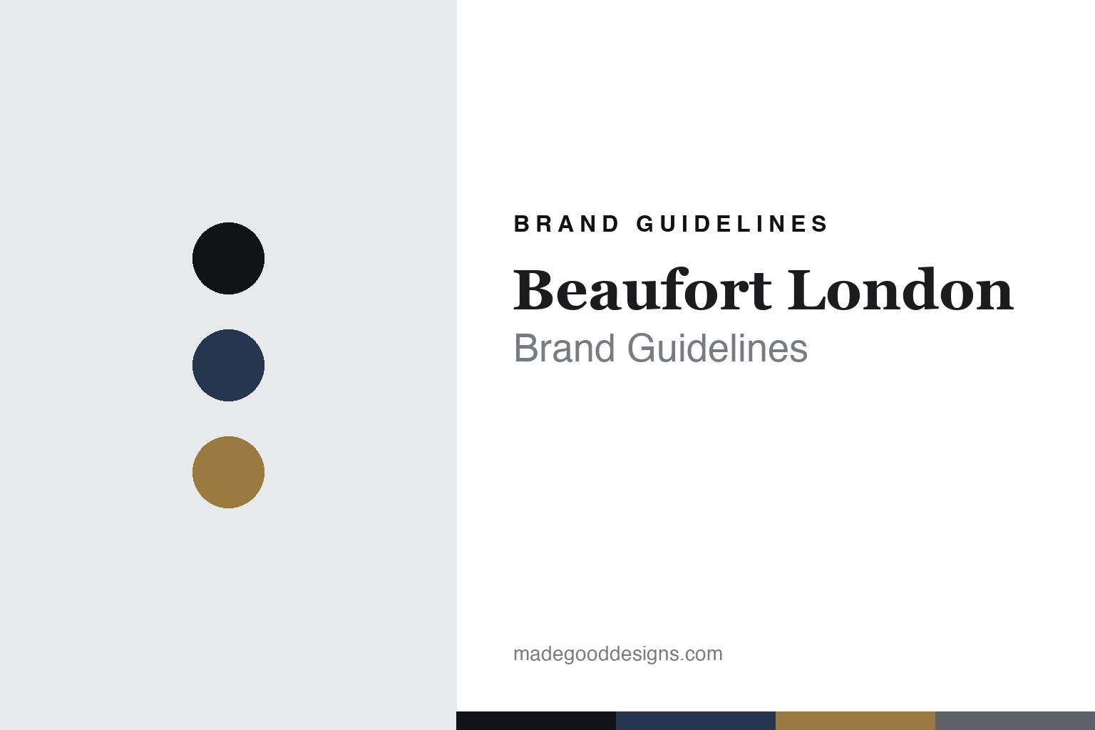
Beaufort London Brand Guidelines
Through smoke.
Aa
Two constants: a navy-and-brass palette and an antiquarian serif register. Abstract homage — not the Beaufort London packaging.
Through smoke
Beaufort London builds a dark maritime world in scent.
Beaufort London is a lesson in a dark world as identity. Founded in 2013 by the musician Leo Crabtree, it is a fiercely independent British house — and, despite the name, one made in Britain rather than literally in London.
Its identity is dark, maritime and elemental: a “darkly luxurious” aesthetic informed by the sea and “a very British obsession with the elements,” built on overdosed, unusual ingredients meant to confront and intrigue — “not necessarily for everyone.” At its centre is the “through smoke” idea (from per fumum), harnessing the olfactory facets of smoke to evoke memories “real or apparitional.” The work is organised into chapters — Come Hell or High Water (2015), Revenants (2017), Force Majeure (2024) — with naval, Latin and gothic names like Tonnerre, Coeur de Noir, Vi et Armis, Fathom V and Iron Duke.
(Honest notes: the founding year is 2013 per the brand (first fragrances 2015); Leo Crabtree is described as a musician — the specific band association comes from outside the brand. “London” is the brand-world, not the manufacturing location — it’s made in Britain (Worcestershire). There’s no official brand hex, so these tones are an unofficial interpretation. This is design commentary and does not promote fragrance use.)
Colour
Beaufort London lives in a navy-and-brass palette. Click a swatch to copy the hex.
Beaufort London’s identity is dark, maritime and dramatic — a naval navy, an ink, a brass, a smoke, and a bone. The palette pairs a naval navy with a brass — the register of a ship’s instrument and a smoke-darkened relic. It signals drama and history rather than prettiness. The honest caveat: with no published brand hex, these tones are an original, unofficial interpretation, not first-party values.
The lesson is a navy with a brass signals a dark, maritime brand. Beaufort’s world is a British naval relic seen through smoke. For designers, it is a reminder that a deep, nautical palette reads as dramatic and historical — right for a house built on the elements. Because a mid brass fails as small text, keep type dark and let the brass live in the accents, palette and band. The takeaways: pick a dark, thematic palette; build a coherent world (maritime, smoke); name for history and myth; and treat any single hex as unofficial.
Typography
The register is an antiquarian serif — dark, historical, dramatic.
Beaufort London’s identity carries a dark, historical, dramatic spirit — a naval relic and a plume of smoke. A high-contrast, antiquarian serif captures the mood: it is engraved and dramatic, the register of naval ephemera. Set in a navy-and-brass palette, the antiquarian serif feels dark and historical — exactly the personality Beaufort carries. It is dramatic rather than plain, mirroring a maritime relic. (Beaufort London’s real bottles and wordmark are works we describe but do not reproduce, and the exact typeface is not ours to use.) Because it is not ours to use, the honest description is “an antiquarian serif spirit,” shown here in a stand-in. The type behaves like the brand: dark, historical and dramatic.
Aa
An antiquarian serif spirit — dark and historical. (Specimen set in Playfair Display, a high-contrast serif STAND-IN; NOT the Beaufort London packaging.)
A dark world as identity
Beaufort London stands for dark maritime drama.
Beaufort London is a lesson in making a dark world the identity. A navy-and-brass palette, an antiquarian serif and a “through smoke” concept make a dark maritime world the whole brand — dark, historical, dramatic. The world is the differentiator. The differentiator is a dark, maritime identity.
For designers and brand-builders, Beaufort offers a clear takeaway: commit to one dark, coherent world. The lessons: build a theme (maritime, elemental, smoke); organise the range into chapters; name for history and myth; and be honest about the facts. It is also a reminder to stay accurate: it’s a 2013 British house made in Britain (not literally London), and the palette here is an unofficial interpretation. Beaufort London made a dark world the brand — proof that a committed world can be the difference.
Explore & save
Keep Beaufort London’s identity on hand — save it to a board in the Made Good inspiration library.
Beaufort London identity set
Pin the navy-and-brass palette and the antiquarian-serif register to your own board.


