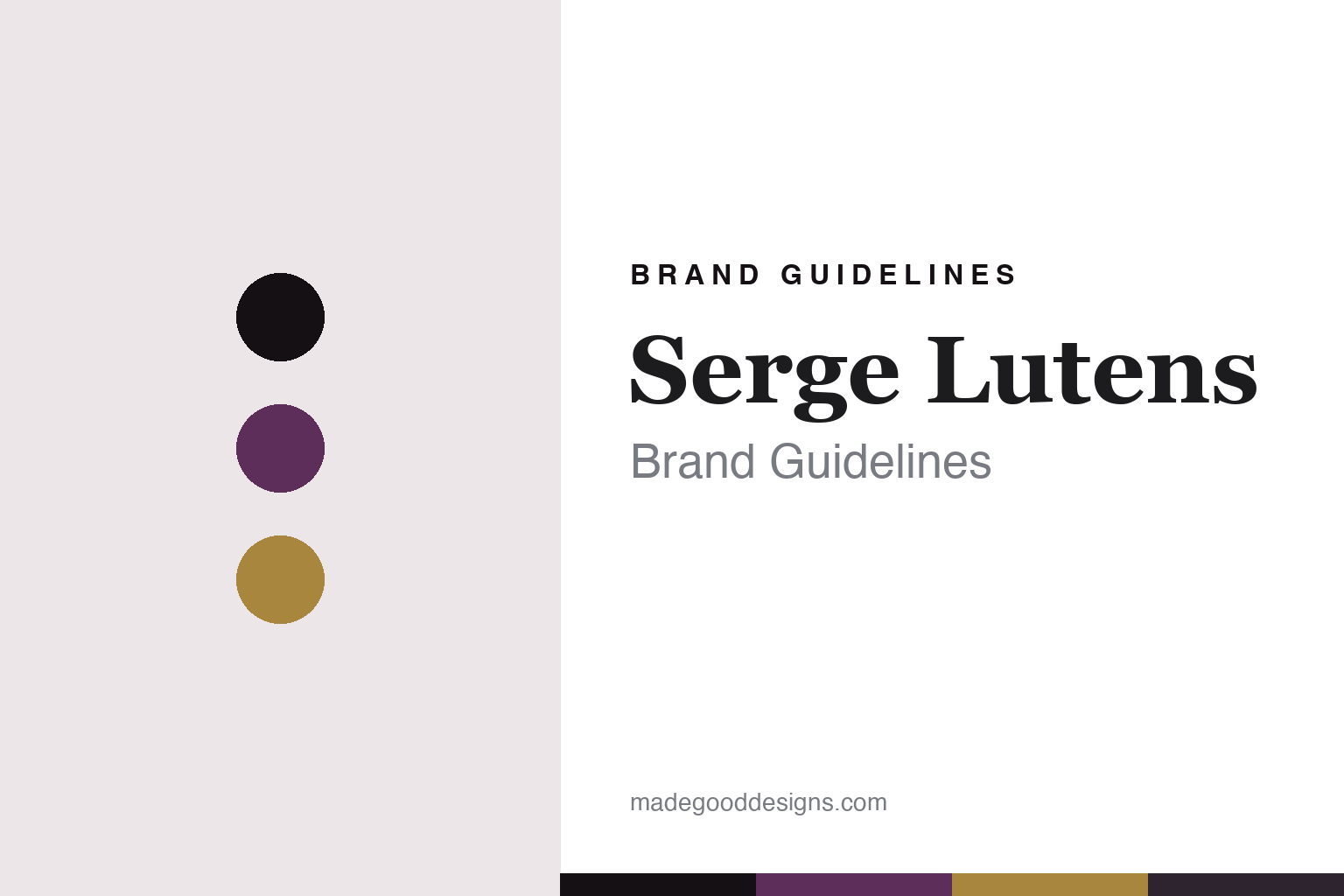
Serge Lutens Brand Guidelines
The bell jar.
Aa
Two constants: an aubergine-and-gilt palette and an aesthete serif register. Abstract homage — not the Serge Lutens packaging.
The bell jar
Serge Lutens built a whole aesthete world around a bottle.
Serge Lutens is a lesson in an aesthete world as identity. The fragrance project began in 1992 in Paris — with Féminité du Bois and the Palais Royal salon — and the eponymous brand was formalised by Shiseido in 2000. Behind it is Serge Lutens himself, a renowned image-maker who art-directed the whole aesthetic.
Its identity has three signatures. First, the rectangular “bell jar” (cloche) bottles, historically exclusive to the Palais Royal salon, beside the tall rectangular export flacon. Second, the aubergine-purple brand colour and a dark-romantic, orientalist, poetic aesthete world. Third, Lutens as total art director — a photographer and filmmaker who came from Dior and Shiseido and designed the salon, the imagery and the entire look. The scents carry evocative French names: Ambre Sultan, Chergui, La Fille de Berlin, Un Bois Vanille.
(Honest notes: Serge Lutens isn’t independent — it’s owned by Shiseido. Serge Lutens the man is alive (born 1942) and remains the house’s creative figure. The 1992 date is the fragrance/salon start; the brand was formalised in 2000. Its longtime perfumer is Christopher Sheldrake (Féminité du Bois was Sheldrake with Pierre Bourdon). There’s no official brand hex, so these tones are an unofficial interpretation. This is design commentary and does not promote fragrance use.)
Colour
Serge Lutens lives in an aubergine-and-gilt palette. Click a swatch to copy the hex.
Serge Lutens’ identity is aesthete, dark and poetic — an aubergine, an ink, a gilt, a plum shadow, and an ivory. The palette pairs an aubergine purple with a gilt — the register of a dark-romantic salon. It signals aesthete luxury and mystery rather than novelty. The honest caveat: with no published brand hex, these tones are an original, unofficial interpretation, not first-party values.
The lesson is an aubergine with a gilt signals an aesthete brand-world. Serge Lutens’ world is a purple, poetic salon. For designers, it is a reminder that a deep, signature colour plus gold reads as aesthete and mysterious — right for a total art director. The takeaways: own a signature colour (aubergine); design the whole world (bottle, salon, imagery); name with poetry (Ambre Sultan); and — because a mid-gilt fails as small text — keep type dark and let the gold live in the accents, palette and band; treat any single hex as unofficial.
Typography
The register is an aesthete serif — poetic, dark, refined.
Serge Lutens’ identity carries a poetic, dark, refined spirit — a purple salon and a bell-jar bottle. A high-contrast aesthete serif captures the mood: it is elegant and literary, the register of a poet-aesthete. Set in an aubergine-and-gilt palette, the aesthete serif feels poetic and refined — exactly the personality Serge Lutens projects. It is dark-romantic rather than plain, mirroring an aesthete world. (Serge Lutens’ real bottles and wordmark are works we describe but do not reproduce, and the exact typeface is not ours to use.) Because it is not ours to use, the honest description is “an aesthete serif spirit,” shown here in a stand-in. The type behaves like the brand: poetic, dark and refined.
Aa
An aesthete serif spirit — poetic and refined. (Specimen set in Playfair Display, a high-contrast serif STAND-IN; NOT the Serge Lutens packaging.)
An aesthete world as identity
Serge Lutens stands for a total, poetic aesthetic.
Serge Lutens is a lesson in making an aesthete world the identity. An aubergine-and-gilt palette, an aesthete serif and the bell-jar bottle make a total aesthetic the whole brand — poetic, dark, refined. The world is the differentiator. The differentiator is an art-directed, aesthete identity.
For designers and brand-builders, Serge Lutens offers a clear takeaway: art-direct the entire world. The lessons: own a signature colour and bottle; design the salon and imagery as one; name with poetry; and be honest about the business. It is also a reminder to stay accurate: it’s Shiseido-owned, Lutens is alive and its total art director, and the palette here is an unofficial interpretation. Serge Lutens made an aesthete world the brand — proof that a total aesthetic can be the difference.
Explore & save
Keep Serge Lutens’s identity on hand — save it to a board in the Made Good inspiration library.
Serge Lutens identity set
Pin the aubergine-and-gilt palette and the aesthete-serif register to your own board.


