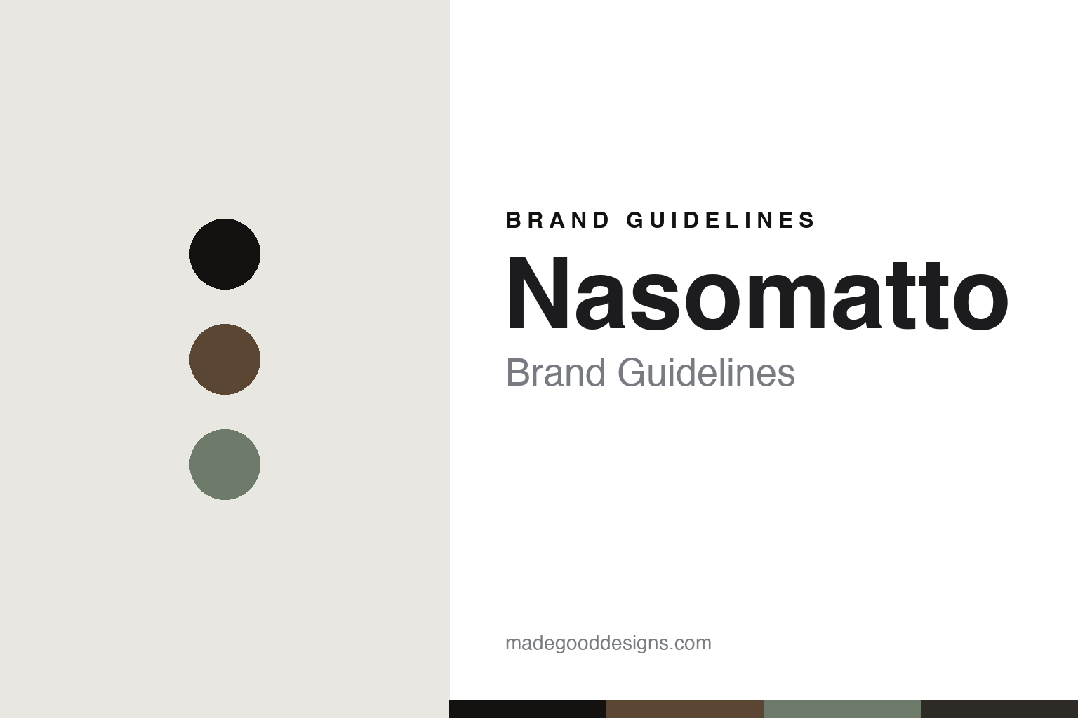
Nasomatto Brand Guidelines
The carved cap.
Aa
Two constants: a burnt-oak-and-silver palette and a plain sans register. Abstract homage — not the Nasomatto packaging.
The carved cap
Nasomatto crowns each bottle with a small, crafted art object.
Nasomatto is a lesson in a cap as identity. Founded in 2007 by the Italian perfumer Alessandro Gualtieri and based in the Netherlands, it built an avant-garde, artisan house around one detail — the cap.
Its identity is the hand-crafted material cap: a simple square glass bottle crowned by a distinct, made-in-Italy cap that is a small objet d’art unique to each scent — burnt oak for Black Afgano; on its sibling brand Orto Parisi, a tumbled silver cap with greenish corrosion and an inlaid seashell for Megamare. The philosophy matches: “Nasomatto” literally means “crazy nose,” and the scents are provocations. The names are single, evocative words — Black Afgano, Pardon, Silver Musk, Baraonda — with a plain, uppercase wordmark that lets the bottle and cap carry the identity.
(Honest notes: the caps are made from wood, metal and other crafted materials — not only wood. Nasomatto is an independent artisan house based in the Netherlands, with the sibling brand Orto Parisi also created by Gualtieri. We don’t assert an Amsterdam address or the sometimes-cited Helmut Lang connection. There’s no official brand hex, so these tones are an unofficial interpretation. This is design commentary and does not promote fragrance use.)
Colour
Nasomatto lives in a burnt-oak-and-silver palette. Click a swatch to copy the hex.
Nasomatto’s identity is crafted, dark and avant-garde — a burnt oak, an ink, a corroded silver, a char, and a bone. The palette pairs a burnt oak with a corroded silver — the register of a hand-made cap. It signals craft and provocation rather than gloss. The honest caveat: with no published brand hex, these tones are an original, unofficial interpretation, not first-party values.
The lesson is a burnt oak with a corroded silver signals a crafted, material cap. Nasomatto’s world is a square bottle with a carved crown. For designers, it is a reminder that a dark, material palette reads as artisanal and avant-garde — right for a “mad nose.” The takeaways: make one detail the signature (the cap); craft it from real materials (wood, metal); keep the wordmark plain; and treat any single hex as unofficial.
Typography
The register is a plain sans — plain, so the cap can speak.
Nasomatto’s identity carries a plain-wordmark, loud-object spirit — a plain logotype and a carved cap. A plain sans captures the mood: it is clean and quiet, stepping back so the object can speak. Set in a burnt-oak-and-silver palette, the plain sans feels understated against the craft — exactly the balance Nasomatto strikes. It is plain rather than decorative, letting the cap carry the bottle. (Nasomatto’s real bottles, caps and wordmark are works we describe but do not reproduce, and the exact typeface is not ours to use.) Because it is not ours to use, the honest description is “a plain sans spirit,” shown here in a stand-in. The type behaves like the brand: plain, so the cap can speak.
Aa
A plain sans spirit — plain against the craft. (Specimen set in Manrope, a clean plain sans STAND-IN; NOT the Nasomatto packaging.)
A cap as identity
Nasomatto stands for the cap as an art object.
Nasomatto is a lesson in making a cap the identity. A burnt-oak-and-silver palette, a plain sans and a hand-carved cap make one detail the whole brand — crafted, dark, avant-garde. The cap is the differentiator. The differentiator is a material-cap, provocation identity.
For designers and brand-builders, Nasomatto offers a clear takeaway: make one detail the whole signature. The lessons: crown the bottle with a crafted object (a material cap); keep the rest plain; name in single provocative words; and be honest about the materials. It is also a reminder to stay accurate: it’s a 2007 Netherlands artisan house, the caps are wood and metal, and the palette here is an unofficial interpretation. Nasomatto made the cap the brand — proof that a single crafted detail can be the difference.
Explore & save
Keep Nasomatto’s identity on hand — save it to a board in the Made Good inspiration library.
Nasomatto identity set
Pin the burnt-oak-and-silver palette and the plain-sans register to your own board.


