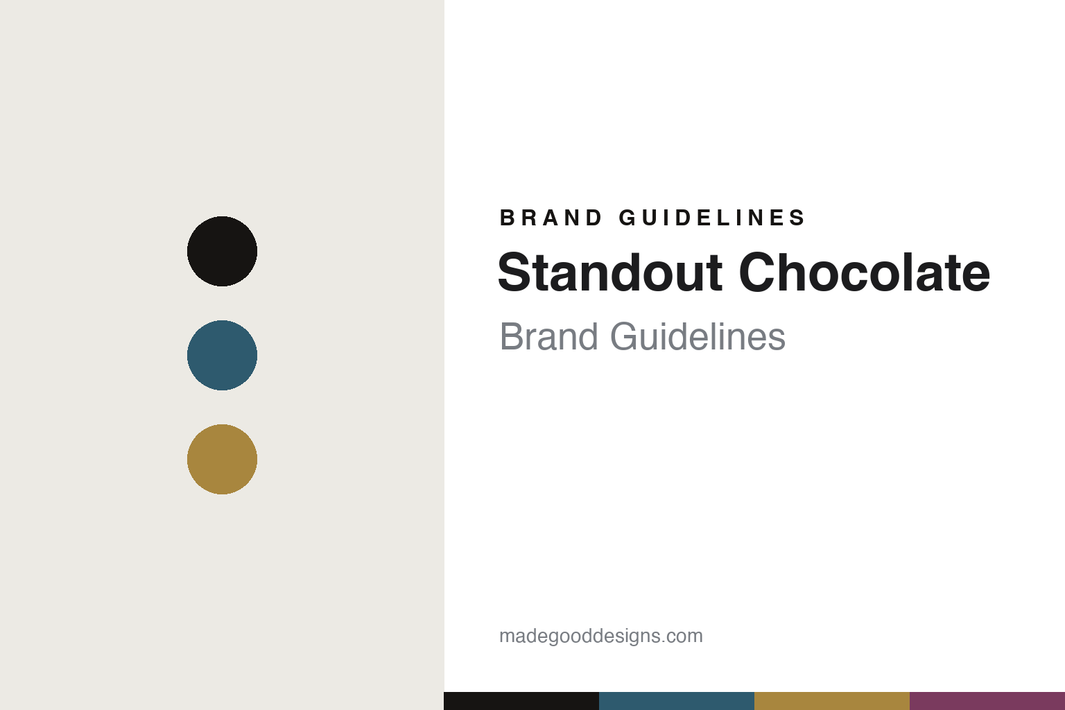
Standout Chocolate Brand Guidelines
The flavour radar.
Aa
Two constants: a teal-and-gold palette and a systematic sans register. Abstract homage — not the Standout Chocolate packaging.
The flavour radar
Standout turned a tasting chart into a packaging system.
Standout Chocolate is a lesson in a system as identity. A small Swedish bean-to-bar maker founded in 2018 by Fredrik Martinsson, it makes small-batch, organic, single-estate chocolate — and builds its whole look on a systematic design.
Its identity is the colour-coded, radar-charted pack: each bar gets its own colour, gold-foil lettering, and a signature hexagonal flavour radar chart — a little piece of data-visualisation that turns tasting notes into a graphic. It’s elegant and premium rather than loud; the colour-coding itself is the “standout.” The range is well structured — single origins named by origin and percentage (Belize Maya Mountain, Uganda Semuliki Forest) alongside a Nordic Nature collection (Spruce Shoots, Cloudberry Caramel) and Swedish Favourites (Swedish Fika, Liquorice & Beech-Smoked Sea Salt).
(Honest notes: the founder is Fredrik Martinsson, and the brand dates to 2018 — not 2015. We keep the location soft (a small Swedish maker), and there’s no named external designer, so we describe the identity without attributing it. There’s no official brand hex, so these tones are an unofficial interpretation.)
Colour
Standout Chocolate lives in a teal-and-gold palette. Click a swatch to copy the hex.
Standout’s identity is systematic, premium and precise — a Standout teal, an ink, a gold foil, a radar plum, and a cream. The palette pairs a Standout teal with a gold foil, with a colour-code plum — the register of a coded, foil-stamped pack. It signals system and craft rather than novelty. The honest caveat: with no published brand hex, these tones are an original, unofficial interpretation, not first-party values.
The lesson is a teal with a gold foil signals a systematic, premium pack. Standout’s world is a shelf of colour-coded bars with a radar chart. For designers, it is a reminder that a systematic colour code plus a data graphic reads as premium and intelligent — right for a rigorous maker. The takeaways: give each flavour a colour; add a signature graphic (the radar); use gold foil for the premium cue; and — because a mid-gold fails as small text — keep type dark and let the gold live in the accents, palette and band; treat any single hex as unofficial.
Typography
The register is a systematic sans — precise, premium, coded.
Standout’s identity carries a precise, premium, coded spirit — a colour-coded bar and a flavour radar. A systematic sans captures the mood: it is clean and exact, the register of a data graphic. Set in a teal-and-gold palette, the systematic sans feels precise and premium — exactly the personality Standout carries. It is coded rather than loud, mirroring a radar-charted pack. (Standout’s real packaging is work we describe but do not reproduce, and the exact typeface is not ours to use.) Because it is not ours to use, the honest description is “a systematic sans spirit,” shown here in a stand-in. The type behaves like the brand: precise, premium and coded.
Aa
A systematic sans spirit — precise and premium. (Specimen set in Jost, a geometric systematic sans STAND-IN; NOT the Standout Chocolate packaging.)
A system as identity
Standout stands for a coded, charted pack.
Standout Chocolate is a lesson in making a system the identity. A teal-and-gold palette, a systematic sans and a colour-coded, radar-charted pack make a design system the whole brand — precise, premium, coded. The system is the differentiator. The differentiator is a colour-coded, data-charted identity.
For designers and brand-builders, Standout offers a clear takeaway: turn information into the design. The lessons: colour-code the range; visualise the tasting notes (a radar chart); use a premium cue (gold foil); and be honest about the story. It is also a reminder to stay accurate: the founder is Fredrik Martinsson, it’s from 2018, and the palette here is an unofficial interpretation. Standout made a system the brand — proof that information, well-designed, can be the difference.
Explore & save
Keep Standout Chocolate’s identity on hand — save it to a board in the Made Good inspiration library.
Standout Chocolate identity set
Pin the teal-and-gold palette and the systematic-sans register to your own board.


