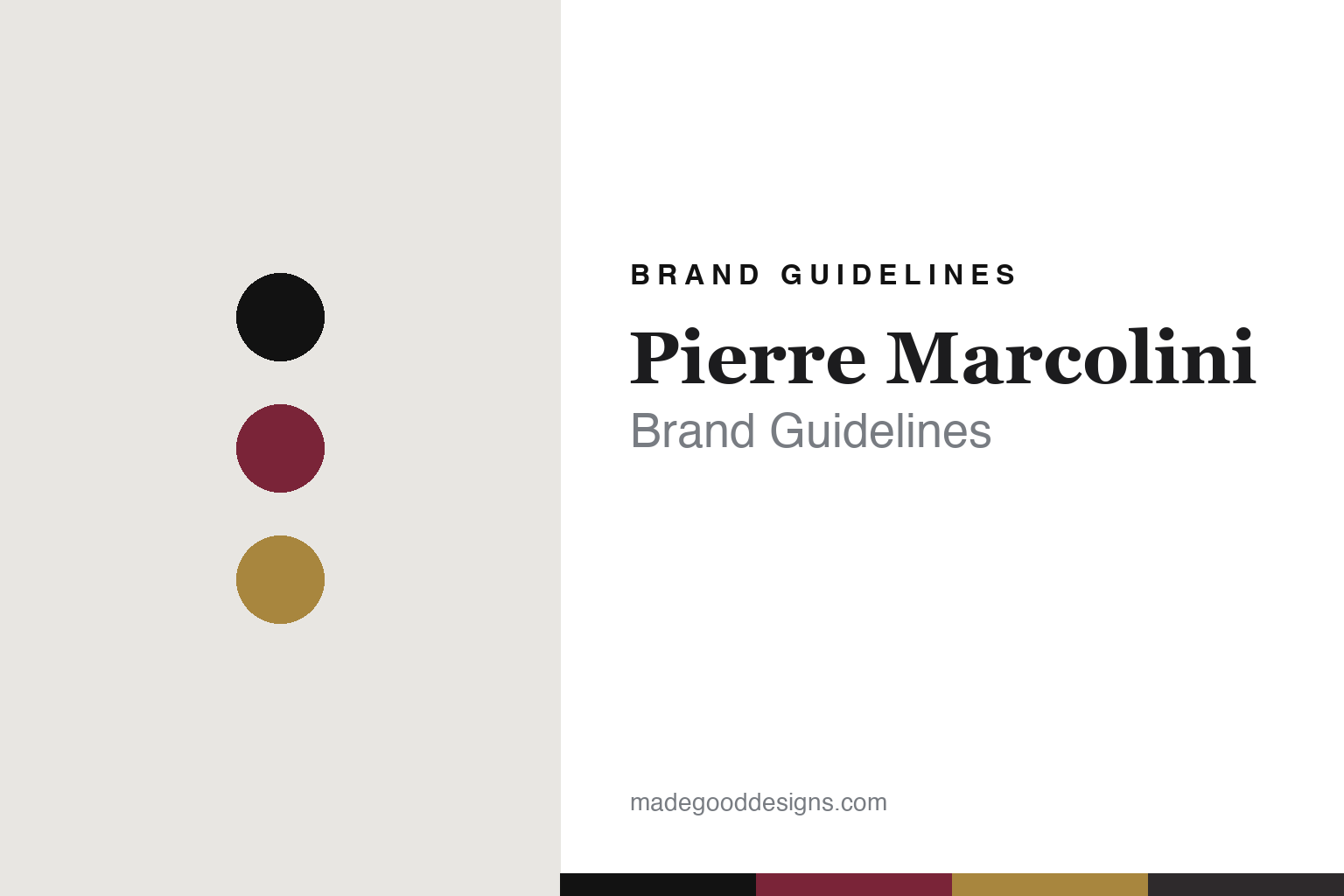
Pierre Marcolini Brand Guidelines
Haute couture chocolate.
Aa
Two constants: a wine-and-black palette and a couture serif register. Abstract homage — not the Pierre Marcolini packaging.
Haute couture chocolate
Pierre Marcolini runs a chocolate house like a fashion maison.
Pierre Marcolini is a lesson in a fashion house as identity. Founded in 1995 in Brussels by Pierre Marcolini — who had just won the World Pastry Cup in Lyon that year — it reframed luxury chocolate as haute couture, presented with the cadence and polish of a fashion or jewellery maison.
Its identity is haute-couture chocolate: a sleek, minimalist, dark-luxury world of black boxes and refined boutiques, with seasonal “collections” released like a couturier’s and fashion collaborations to match (Olympia Le-Tan, Maison Kitsuné, Nespresso). Marcolini was also among the first luxury chocolatiers to go bean-to-bar, controlling the chain from the cocoa; the range runs from single-origin, grand-cru tablets to the signature Cœur, a heart-shaped praline.
(Honest notes: bean-to-bar came around 2002, not the 1995 founding, so we keep those apart. And the independence story is historical: after a Nestlé minority stake (2007) that was later bought back, and outside investment, the house was acquired by a South Korean group in 2023 — so it’s best described as founded and long led by Pierre Marcolini, and since 2023 owned by a South Korean group, with Marcolini as its namesake and creative figurehead. There’s no official brand hex, so these tones are an unofficial interpretation.)
Colour
Pierre Marcolini lives in a wine-and-black palette. Click a swatch to copy the hex.
Pierre Marcolini’s identity is dark, refined and couture — a couture wine, a matte black, a gilt, a graphite, and a chalk. The palette pairs a couture wine with matte black, with a gilt — the register of a fashion-house box. It signals luxury and restraint rather than indulgence. The honest caveat: with no published brand hex, these tones are an original, unofficial interpretation, not first-party values.
The lesson is a deep wine with matte black signals fashion-house luxury. Pierre Marcolini’s world is a black box in a minimalist boutique. For designers, it is a reminder that a dark, restrained palette reads as couture and premium — right for a chocolate maison. The takeaways: go dark and minimal (black, wine, gilt); release in seasonal collections; present like a fashion house; and — because a mid-gilt fails as small text — keep type dark and let the gold live in the accents, palette and band; treat any single hex as unofficial.
Typography
The register is a couture serif — elegant, dark, fashion-house.
Pierre Marcolini’s identity carries an elegant, dark, fashion-house spirit — a black box and a seasonal collection. A high-contrast couture serif captures the mood: it is refined and formal, the register of a couture maison. Set in a wine-and-black palette, the couture serif feels elegant and dark — exactly the personality Pierre Marcolini projects. It is fashion-house rather than confectionery, mirroring a minimalist box. (Pierre Marcolini’s real packaging is work we describe but do not reproduce, and the exact typeface is not ours to use.) Because it is not ours to use, the honest description is “a couture serif spirit,” shown here in a stand-in. The type behaves like the brand: elegant, dark and fashion-house.
Aa
A couture serif spirit — elegant and dark. (Specimen set in Prata, a high-contrast didone STAND-IN; NOT the Pierre Marcolini packaging.)
A fashion house as identity
Pierre Marcolini stands for chocolate as couture.
Pierre Marcolini is a lesson in making a fashion house the identity. A wine-and-black palette, a couture serif and a minimalist black box make couture the whole brand — elegant, dark, fashion-house. The couture framing is the differentiator. The differentiator is a fashion-maison, bean-to-bar identity.
For designers and brand-builders, Pierre Marcolini offers a clear takeaway: borrow another category’s codes. The lessons: present chocolate like fashion (black boxes, collections); control the craft (bean-to-bar); collaborate across design; and be honest about the business. It is also a reminder to stay accurate: bean-to-bar came in 2002, the house is South-Korean-owned since 2023, and the palette here is an unofficial interpretation. Pierre Marcolini made a fashion house the brand — proof that borrowed codes can be the difference.
Explore & save
Keep Pierre Marcolini’s identity on hand — save it to a board in the Made Good inspiration library.
Pierre Marcolini identity set
Pin the wine-and-black palette and the couture-serif register to your own board.


