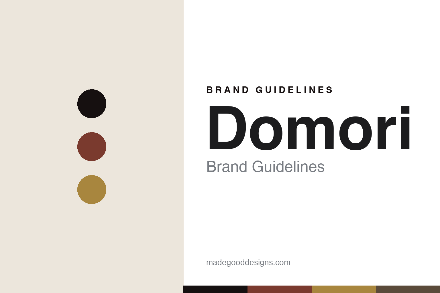
Domori Brand Guidelines
The Criollo catalogue.
Aa
Two constants: a rust-and-gold palette and a systematic sans register. Abstract homage — not the Domori packaging.
The Criollo catalogue
Domori built a brand on the rarest cacao and a rigorous system.
Domori is a lesson in purism as identity. Founded in 1997 in None, near Turin, by Gianluca Franzoni — who had travelled to Venezuela in 1993 to study cacao — it built its name on the finest, rarest beans and a rigorous, almost scientific approach.
Its identity is Criollo purism, organised as a catalogue: Domori headlines the Criollo variety as “the finest cacao in the world,” makes a 100% Criollo bar with no added lecithin or flavourings, and lays the range out as a percentage- and origin-coded system — Criollo at 70/80/90/100%, plus Single Origins, Anthology and Napolitains. The minimal-ingredient philosophy is the point: let the bean speak.
(Honest notes: Domori isn’t independent — it has been part of the Illy group since illycaffè acquired it in 2006 (held via the family’s Polo del Gusto division), and it’s a legal Benefit Company. Its exact single-origin lineup rotates, so we name varieties illustratively. There’s no official brand hex, so these tones are an unofficial interpretation.)
Colour
Domori lives in a rust-and-gold palette. Click a swatch to copy the hex.
Domori’s identity is refined, precise and purist — a Criollo rust, an ink, a fine gold, a cocoa, and a cream. The palette pairs a Criollo rust with a fine gold — the register of rare cacao and a catalogue. It signals refinement and rigour rather than novelty. The honest caveat: with no published brand hex, these tones are an original, unofficial interpretation, not first-party values.
The lesson is a rust with a fine gold signals fine-cacao purism. Domori’s world is a rigorous catalogue of rare beans. For designers, it is a reminder that a restrained, cacao-derived palette reads as premium and precise — right for a purist maker. The takeaways: source the palette from the bean (rust, cocoa, gold); systematise the range (percentages, origins); keep the ingredients — and the design — minimal; and treat any single hex as unofficial.
Typography
The register is a systematic sans — precise, catalogued, refined.
Domori’s identity carries a precise, catalogued, refined spirit — a percentage system and a rare bean. A systematic sans captures the mood: it is clean and exact, the register of a catalogue. Set in a rust-and-gold palette, the systematic sans feels precise and refined — exactly the personality Domori carries. It is catalogued rather than decorative, mirroring a coded range. (Domori’s real packaging is work we describe but do not reproduce, and the exact typeface is not ours to use.) Because it is not ours to use, the honest description is “a systematic sans spirit,” shown here in a stand-in. The type behaves like the brand: precise, catalogued and refined.
Aa
A systematic sans spirit — precise and refined. (Specimen set in Sora, a clean geometric sans STAND-IN; NOT the Domori packaging.)
Purism as identity
Domori stands for the bean, catalogued.
Domori is a lesson in making purism the identity. A rust-and-gold palette, a systematic sans and a coded catalogue make fine-cacao purism the whole brand — precise, catalogued, refined. The purism is the differentiator. The differentiator is a Criollo-first, systematic identity.
For designers and brand-builders, Domori offers a clear takeaway: let rigour be the design. The lessons: pick the rarest input (Criollo); strip the recipe (no lecithin or flavourings); systematise the range (percentages, origins); and be honest about ownership. It is also a reminder to stay accurate: it’s Illy-group-owned since 2006, a Benefit Company, and the palette here is an unofficial interpretation. Domori made purism the brand — proof that rigour can be the difference.
Explore & save
Keep Domori’s identity on hand — save it to a board in the Made Good inspiration library.
Domori identity set
Pin the rust-and-gold palette and the systematic-sans register to your own board.


