Law Firm Logo Design: Marks That Build Trust
A law firm logo has one strategic job: to make a stressed, comparison-shopping client feel that this practice is serious, stable, and safe to hire. It is the most-seen piece of a firm’s identity, sitting on letterhead, signage, and every proposal, and it sets the tone before anyone reads a word. This guide covers the mark types that work for legal practices, the fonts and colors that earn trust, and the cliches to leave behind.
If you are building the full identity rather than just the mark, start with our complete guide to law firm branding, then come back here for the logo specifics.
What a legal logo has to communicate
Legal services are high-stakes and hard to evaluate, so clients lean on visual proxies for competence. A good attorney logo conveys three things at a glance: trust (this firm is reputable), authority (it knows what it is doing), and stability (it will still be here when the matter closes). Those qualities come from restraint, classic typography, and a conservative palette, not from a clever icon. The logos that fail in legal are usually the ones trying too hard.
The three mark types that suit law firms
Because most firms are named after partners, the logo almost always centers on the name itself. Three approaches dominate.
- Wordmark: the firm’s name set in a distinctive, carefully spaced typeface. This is the default for partner-named firms because it puts accountability, the named lawyers, front and center. “Hartley & Cross” set in a refined serif needs no symbol.
- Lettermark: the initials of a long partner list condensed into a clean mark, such as “HCM.” Useful when three or four surnames would be unwieldy on a business card, and it reads as modern and efficient.
- Monogram: a more crafted interlocking of initials, often inside a subtle containing shape. It can add a heritage, crest-like quality when handled with restraint.
| Mark type | Use when | Risk to avoid |
|---|---|---|
| Wordmark | Two or three partner names | Generic font choice |
| Lettermark | Long or multi-partner names | Looking like a bank or insurer |
| Monogram | Heritage positioning | Overworked, fussy detail |
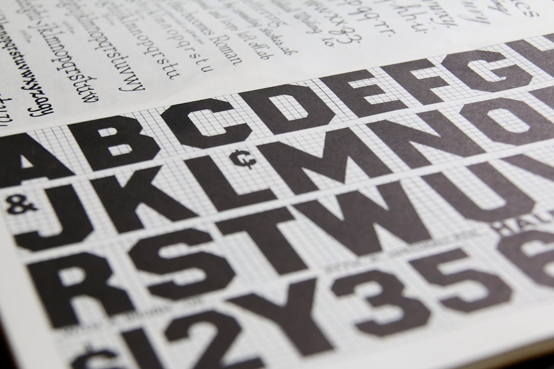
Typography: the real engine of a legal mark
In a wordmark-driven field, the typeface is the logo. The serif-versus-sans choice maps directly to positioning.
- Serif typefaces signal tradition, authority, and permanence. A transitional or old-style serif gives an established firm gravitas. This is the safe, classic route for most practices selling experience and continuity.
- Modern sans-serifs signal clarity and approachability. A clean geometric or humanist sans suits a challenger firm, a startup-counsel practice, or a consumer-facing firm that wants to feel less intimidating.
Whichever direction you choose, the typeface usually needs custom spacing and small optical adjustments to feel like a designed mark rather than a font typed into a box. If you are also setting body copy and headlines, our font pairing guide helps you choose a complementary second typeface so the whole identity hangs together.
Color: conservative by default, distinctive on purpose
Legal logos lean on a narrow, deliberate palette because the colors carry the trust message.
- Navy: the most common legal logo color, reading as established and corporate.
- Charcoal and black: authoritative, flexible, and reproduce cleanly on signage and engraved stationery.
- Deep green: a warmer alternative that still reads as stable and serious.
- Gold or brass: a premium accent, effective in small doses for heritage firms and quick to look gimmicky if overused.
A challenger firm can break this palette with a brighter accent to stand out, but it should do so to make a deliberate point about positioning, not for novelty. Always design the logo in a single color first; if it works in plain black, the color version will only get stronger.
Cliches to avoid
The fastest way to look like every other firm is to reach for the obvious symbols. These rarely add value:
- Scales of justice: instantly generic and used by countless firms and template makers.
- Gavels: visually clunky and, ironically, mostly used by judges rather than practicing attorneys.
- Greek columns: overused shorthand for “establishment” that reads as stock art.
- Lady Justice and blindfolds: hard to render small and laden with cliche.
If a firm genuinely wants a symbol, the strongest option is usually an abstract or typographic mark derived from the firm’s initials rather than a literal legal icon.
Building the logo properly
A usable logo is a system, not a single image. Designers build legal marks as vectors in Illustrator so they scale from a business card to a building sign without losing crispness, then deliver the suite a firm actually needs: full-color, single-color, and reversed (white) versions, plus clear-space and minimum-size rules. The mark then flows into stationery templates, often laid out in InDesign. For the end-to-end workflow, our logo design process guide covers each stage from brief to delivery.
One practical test: the logo must survive its hardest real-world use. For most firms that is a small, single-color application, an embossed business card, a faxed engagement letter, a favicon. Design for that constraint and the logo will hold up everywhere else.
Deliverables a firm actually needs
A logo project should hand over more than a single file. At minimum, expect the full mark in vector format (for scaling), plus high-resolution raster versions for everyday use. You also need the variations that real life demands: a horizontal lockup and a stacked version, a full-color version, a single-color (black) version, and a reversed (white) version for dark backgrounds. A favicon and a square avatar crop matter too, since the firm’s mark has to work in a browser tab and as a profile image on legal directories and social platforms.
Alongside the files, a short usage sheet protects the investment: the exact color values, the minimum size, the clear-space rule, and a few “do not” examples (do not stretch it, recolor it, or add effects). This is what keeps the mark consistent once it leaves the designer’s hands and starts appearing on materials produced by the firm’s own staff under deadline. Without it, even a strong logo drifts within a year.
Where the logo lives
The mark earns its keep across the firm’s touchpoints, so design it knowing where it will appear. It anchors the letterhead and engagement letters, sits at the top of every proposal, leads the website header, and closes every email signature. Consistency across these is what makes a firm look like one coherent practice rather than several. Adjacent professional-services fields apply the same logic; if you advise other practices, our guides to accounting firm branding and consulting brand design show how the trust-first approach carries across.
Frequently Asked Questions
What kind of logo is best for a law firm?
A wordmark is best for most firms because they are named after partners, and a name set in a distinctive typeface signals accountability and heritage. Firms with long partner lists often use a lettermark or monogram instead. Pictorial symbols are rarely necessary and frequently look generic in the legal field.
What font should a law firm logo use?
Use a serif typeface to signal tradition, authority, and permanence, which suits most established firms. Use a modern sans-serif to feel clear and approachable, which suits challenger and consumer-facing practices. The typeface usually needs custom spacing to read as a designed mark rather than plain typed text.
Should I include scales of justice in my law firm logo?
Generally no. Scales, gavels, and columns are heavily overused and tend to look like stock clip art, making a firm blend in rather than stand out. If you want a symbol, an abstract or typographic mark built from the firm’s initials communicates authority more distinctively than a literal legal icon.
What colors are best for an attorney logo?
Navy, charcoal, and deep green dominate because they read as trustworthy and stable, with gold used sparingly as a premium accent. Design the logo in a single color first to confirm it is strong, then add color. Challenger firms can use a brighter accent, but only as a deliberate positioning choice.