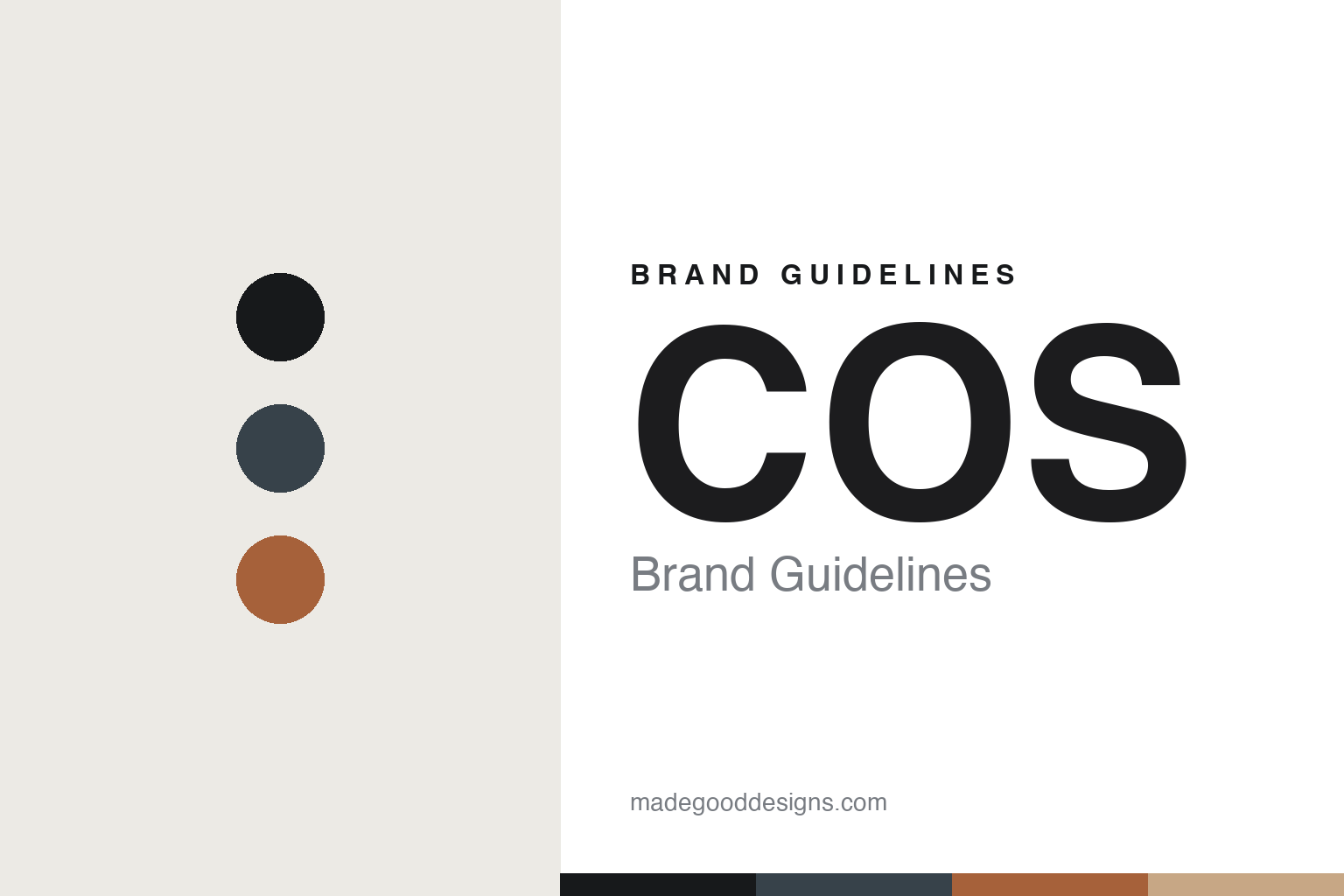
COS Brand Guidelines
Architects of the bottle.
Aa
Two constants: a graphite-and-sienna palette and a modernist sans register. Abstract homage — not the COS label or bottle.
Architects of the bottle
COS was founded by architects, and it shows in the object.
COS is a lesson in an architect’s eye applied to wine. Founded in 1980 by three school friends — Giambattista Cilia, Giusto Occhipinti and Cirino Strano, whose surnames give the name C-O-S — it is based in the Fontane district of Vittoria, in south-eastern Sicily. Cilia and Occhipinti (Strano left early to practise medicine) both trained as architects, and that sensibility runs through everything: the cellar, the vessels and the packaging.
Its brand identity is modernist, understated and object-led. The signature is a custom squat bottle unique to the winery, modelled on an antique bottle unearthed on the estate — archaeology turned into design. Its amphora program (the terracotta-fermented “Pithos,” from 2000) even becomes graphic: the Pithos label carries a muted, ghosted image of the amphora itself. The labels are quiet and modernist, letting form and vessel speak.
(Honest notes: COS is not Arianna Occhipinti — she is Giusto’s niece, with a separate winery in the same town. The name is the founders’ initials, not the Greek island or the fashion brand. COS uses concrete and some oak as well as amphorae. Its label designer, typeface and exact palette aren’t publicly documented, and there’s no official brand hex, so the tones here are an unofficial interpretation.)
Colour
COS lives in a graphite-and-sienna palette. Click a swatch to copy the hex.
COS’s identity is modernist, earthen and restrained — a graphite, an ink, a sienna, a ceramic, and a chalk. The palette pairs a cool architect’s graphite with a warm terracotta sienna — the register of a modernist eye working in Sicilian clay. It signals restraint and craft rather than heraldry. The honest caveat: with no published brand hex, these tones are an original, unofficial interpretation, not first-party values.
The lesson is a cool graphite plus a warm sienna signals modern craft in clay. COS’s world is buried terracotta amphorae and a bottle copied from an artifact. For designers, it is a reminder that graphite with a ceramic sienna reads as architectural and grounded — right for an architect-led estate. The takeaways: anchor with a cool neutral; warm it with a terracotta; keep the whole thing quiet; and treat any single hex as unofficial — using ink for small text so the palette stays modernist.
Typography
The register is a modernist sans — clean, precise, architectural.
COS’s identity carries a modernist, precise, architectural spirit — clean lines and form-follows-function. A modernist sans captures the mood: it is crisp and orderly, the register of a designer’s restraint. Set in a graphite-and-sienna palette, the modernist sans feels architectural and grounded — exactly the personality COS carries. It is precise rather than ornate, mirroring an understated label. (COS’s real label is a trademark we describe but do not reproduce, and no typeface is documented for us to use.) Because the label is not ours to use, the honest description is “a modernist sans spirit,” shown here in a stand-in. The type behaves like the brand: clean, precise and architectural.
Aa
A modernist sans spirit — clean and architectural. (Specimen set in Manrope, a modernist sans STAND-IN; NOT the COS label, which is a trademark.)
The object as identity
COS stands for a design signature you can hold — a bottle from an artifact.
COS is a lesson in making the object the identity. A graphite-and-sienna palette, a modernist label and a bottle copied from an unearthed artifact make the vessel itself the whole brand — considered, grounded, unmistakable. The bottle is the differentiator. The differentiator is an architect’s, amphora-fermented, modernist identity.
For designers and brand-builders, COS offers a clear takeaway: form can be the brand. The lessons: put the signature in the object (a proprietary squat bottle drawn from an artifact on the land); let a method become graphic (the amphora ghosted onto the Pithos label); and keep the type quiet so the form leads. It is also a reminder to stay accurate: COS is the founders’ initials (and not Arianna Occhipinti’s estate), it was founded in 1980, and the palette here is an unofficial interpretation. COS made the object the brand — proof that form can be the difference.
Explore & save
Keep COS’s identity on hand — save it to a board in the Made Good inspiration library.
COS identity set
Pin the graphite-and-sienna palette and the modernist-sans register to your own board.


