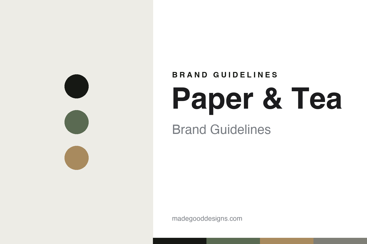
Paper & Tea Brand Guidelines
The gallery of tea.
Aa
Two constants: a sage-and-wood palette and a gallery sans register. Abstract homage — not the Paper & Tea packaging.
The gallery of tea
Paper & Tea treats loose-leaf tea like a design object.
Paper & Tea is a lesson in a gallery as identity. Founded in 2011 (registered 2012) in Berlin by Jens de Gruyter, it presents premium loose-leaf tea as a design object, in a gallery- and apothecary-like retail world of glass fronts, wood, warm light and “Brew Bars.”
Its identity is design-led minimalism: “design is an integral part of the brand.” The most verifiable signature is its award-winning retail and interior design (German Design Award, Red Dot and ICONIC recognitions, per P&T; flagship interiors by pluspunkt architektur and Schwitzke & Górski). The teas pair evocative blend names with a hyphenated catalogue code — Golden Earl N-514, In the Mood for Love N-323, Berlin 2011 N-523.
(Honest notes: P&T isn’t founder-owned or independent — Jens de Gruyter left as managing director in 2021, it was VC-backed, and it went through an insolvency and restructuring in 2025 under new ownership. The design awards are for retail/interior design (attribute them to P&T), and the naming code is “N-###,” not “N°.” There’s no official brand hex, so these tones are an unofficial interpretation.)
Colour
Paper & Tea lives in a sage-and-wood palette. Click a swatch to copy the hex.
Paper & Tea’s identity is minimal, natural and curated — an ink, a sage green, a warm wood, a stone, and a chalk. The palette pairs a soft sage green with a warm wood — the register of a tea gallery. It signals calm and craft rather than novelty. The honest caveat: with no published brand hex, these tones are an original, unofficial interpretation, not first-party values.
The lesson is a soft sage with a warm wood signals a tea gallery. Paper & Tea’s world is a minimalist, museum-like shop. For designers, it is a reminder that a muted, natural palette reads as curated and premium — right for tea presented as a design object. The takeaways: keep the palette muted and natural (sage, wood, stone); let space and light do the work; catalogue the range (N-###); and treat any single hex as unofficial.
Typography
The register is a gallery sans — minimal, calm, curated.
Paper & Tea’s identity carries a minimal, calm, curated spirit — tea as a design object in a gallery. A gallery sans captures the mood: it is clean and quiet, the register of a museum label. Set in a sage-and-wood palette, the gallery sans feels minimal and calm — exactly the personality Paper & Tea carries. It is curated rather than loud, mirroring a minimalist shop. (Paper & Tea’s real packaging is work we describe but do not reproduce, and the exact typeface is not ours to use.) Because it is not ours to use, the honest description is “a gallery sans spirit,” shown here in a stand-in. The type behaves like the brand: minimal, calm and curated.
Aa
A gallery sans spirit — minimal and calm. (Specimen set in Sora, a clean gallery sans STAND-IN; NOT the Paper & Tea packaging.)
A gallery as identity
Paper & Tea stands for tea shown like art.
Paper & Tea is a lesson in making the gallery the identity. A sage-and-wood palette, a gallery sans and a museum-like shop make design the whole brand — minimal, calm, curated. The gallery is the differentiator. The differentiator is a gallery-minimal, design-object identity.
For designers and brand-builders, Paper & Tea offers a clear takeaway: present the everyday as design. The lessons: treat the product as an object (loose-leaf as design); build the retail experience (gallery interiors); catalogue with a system (N-###); and be honest about the business. It is also a reminder to stay accurate: it’s VC-backed and restructured, the awards are for interiors, and the palette here is an unofficial interpretation. Paper & Tea made the gallery the brand — proof that presentation can be the difference.
Explore & save
Keep Paper & Tea’s identity on hand — save it to a board in the Made Good inspiration library.
Paper & Tea identity set
Pin the sage-and-wood palette and the gallery-sans register to your own board.


