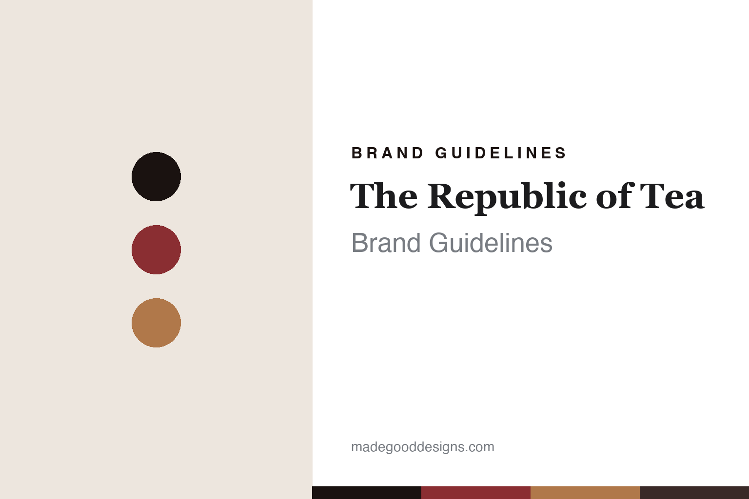
The Republic of Tea Brand Guidelines
A nation of tea.
Aa
Two constants: a republic-red-and-parchment palette and a literary serif register. Abstract homage — not the Republic of Tea packaging.
A nation of tea
The Republic of Tea built a brand as a make-believe nation.
The Republic of Tea is a lesson in a voice as identity. Founded in 1992 in Novato, California — and now based in Larkspur — it grew out of an epistolary business book, “The Republic of Tea: Letters to a Young Zentrepreneur,” written by Banana Republic founders Mel and Patricia Ziegler with Bill Rosenzweig. The book became a company.
Its identity is a complete brand world: the conceit of a “republic,” with Ministers, Citizens and Embassies; the mantra “Sip by Sip Rather Than Gulp by Gulp”; and a signature round, airtight tin. The naming runs from straightforward flavours to a “Get___” wellness line (Get Relaxed, Get Burning), dessert names and licensed pop-culture collections — all narrated in the same gently literary voice.
(Honest notes: the Republic of Tea isn’t founder-run today. Ron Rubin acquired the company in 1994, styling himself “Minister of Tea,” and the Zieglers and Rosenzweig left within a couple of years; Rubin’s son Todd became President in 2015, so it’s Rubin-family-owned. There’s no official brand hex, so these tones are an unofficial interpretation.)
Colour
The Republic of Tea lives in a red-and-parchment palette. Click a swatch to copy the hex.
The Republic of Tea’s identity is literary, warm and civic — a republic red, an ink, a parchment tan, a deep wine, and a cream. The palette pairs a republic red with a parchment tan — the register of a printed letter and a round tin. It signals story and warmth rather than novelty. The honest caveat: with no published brand hex, these tones are an original, unofficial interpretation, not first-party values.
The lesson is a republic red with a parchment tan signals a literary tea world. The Republic of Tea’s world is a book turned into a brand. For designers, it is a reminder that a warm red with a paper tone reads as narrative and civic — right for a brand built on a voice. The takeaways: build a whole world (a “republic”); write in one voice (“Sip by Sip”); make the package a keepsake (round tins); and treat any single hex as unofficial.
Typography
The register is a literary serif — narrative, warm, civic.
The Republic of Tea’s identity carries a narrative, warm, civic spirit — a make-believe nation and a printed letter. A literary serif captures the mood: it is readable and warm, the register of a well-set book. Set in a red-and-parchment palette, the literary serif feels narrative and civic — exactly the personality the Republic of Tea carries. It is storied rather than loud, mirroring a printed letter. (The Republic of Tea’s real packaging is work we describe but do not reproduce, and the exact typeface is not ours to use.) Because it is not ours to use, the honest description is “a literary serif spirit,” shown here in a stand-in. The type behaves like the brand: narrative, warm and civic.
Aa
A literary serif spirit — narrative and warm. (Specimen set in Lora, a readable literary serif STAND-IN; NOT the Republic of Tea packaging.)
A voice as identity
The Republic of Tea stands for a brand you can read.
The Republic of Tea is a lesson in making a voice the identity. A red-and-parchment palette, a literary serif and the conceit of a “republic” make a story the whole brand — narrative, warm, civic. The voice is the differentiator. The differentiator is a fully written brand world.
For designers and brand-builders, the Republic of Tea offers a clear takeaway: write the brand, don’t just design it. The lessons: invent a world with its own vocabulary (Ministers, Citizens); keep one voice everywhere (“Sip by Sip”); make the package part of the story (round tins); and be honest about the history. It is also a reminder to stay accurate: it began as a 1992 book, Ron Rubin acquired it in 1994, it’s Rubin-family-owned, and the palette here is an unofficial interpretation. The Republic of Tea made a voice the brand — proof that words can be the difference.
Explore & save
Keep The Republic of Tea’s identity on hand — save it to a board in the Made Good inspiration library.
The Republic of Tea identity set
Pin the red-and-parchment palette and the literary-serif register to your own board.


