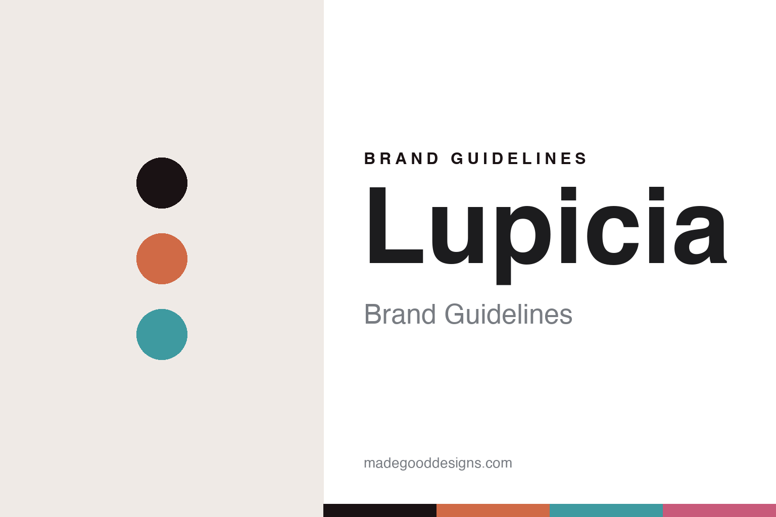
Lupicia Brand Guidelines
The seasonal tin.
Aa
Two constants: a colourful collectible-tin palette and a friendly sans register. Abstract homage — not the Lupicia packaging.
The seasonal tin
Lupicia turned tea into a seasonal collectible.
Lupicia is a lesson in the collectible as identity. Founded in 1994 as “Lepicier,” and rebranded “Lupicia” in 2005 on a merger, the Japanese house (now headquartered in Niseko, Hokkaido) built its world on flavoured “world teas” sold in colourful tins that change with the seasons.
Its identity is the colourful, collectible tin: a vast, ever-rotating range of seasonal and limited-edition flavoured teas, each in a different bright colourway, so the tins themselves become a collectible ritual. The naming is friendly and flavour-led — Momo Oolong (peach), Sakurambo (cherry), Rose Royal — with seasonal “Grand Cru” editions. The register is bright and approachable rather than ceremonial.
(Honest notes: Lupicia was founded in 1994 as “Lepicier” (レピシエ) — not “Rouge et Blanc” — and adopted the “Lupicia” name in 2005; it’s a private, independent company (there’s no “Green House” parent). “Lupicia” has no documented meaning, and there’s no formal numbering scheme for the blends. There’s no official brand hex, so these tones are an unofficial interpretation.)
Colour
Lupicia lives in a colourful, collectible palette. Click a swatch to copy the hex.
Lupicia’s identity is colourful, seasonal and friendly — a berry, an ink, a coral, a teal, and a cream. The palette gathers a berry, a coral and a teal — the register of a shelf of colourful seasonal tins. It signals variety and delight rather than restraint. The honest caveat: with no published brand hex, these tones are an original, unofficial interpretation, not first-party values.
The lesson is a rotating set of bright colourways signals a collectible tea. Lupicia’s world is a wall of seasonal tins. For designers, it is a reminder that a multi-colour, seasonal system reads as playful and collectible — right for a brand built on variety. The takeaways: give each blend a colourway; rotate with the seasons; keep the register friendly; and — because bright hues fail as small text — keep type dark and let the colour live in the tins, palette and band; treat any single hex as unofficial.
Typography
The register is a friendly sans — bright, approachable, seasonal.
Lupicia’s identity carries a bright, approachable, seasonal spirit — a shelf of colourful tins. A friendly, rounded sans captures the mood: it is warm and open, the register of an approachable brand. Set in a colourful palette, the friendly sans feels bright and seasonal — exactly the personality Lupicia carries. It is approachable rather than ceremonial, mirroring a collectible tin. (Lupicia’s real packaging is work we describe but do not reproduce, and the exact typeface is not ours to use.) Because it is not ours to use, the honest description is “a friendly sans spirit,” shown here in a stand-in. The type behaves like the brand: bright, approachable and seasonal.
Aa
A friendly sans spirit — bright and approachable. (Specimen set in Nunito, a rounded friendly sans STAND-IN; NOT the Lupicia packaging.)
The collectible as identity
Lupicia stands for tea you collect by the season.
Lupicia is a lesson in making the collectible the identity. A colourful palette, a friendly sans and a seasonal tin make variety the whole brand — bright, approachable, seasonal. The collectible tin is the differentiator. The differentiator is a colourful, ever-rotating identity.
For designers and brand-builders, Lupicia offers a clear takeaway: make the package a collectible. The lessons: give every blend a colourway; rotate with the seasons to reward return visits; keep the register friendly; and be honest about the history. It is also a reminder to stay accurate: it began as “Lepicier” in 1994, took the “Lupicia” name in 2005, is privately independent, and the palette here is an unofficial interpretation. Lupicia made the tin a collectible — proof that variety, well-packaged, can be the difference.
Explore & save
Keep Lupicia’s identity on hand — save it to a board in the Made Good inspiration library.
Lupicia identity set
Pin the colourful collectible palette and the friendly-sans register to your own board.


