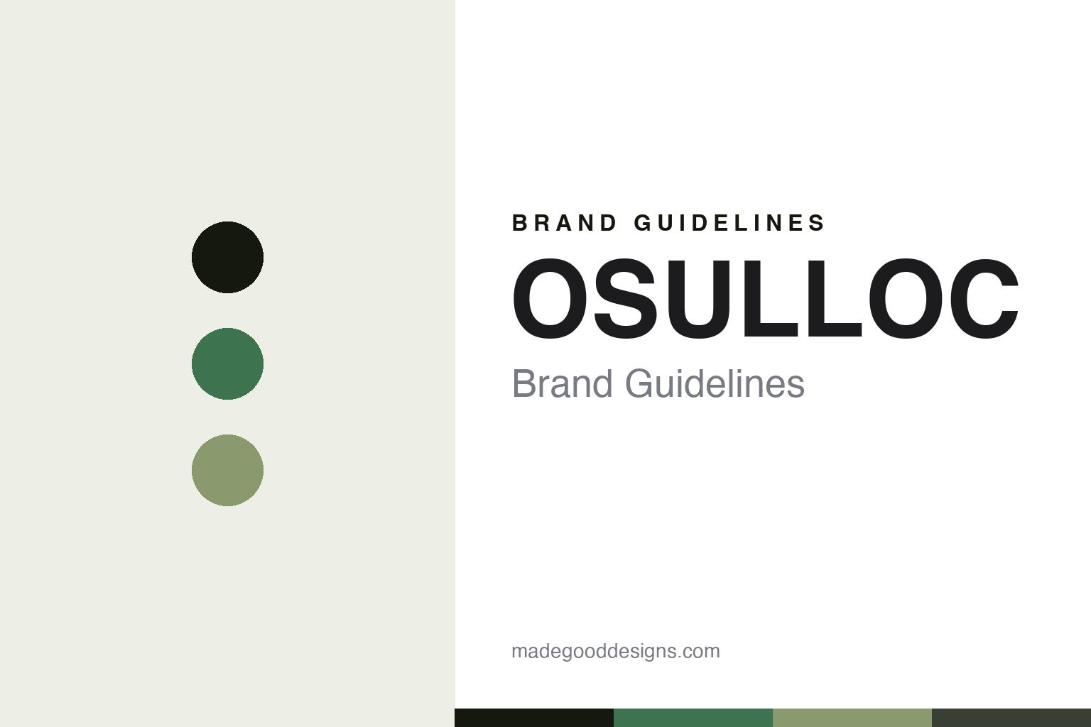
OSULLOC Brand Guidelines
The tea museum.
Aa
Two constants: a Jeju-green-and-sage palette and a minimal sans register. Abstract homage — not the OSULLOC packaging.
The tea museum
OSULLOC built a green-tea brand around a museum on Jeju.
OSULLOC is a lesson in a destination as identity. Its tea story begins in 1979, when the founder of Amorepacific, Suh Sung-hwan, reclaimed volcanic land on Jeju Island to plant Korea’s tea fields; the first teas followed in 1980 under the “Sulloc” name. Today it is a modern, minimalist, design-forward Korean green-tea brand rooted in Jeju nature.
Its strongest signature is the O’Sulloc Tea Museum on Jeju — opened in 2001 as Korea’s first tea museum, a design-forward architectural destination set among the tea fields that anchors the whole brand world and draws around 1.5 million visitors a year. Around it sits a clean, contemporary identity: green teas by traditional grade (Woojeon, Sejak) and the Ilohyang blend, plus evocative “Island”-named blends — Moonlight Island, Coral Island, Jeju Tangerine. OSULLOC even won an iF Design Award in 2015.
(Honest notes: OSULLOC isn’t independent — it’s wholly owned by Amorepacific, carved into a 100%-owned subsidiary, O’Sulloc Corporation, in 2020. Its “founder” is Amorepacific’s founder (who built the parent company in 1945), not a standalone tea entrepreneur; 1979 is the tea field, with the museum and retail world coming later. Don’t confuse OSULLOC with Amorepacific’s green-tea skincare brands (Innisfree, AMOREPACIFIC), and there’s no official brand hex, so these tones are an unofficial interpretation.)
Colour
OSULLOC lives in a Jeju-green-and-sage palette. Click a swatch to copy the hex.
OSULLOC’s identity is minimal, natural and modern — a Jeju green, an ink, a field sage, a basalt, and a rice. The palette pairs a Jeju green with a field sage, grounded by a volcanic basalt — the register of a tea field and a modern museum. It signals nature and design rather than novelty. The honest caveat: with no published brand hex, these tones are an original, unofficial interpretation, not first-party values.
The lesson is a Jeju green with a field sage signals a design-forward tea house. OSULLOC’s world is a green field and a white-walled museum. For designers, it is a reminder that a natural, restrained green palette reads as calm and premium — right for tea presented as a design destination. The takeaways: source the palette from the land (Jeju green, sage, basalt); keep it minimal and modern; build a place people visit; and treat any single hex as unofficial.
Typography
The register is a minimal sans — clean, calm, modern.
OSULLOC’s identity carries a clean, calm, modern spirit — a Jeju tea field and a contemporary museum. A minimal sans captures the mood: it is quiet and precise, the register of a design-forward destination. Set in a Jeju-green-and-sage palette, the minimal sans feels clean and modern — exactly the personality OSULLOC carries. It is calm rather than loud, mirroring a white-walled tea house. (OSULLOC’s real packaging and wordmark are works we describe but do not reproduce, and the exact typeface is not ours to use.) Because it is not ours to use, the honest description is “a minimal sans spirit,” shown here in a stand-in. The type behaves like the brand: clean, calm and modern.
Aa
A minimal sans spirit — clean and calm. (Specimen set in Manrope, a clean modern sans STAND-IN; NOT the OSULLOC packaging.)
A destination as identity
OSULLOC stands for tea you can visit.
OSULLOC is a lesson in making a destination the identity. A Jeju-green-and-sage palette, a minimal sans and a tea museum make a place the whole brand — clean, calm, modern. The destination is the differentiator. The differentiator is a design-forward, Jeju-rooted identity.
For designers and brand-builders, OSULLOC offers a clear takeaway: build a place, not just a package. The lessons: root the brand in a real landscape (Jeju); make a destination people travel to (the museum); keep the palette and type minimal and natural; and be honest about the business. It is also a reminder to stay accurate: it’s Amorepacific-owned, 1979 is the field not the brand launch, and the palette here is an unofficial interpretation. OSULLOC made a destination the brand — proof that a place can be the difference.
Explore & save
Keep OSULLOC’s identity on hand — save it to a board in the Made Good inspiration library.
OSULLOC identity set
Pin the Jeju-green-and-sage palette and the minimal-sans register to your own board.


