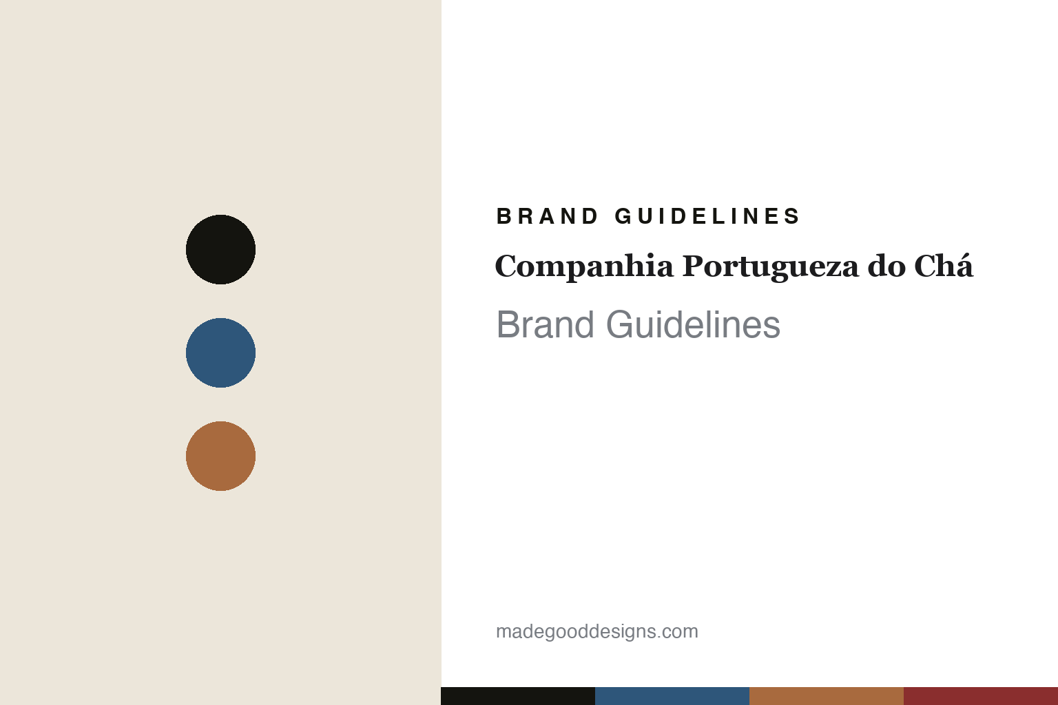
Companhia Portugueza do Chá Brand Guidelines
The invented house.
Aa
Two constants: an azulejo-blue-and-terracotta palette and a period serif register. Abstract homage — not the Companhia Portugueza do Chá packaging.
The invented house
A designer built a convincing 19th-century tea house — in 2014.
Companhia Portugueza do Chá is a lesson in a fabricated heritage as identity. Founded in 2014 in Lisbon by Sebastian Filgueiras — an Argentine designer-painter who later trained in tea blending — it is a modern company that convincingly dresses itself as a 19th-century Portuguese trading house, from the archaic spelling of “Portugueza” and “Chá” to the shop it occupies: the preserved former Sapataria Bastos, a shoe shop that opened in 1880.
Its identity is the Catherine of Braganza emblem: a profile of the Portuguese princess who popularised tea at the English court, paired with the word “Lisbon” set in the handwriting of the writer Wenceslau de Moraes — tea’s Portuguese origin story rendered as a face in profile. Around it is a wall of colourful patterned tins in an apothecary interior, plus fine-artist “Author’s Editions.” The blends carry Portuguese names — Lisboa Breakfast, Porto Breakfast, an Earl Grey made with Alentejo bergamot — and the range even includes Azorean tea from Gorreana, Europe’s oldest plantation.
(Honest notes: this is a modern brand — founded 2014 — not a historic house; the “1880” belongs to the building, not the company. It’s independent and founder-led; the notable named creatives are fine-artists doing limited-edition tins, not an external branding studio. The “Portugal gave Britain tea” line is the brand’s narrative, historically debated. There’s no official brand hex, so these tones are an unofficial interpretation.)
Colour
Companhia Portugueza do Chá lives in an azulejo-blue-and-terracotta palette. Click a swatch to copy the hex.
Companhia Portugueza do Chá’s identity is old-world, colourful and Portuguese — an azulejo blue, an ink, a terracotta, a colonial red, and a cream. The palette pairs an azulejo blue with a terracotta — the register of a Portuguese trading house. It signals heritage and craft rather than novelty. The honest caveat: with no published brand hex, these tones are an original, unofficial interpretation, not first-party values.
The lesson is an azulejo blue with a terracotta signals a Portuguese trading house. The brand’s world is a wall of patterned tins in a period shop. For designers, it is a reminder that a tile-blue and terracotta palette reads as Portuguese and old-world — and that art direction can build a convincing heritage. The takeaways: source the palette from place (azulejo, terracotta); make each tin a pattern; commit to a period conceit (spelling, emblem); and — because a bright blue can fail as small text — keep type dark and let the blue live in the tins, palette and band; treat any single hex as unofficial.
Typography
The register is a period serif — old-world, elegant, Portuguese.
Companhia Portugueza do Chá’s identity carries an old-world, elegant, Portuguese spirit — a fabricated trading house and a princess in profile. A period serif captures the mood: it is high-contrast and antique, the register of a 19th-century label. Set in an azulejo-blue-and-terracotta palette, the period serif feels old-world and elegant — exactly the personality the brand projects. It is antique rather than modern, mirroring a patterned tin. (The brand’s real emblem, tins and wordmark are works we describe but do not reproduce, and the exact typeface is not ours to use.) Because it is not ours to use, the honest description is “a period serif spirit,” shown here in a stand-in. The type behaves like the brand: old-world, elegant and Portuguese.
Aa
A period serif spirit — old-world and elegant. (Specimen set in Playfair Display, a high-contrast period serif STAND-IN; NOT the Companhia Portugueza do Chá packaging.)
A fabricated heritage as identity
Companhia Portugueza do Chá stands for a designed past.
Companhia Portugueza do Chá is a lesson in making a fabricated heritage the identity. An azulejo-blue-and-terracotta palette, a period serif and a Braganza emblem make a designed past the whole brand — old-world, elegant, Portuguese. The invented house is the differentiator. The differentiator is a designer’s convincing period identity.
For designers and brand-builders, this brand offers a clear takeaway: a designer can author a whole history. The lessons: commit to a period conceit (archaic spelling, an emblem); root it in place (Braganza, azulejo, Gorreana); make the tins the collectible; and be honest that it’s modern. It is also a reminder to stay accurate: it’s from 2014 (the 1880 is the building), it’s founder-led, and the palette here is an unofficial interpretation. Companhia Portugueza do Chá designed a past — proof that art direction, honestly understood, can be the difference.
Explore & save
Keep Companhia Portugueza do Chá’s identity on hand — save it to a board in the Made Good inspiration library.
Companhia Portugueza do Chá identity set
Pin the azulejo-blue-and-terracotta palette and the period-serif register to your own board.


