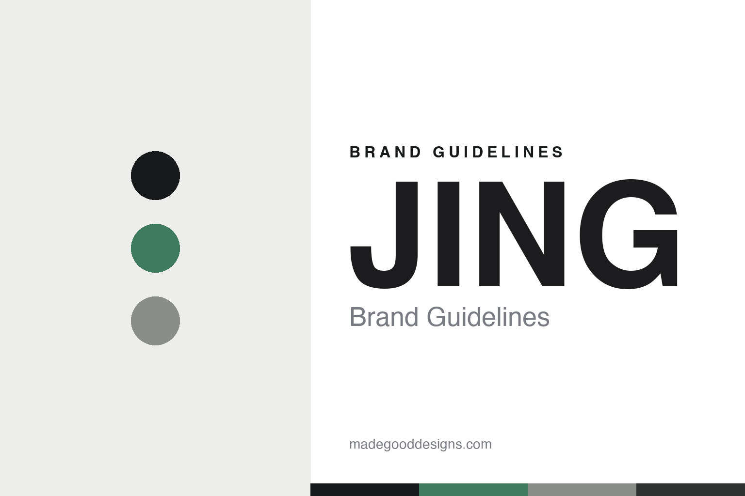
JING Brand Guidelines
The glass and the garden.
Aa
Two constants: a jade-and-stone palette and a minimal sans register. Abstract homage — not the JING packaging.
The glass and the garden
JING made minimalism the counterpoint to ornate tea.
JING is a lesson in minimalism as identity. Founded in 2004 in London by Ed Eisler, and independent and founder-led, it set out to present fine tea in a modern, clean, contemporary register — a deliberate contrast to the ornate, heritage-heavy world most tea brands inhabit.
Its identity has two threads. The first is whole-leaf, single-garden tea, sourced direct from named growers and organised by type and origin — Dragon Well from Yong’an Garden, Ali Shan from Chenjia Garden, Assam Breakfast. The second — and the strongest design signature — is the glass serveware: JING’s trademarked Tea-iere, a cafetière-style glass infuser without a plunger, and its One Cup version, the clear vessels that made whole-leaf tea recognisable on fine-dining tables. The wordmark matches: a clean, all-caps “JING.”
(Honest notes: the founder is Ed Eisler, and JING presents as independent and founder-led with no acquisition on record. The word “JING” is often read as “essence,” but the brand doesn’t officially define it, so we treat that as a reading, not a fact. JING’s hospitality reach is real and premium, though the “Michelin” framing is its own marketing. There’s no official brand hex, so these tones are an unofficial interpretation.)
Colour
JING lives in a jade-and-stone palette. Click a swatch to copy the hex.
JING’s identity is minimal, clean and modern — a jade, an ink, a stone, a charcoal, and a chalk. The palette pairs a jade green with a stone grey — the register of clear glass and whole leaf. It signals purity and calm rather than decoration. The honest caveat: with no published brand hex, these tones are an original, unofficial interpretation, not first-party values.
The lesson is a jade with a stone signals clean, modern tea. JING’s world is a glass infuser on a white table. For designers, it is a reminder that a restrained, near-monochrome palette reads as premium and precise — right for a minimalist counterpoint to ornate tea. The takeaways: keep the palette restrained and cool (jade, stone, charcoal); let clear glass be the hero; name by garden and origin; and treat any single hex as unofficial.
Typography
The register is a minimal sans — clean, precise, modern.
JING’s identity carries a clean, precise, modern spirit — a glass infuser and a single garden. A minimal sans captures the mood: it is quiet and exact, the register of a modern premium brand. Set in a jade-and-stone palette, the minimal sans feels clean and precise — exactly the personality JING carries. It is modern rather than ornate, mirroring clear glass. (JING’s real packaging and serveware are works we describe but do not reproduce, and the exact typeface is not ours to use.) Because it is not ours to use, the honest description is “a minimal sans spirit,” shown here in a stand-in. The type behaves like the brand: clean, precise and modern.
Aa
A minimal sans spirit — clean and precise. (Specimen set in Jost, a geometric minimal sans STAND-IN; NOT the JING packaging.)
Minimalism as identity
JING stands for clean glass and a named garden.
JING is a lesson in making minimalism the identity. A jade-and-stone palette, a minimal sans and clear glass serveware make restraint the whole brand — clean, precise, modern. The minimalism is the differentiator. The differentiator is a glass-and-garden, modern identity.
For designers and brand-builders, JING offers a clear takeaway: be the clean counterpoint in a decorative category. The lessons: strip the palette to a cool few (jade, stone); design an ownable object (the glass Tea-iere); name by garden and origin; and be honest about the claims. It is also a reminder to stay accurate: “JING” is read as “essence” but not officially defined, and the palette here is an unofficial interpretation. JING made minimalism the brand — proof that restraint can be the difference.
Explore & save
Keep JING’s identity on hand — save it to a board in the Made Good inspiration library.
JING identity set
Pin the jade-and-stone palette and the minimal-sans register to your own board.


