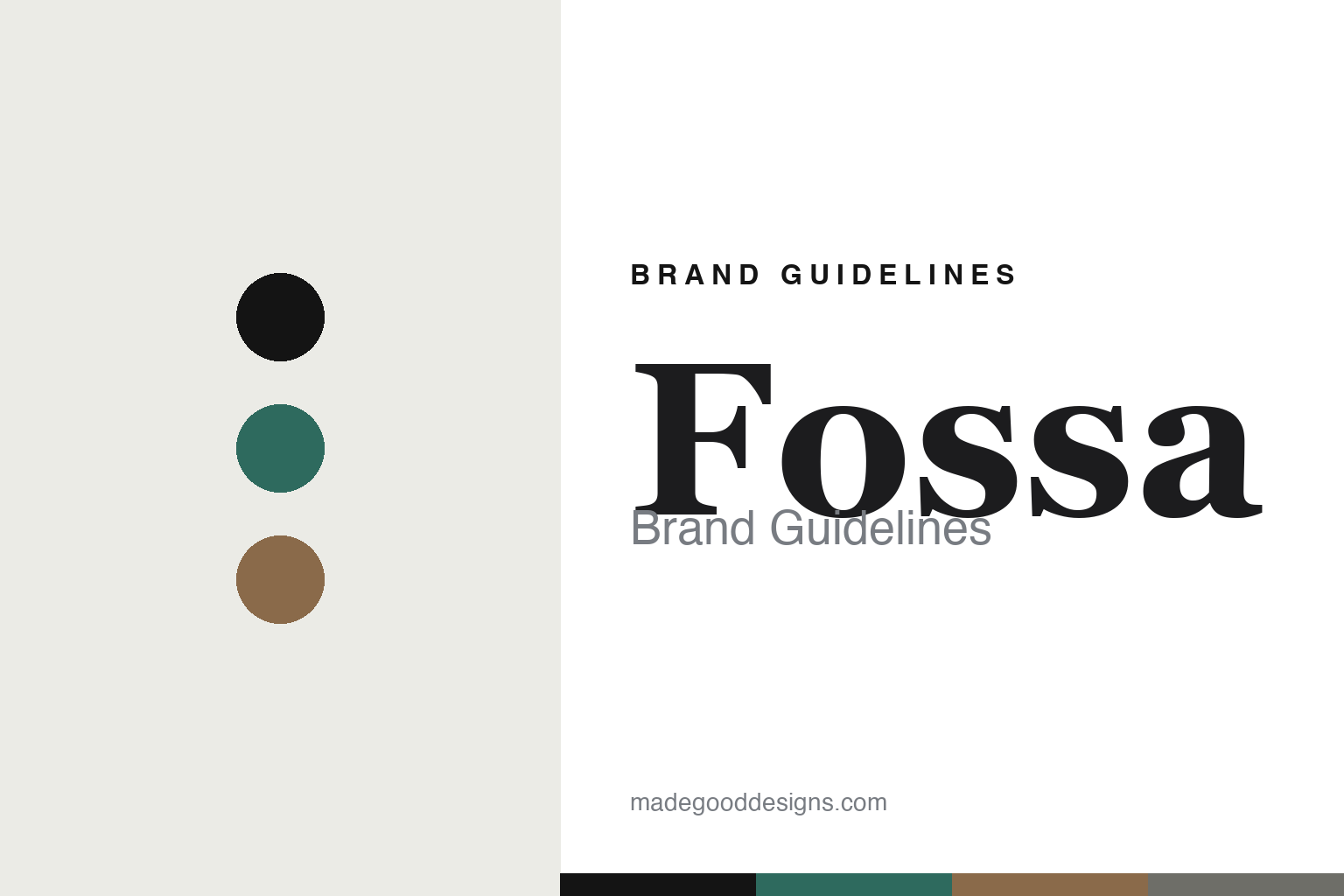
Fossa Brand Guidelines
The flavours of home.
Aa
Two constants: a jade-and-tan palette and a fine serif register. Abstract homage — not the Fossa packaging.
The flavours of home
Fossa roots bean-to-bar chocolate in Asian food culture.
Fossa is a lesson in a food culture as identity. An independent Singaporean maker founded in the mid-2010s by a small co-founding team — Jay, Yilina and Charis, with the chocolate-making shared — it built its brand on the flavours of home.
Its identity has two threads. First, the Asian-inspired “Local Flavours” bars that root bean-to-bar chocolate in Singaporean and Asian food culture — Nanyang Kaya, Sake Kasu, Shrimp & Bonito, gula melaka and more. Second, a distinctive illustrated wrapper of intricate, limited-palette line-art with animal and nature motifs. There’s even a design pun in the name: a “fossa” is a carnivorous mammal native to Madagascar — a major cocoa origin — which anchors the animal-illustration motif to where cacao comes from.
(Honest notes: Fossa is a small co-founded team, not a solo brand, and the exact founding year isn’t clearly published, so we date it to the mid-2010s. Its flavours rotate, and it doesn’t publicly credit an external illustrator — the design appears in-house — so we describe the work without naming a designer. There’s no official brand hex, so these tones are an unofficial interpretation.)
Colour
Fossa lives in a jade-and-tan palette. Click a swatch to copy the hex.
Fossa’s identity is crafted, Asian and illustrated — a Fossa jade, an ink, a warm tan, a stone, and a chalk. The palette pairs a jade with a warm tan — the register of a limited-palette, line-art wrapper. It signals craft and food culture rather than mass chocolate. The honest caveat: with no published brand hex, these tones are an original, unofficial interpretation, not first-party values.
The lesson is a jade with a warm tan signals a crafted, illustrated wrapper. Fossa’s world is a line-drawn animal on a limited-palette wrapper. For designers, it is a reminder that a restrained, illustrative palette reads as crafted and considered — right for a food-culture brand. The takeaways: root the flavours in a real culture (Asian ingredients); illustrate the wrapper with a motif (animals, nature); tie the name to the story (the Madagascar fossa); and treat any single hex as unofficial.
Typography
The register is a fine serif — crafted, considered, editorial.
Fossa’s identity carries a crafted, considered, editorial spirit — a line-art animal and an Asian flavour. A fine serif captures the mood: it is delicate and refined, letting the illustration lead. Set in a jade-and-tan palette, the fine serif feels crafted and considered — exactly the personality Fossa carries. It is editorial rather than loud, mirroring an intricate wrapper. (Fossa’s real packaging is work we describe but do not reproduce, and the exact typeface is not ours to use.) Because it is not ours to use, the honest description is “a fine serif spirit,” shown here in a stand-in. The type behaves like the brand: crafted, considered and editorial.
Aa
A fine serif spirit — crafted and considered. (Specimen set in Cormorant Garamond, a delicate fine serif STAND-IN; NOT the Fossa packaging.)
A food culture as identity
Fossa stands for chocolate that tastes of home.
Fossa is a lesson in making a food culture the identity. A jade-and-tan palette, a fine serif and illustrated wrappers make Asian food culture the whole brand — crafted, considered, editorial. The flavours are the differentiator. The differentiator is an Asian-flavour, illustrated-wrapper identity.
For designers and brand-builders, Fossa offers a clear takeaway: root the brand in a real food culture. The lessons: draw the flavours from home (kaya, gula melaka); illustrate a motif (animals, nature); find a story in the name (the Madagascar fossa); and be honest about the details. It is also a reminder to stay accurate: it’s a co-founded team from the mid-2010s with in-house design, and the palette here is an unofficial interpretation. Fossa made a food culture the brand — proof that the flavours of home can be the difference.
Explore & save
Keep Fossa’s identity on hand — save it to a board in the Made Good inspiration library.
Fossa identity set
Pin the jade-and-tan palette and the fine-serif register to your own board.


