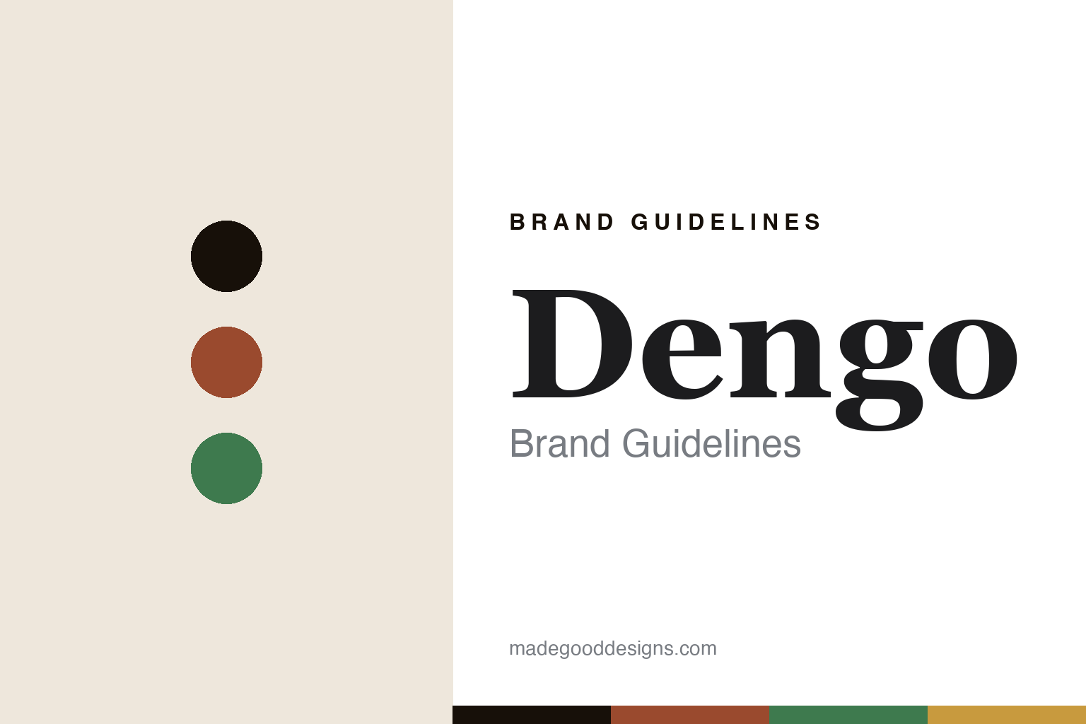
Dengo Brand Guidelines
Chocolate as affection.
Aa
Two constants: a terracotta-and-green palette and a warm serif register. Abstract homage — not the Dengo packaging.
Chocolate as affection
Dengo built a Brazilian brand on tenderness and fair pay.
Dengo is a lesson in a mission as identity. Founded in 2017 in São Paulo by Guilherme Leal — the co-founder of the cosmetics giant Natura — with Estevan Sartoreli, it is a well-backed, mission-driven impact company whose very name says its intent: dengo is a Brazilian-Portuguese word for affection and tenderness.
Its identity is fair pay as design: Dengo works directly with 150-plus small and medium cacao producers in southern Bahia, reportedly paying around 92% above the market price, using the shade-grown cabruca system tied to Atlantic Forest preservation. Around that sits a warm, modern Brazilian retail and packaging world — its 2020 Faria Lima flagship is a design destination — and a signature format, the Quebra-Quebra (“break-break”), a large breakable slab sold by weight, alongside bars built on Brazilian fruits and nuts (Brazil nut, cashew, jabuticaba).
(Honest notes: the founders are Guilherme Leal and Estevan Sartoreli — not the filmmaker of a similar name — and Dengo is best described as a well-backed impact company, not a bootstrapped micro-maker. We don’t assert a B Corp certification or name the flagship’s architect, both unverified. There’s no official brand hex, so these tones are an unofficial interpretation.)
Colour
Dengo lives in a terracotta-and-green palette. Click a swatch to copy the hex.
Dengo’s identity is warm, natural and Brazilian — a Bahia terracotta, an ink, a forest green, a warm gold, and a cream. The palette pairs a Bahia terracotta with a forest green — the register of a shaded cacao grove. It signals warmth and origin rather than novelty. The honest caveat: with no published brand hex, these tones are an original, unofficial interpretation, not first-party values.
The lesson is a terracotta with a forest green signals warm, Brazilian craft. Dengo’s world is a Bahia grove and a warm modern shop. For designers, it is a reminder that an earthy, natural palette reads as warm and rooted — right for a tenderness-named brand. The takeaways: source the palette from the land (terracotta, forest green); make the retail warm and modern; give the format a name (Quebra-Quebra); and treat any single hex as unofficial.
Typography
The register is a warm serif — affectionate, natural, modern.
Dengo’s identity carries a warm, affectionate, modern spirit — a name that means tenderness and a shaded grove. A warm serif captures the mood: it is soft and characterful, the register of an affectionate brand. Set in a terracotta-and-green palette, the warm serif feels affectionate and natural — exactly the personality Dengo carries. It is warm rather than austere, mirroring a modern-Brazilian shop. (Dengo’s real packaging is work we describe but do not reproduce, and the exact typeface is not ours to use.) Because it is not ours to use, the honest description is “a warm serif spirit,” shown here in a stand-in. The type behaves like the brand: warm, affectionate and modern.
Aa
A warm serif spirit — affectionate and natural. (Specimen set in Fraunces, a soft old-style serif STAND-IN; NOT the Dengo packaging.)
A mission as identity
Dengo stands for fair pay and affection.
Dengo is a lesson in making a mission the identity. A terracotta-and-green palette, a warm serif and a fair-pay model make purpose the whole brand — warm, affectionate, modern. The mission is the differentiator. The differentiator is a fair-pay, affection-named identity.
For designers and brand-builders, Dengo offers a clear takeaway: let purpose and warmth carry the brand. The lessons: pay farmers well and say so (92% above market); make the retail a warm destination; name the product with feeling (Quebra-Quebra, and “dengo” itself); and be honest about the backing. It is also a reminder to stay accurate: it’s a well-backed 2017 impact company, its founders are Leal and Sartoreli, and the palette here is an unofficial interpretation. Dengo made a mission the brand — proof that purpose and warmth can be the difference.
Explore & save
Keep Dengo’s identity on hand — save it to a board in the Made Good inspiration library.
Dengo identity set
Pin the terracotta-and-green palette and the warm-serif register to your own board.


