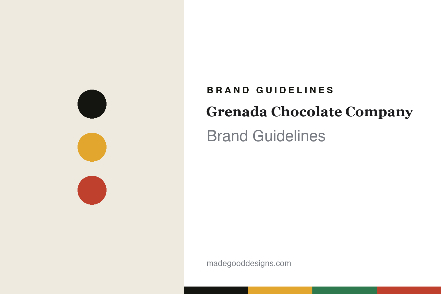
Grenada Chocolate Company Brand Guidelines
Made at origin.
Aa
Two constants: an island folk-art palette and a folk slab register. Abstract homage — not the Grenada Chocolate Company packaging.
Made at origin
Grenada Chocolate Company makes chocolate where the cacao grows.
Grenada Chocolate Company is a lesson in origin as identity. Founded in 1999 in Hermitage, Grenada, by Mott Green (the pen name of David Lawrence Friedman), Doug Browne and Edmond Brown, it built a pioneering model: make the whole chocolate on the island where the cacao grows.
Its identity is tree-to-bar, at origin — its literal motto is “tree to bar.” Organic cacao is grown, fermented, dried, roasted and made into finished chocolate all on Grenada, powered in part by solar energy, on restored vintage machinery, and run as an equal-pay cooperative linked to a cacao-growers’ co-op. The packaging matches the spirit: colourful, hand-drawn, retro island folk-art labels. The bars are organic darks by percentage (60, 71, 82, 100), with playful “-Licious” specialty names (Nib-A-Licious, Salty-Licious). It even shipped chocolate across the Atlantic by sail in 2012.
(Honest notes, told respectfully: all three founders have died — Doug Browne in 2008, Mott Green in 2013 (electrocuted while working on solar cooling equipment), and Edmond Brown in 2024 — and the company is carried on today by its roughly 23-person Hermitage community. Its “first and only maker in a cocoa-producing country” line is its own era’s claim. There’s no official brand hex, so these tones are an unofficial interpretation.)
Colour
Grenada Chocolate Company lives in an island folk-art palette. Click a swatch to copy the hex.
Grenada Chocolate Company’s identity is colourful, hand-made and island — an island green, an ink, an island yellow, an island red, and a cream. The palette gathers a green, a yellow and a red — the register of Grenadian folk-art and the island’s own colours. It signals craft and place rather than polish. The honest caveat: with no published brand hex, these tones are an original, unofficial interpretation, not first-party values.
The lesson is bright island colours signal hand-made, at-origin chocolate. Grenada Chocolate Company’s world is a small island factory. For designers, it is a reminder that a colourful, folk-art palette reads as authentic and local — right for a made-at-origin co-op. The takeaways: draw the palette from the island (green, yellow, red); keep the labels hand-drawn and retro; let place carry the story; and — because bright hues fail as small text — keep type dark and let the colour live in the palette and band; treat any single hex as unofficial.
Typography
The register is a folk slab — hand-made, warm, island.
Grenada Chocolate Company’s identity carries a hand-made, warm, island spirit — a small factory and a folk-art label. A folk slab serif captures the mood: it is sturdy and characterful, the register of a hand-lettered sign. Set in an island folk-art palette, the folk slab feels hand-made and warm — exactly the personality the company carries. It is island rather than corporate, mirroring a retro label. (Grenada Chocolate Company’s real packaging is work we describe but do not reproduce, and the exact typeface is not ours to use.) Because it is not ours to use, the honest description is “a folk slab spirit,” shown here in a stand-in. The type behaves like the brand: hand-made, warm and island.
Aa
A folk slab spirit — hand-made and warm. (Specimen set in Bitter, a warm slab serif STAND-IN; NOT the Grenada Chocolate Company packaging.)
Origin as identity
Grenada Chocolate Company stands for making it where it grows.
Grenada Chocolate Company is a lesson in making origin the identity. An island folk-art palette, a folk slab and a made-at-origin model make place the whole brand — hand-made, warm, island. The origin is the differentiator. The differentiator is a tree-to-bar, cooperative identity.
For designers and brand-builders, it offers a clear takeaway: make it where it grows, and let the place show. The lessons: keep the whole chain at origin (tree to bar); run it ethically (equal-pay co-op); dress it in local folk-art; and be honest about the story. It is also a reminder to stay accurate and respectful: its founders have passed, the community carries it on, the “first/only” line is a claim, and the palette here is an unofficial interpretation. Grenada Chocolate Company made origin the brand — proof that making it where it grows can be the difference.
Explore & save
Keep Grenada Chocolate Company’s identity on hand — save it to a board in the Made Good inspiration library.
Grenada Chocolate Company identity set
Pin the island folk-art palette and the folk-slab register to your own board.


