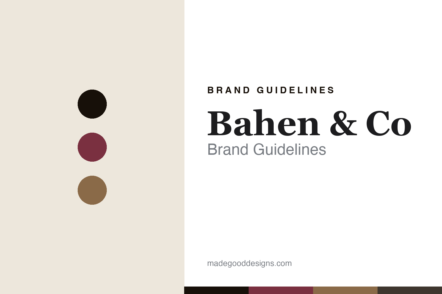
Bahen & Co Brand Guidelines
The vintage machines.
Aa
Two constants: a burgundy-and-kraft palette and a vintage serif register. Abstract homage — not the Bahen & Co packaging.
The vintage machines
Bahen & Co makes chocolate on century-old machines.
Bahen & Co. is a lesson in method as identity. Founded around 2010 in Margaret River, Western Australia, by Josh and Jacqui Bahen — former vignerons (winemakers) — it makes chocolate slowly, in small batches, on a collection of restored antique machines.
Its identity is the vintage machinery: a 1930s Barth Sirocco ball roaster, a c.1910 Guitard stone melangeur, a hundred-year-old winnower recovered from Latin America, and a vintage Carle & Montanari conche. The bars are hand-wrapped in printed paper — “wrapped in prints inspired from our journeys to the chocolate lands” — a restrained, vintage-inspired look that carries a winemaker’s sense of terroir. Bars are named by origin at 75% (Guatemala, Papua New Guinea, Ecuador, Madagascar) beside a House Blend 88%.
(Honest notes: the founding year is best given as “around 2010,” as it isn’t stated on the brand’s site. The machinery is a Barth Sirocco roaster (not a “ball mill”) and a Latin-American winnower (not German). The wrappers are hand-wrapped printed paper — we don’t assert “letterpress” or “kraft.” There’s no official brand hex, so these tones are an unofficial interpretation.)
Colour
Bahen & Co lives in a burgundy-and-kraft palette. Click a swatch to copy the hex.
Bahen & Co.’s identity is restrained, warm and vintage — a vigneron burgundy, an ink, a kraft tan, a cocoa, and a cream. The palette pairs a vigneron burgundy with a kraft tan — the register of a winemaker and a paper-wrapped bar. It signals craft and terroir rather than novelty. The honest caveat: with no published brand hex, these tones are an original, unofficial interpretation, not first-party values.
The lesson is a burgundy with a kraft tan signals slow, vintage craft. Bahen & Co.’s world is a room of antique machines. For designers, it is a reminder that a warm, restrained palette reads as old-world and hand-made — right for a vintage-machinery maker. The takeaways: source the palette from the winemaker’s world (burgundy, kraft, cocoa); keep the wrapper restrained and printed; let the method be the story; and treat any single hex as unofficial.
Typography
The register is a vintage serif — restrained, old-world, hand-made.
Bahen & Co.’s identity carries a restrained, old-world, hand-made spirit — antique machines and a paper-wrapped bar. A vintage serif captures the mood: it is classic and quiet, the register of an old workshop. Set in a burgundy-and-kraft palette, the vintage serif feels restrained and old-world — exactly the personality Bahen & Co. carries. It is hand-made rather than loud, mirroring a printed-paper wrapper. (Bahen & Co.’s real packaging is work we describe but do not reproduce, and the exact typeface is not ours to use.) Because it is not ours to use, the honest description is “a vintage serif spirit,” shown here in a stand-in. The type behaves like the brand: restrained, old-world and hand-made.
Aa
A vintage serif spirit — restrained and old-world. (Specimen set in EB Garamond, a classic old-style serif STAND-IN; NOT the Bahen & Co packaging.)
Method as identity
Bahen & Co stands for slow, old-world craft.
Bahen & Co. is a lesson in making method the identity. A burgundy-and-kraft palette, a vintage serif and a room of antique machines make a slow method the whole brand — restrained, old-world, hand-made. The method is the differentiator. The differentiator is a vintage-machinery, winemaker’s-terroir identity.
For designers and brand-builders, Bahen & Co. offers a clear takeaway: let the how become the brand. The lessons: make the method visible (antique machines); wrap it restrained (printed paper); carry a terroir sensibility (a winemaker’s eye); and be honest about the details. It is also a reminder to stay accurate: it’s a Margaret River family firm from around 2010, the machines are specific (Barth Sirocco, Guitard, Carle & Montanari), and the palette here is an unofficial interpretation. Bahen & Co. made the method the brand — proof that how you make it can be the difference.
Explore & save
Keep Bahen & Co’s identity on hand — save it to a board in the Made Good inspiration library.
Bahen & Co identity set
Pin the burgundy-and-kraft palette and the vintage-serif register to your own board.


