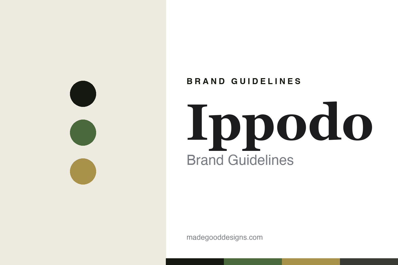
Ippodo Brand Guidelines
Since 1717.
Aa
Two constants: a matcha-green-and-gold palette and a Kyoto serif register. Abstract homage — not the Ippodo packaging.
Since 1717
Ippodo keeps one Kyoto tradition, quietly.
Ippodo is a lesson in restraint as identity. Founded in 1717 in Kyoto by the Watanabe family — originally a shop called “Omiya” selling tea and ceramics — it is a family-run tea house that has kept one thing going for three centuries.
Its identity is a restrained, ceremonial Kyoto-heritage minimalism — quiet, refined, sold in understated canisters and paper, with a calm tea-house presentation. The focus is matcha and gyokuro with poetic Japanese names: the matcha Ummon (deep umami) and Sayaka (light, for newcomers), the gyokuro Tenka-ichi (“finest under heaven”). The mark itself is the calligraphic kanji 一保堂.
(Honest notes: the shop was originally called Omiya — the name “Ippodo,” meaning roughly “preserve one [tradition],” was bestowed by Prince Yamashina in 1846, so it hasn’t been “Ippodo since 1717.” The long Japanese product names carry traditional suffixes (Ummon-no-mukashi) that the international store shortens. We don’t claim a superlative like “oldest tea shop in Japan,” and there’s no official brand hex, so these tones are an unofficial interpretation.)
Colour
Ippodo lives in a matcha-green-and-gold palette. Click a swatch to copy the hex.
Ippodo’s identity is refined, ceremonial and quiet — an ink, a matcha green, a gyokuro gold, a Kyoto charcoal, and a rice. The palette pairs a matcha green with a gyokuro gold — the register of a Kyoto tea house. It signals ceremony and heritage rather than novelty. The honest caveat: with no published brand hex, these tones are an original, unofficial interpretation, not first-party values.
The lesson is a matcha green with a gyokuro gold signals a Kyoto tea house. Ippodo’s world is a bowl of matcha. For designers, it is a reminder that a deep, natural, restrained palette reads as ceremonial and heritage — right for a 300-year house. The takeaways: source the palette from the tea (matcha, gyokuro); keep it quiet and refined; let the calligraphy carry the mark; and treat any single hex as unofficial.
Typography
The register is a Kyoto serif — refined, ceremonial, heritage.
Ippodo’s identity carries a refined, ceremonial, heritage spirit — a Kyoto tea house and a bowl of matcha. A Kyoto serif captures the mood: it is elegant and calm, the register of Japanese heritage. Set in a matcha-green-and-gold palette, the Kyoto serif feels refined and ceremonial — exactly the personality Ippodo carries. It is heritage rather than loud, mirroring an understated canister. (Ippodo’s real packaging and calligraphic mark are works we describe but do not reproduce, and the exact typeface is not ours to use.) Because it is not ours to use, the honest description is “a Kyoto serif spirit,” shown here in a stand-in. The type behaves like the brand: refined, ceremonial and heritage.
Aa
A Kyoto serif spirit — refined and ceremonial. (Specimen set in Shippori Mincho, a Japanese serif STAND-IN; NOT the Ippodo packaging.)
Restraint as identity
Ippodo stands for one tradition, kept.
Ippodo is a lesson in making restraint the identity. A matcha-green-and-gold palette, a Kyoto serif and an understated canister make three centuries of restraint the whole brand — refined, ceremonial, heritage. The restraint is the differentiator. The differentiator is a Kyoto-matcha, preserve-one identity.
For designers and brand-builders, Ippodo offers a clear takeaway: keep one thing, and keep it well. The lessons: hold to a tradition (matcha and gyokuro); keep the presentation quiet (canisters, paper); name with poetry (Ummon, Tenka-ichi); and be honest about the history. It is also a reminder to stay accurate: it was first “Omiya,” the name came in 1846, and the palette here is an unofficial interpretation. Ippodo made restraint the brand — proof that quiet can be the difference.
Explore & save
Keep Ippodo’s identity on hand — save it to a board in the Made Good inspiration library.
Ippodo identity set
Pin the matcha-green-and-gold palette and the Kyoto-serif register to your own board.


