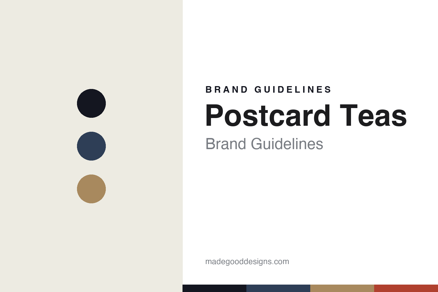
Postcard Teas Brand Guidelines
Name the grower.
Aa
Two constants: a postal-navy-and-kraft palette and a mail-art grotesque register. Abstract homage — not the Postcard Teas packaging.
Name the grower
Postcard Teas puts the farmer on the packet — and mails it.
Postcard Teas is a lesson in transparency as identity. Run by founder Tim d’Offay from a shop at 9 Dering Street in Mayfair, it grew out of his East Teas venture at Borough Market (2000); the Postcard Teas shop is commonly dated to around 2007.
Its identity has two threads. The first is the postcard packet: the flagship packet is a postcard you can write on, stamp and post to someone, its name rooted in d’Offay’s travel postcards from tea regions. The second — and strongest — is named-grower transparency: Postcard Teas says it was the first tea company in the world to put the maker’s name and location on its teas (2008), and in 2012 it switched to working only with micro-farms under 15 acres, calling itself a pioneer of tea provenance. Each tea is named for its leaf, producer and place.
(Honest notes: the shop is in Mayfair, not Marylebone. The founding is layered — East Teas from 2000, the Postcard Teas shop around 2007 (commonly cited, operating by 2008). The “first to name the maker” line is Postcard’s own claim. Design is in-house (Zhou Lu and Natalia Ruhe), not a named external studio, and there’s no official brand hex, so these tones are an unofficial interpretation.)
Colour
Postcard Teas lives in a postal-navy-and-kraft palette. Click a swatch to copy the hex.
Postcard Teas’ identity is transparent, crafted and postal — an ink, a postal navy, a kraft, a stamp red, and a chalk. The palette pairs a postal navy with a kraft, with a stamp red for the mail-art side — the register of a postable packet. It signals provenance and craft rather than mass tea. The honest caveat: with no published brand hex, these tones are an original, unofficial interpretation, not first-party values.
The lesson is a postal navy with a kraft signals a postable, honest packet. Postcard Teas’ world is a packet you can mail. For designers, it is a reminder that a postal, kraft-derived palette reads as honest and hand-made — right for a transparency-led shop. The takeaways: make the package do a second job (a postcard); name the source on it (grower and place); keep the palette postal and kraft; and — because a bright stamp red fails as small text — keep type dark and let the red live in the palette and band; treat any single hex as unofficial.
Typography
The register is a mail-art grotesque — honest, crafted, postal.
Postcard Teas’ identity carries an honest, crafted, postal spirit — a postcard packet and a named grower. A mail-art grotesque captures the mood: it is plain and characterful, the register of a stamped postcard. Set in a postal-navy-and-kraft palette, the mail-art grotesque feels honest and crafted — exactly the personality Postcard Teas carries. It is postal rather than polished, mirroring a mailable packet. (Postcard Teas’ real packaging is work we describe but do not reproduce, and the exact typeface is not ours to use.) Because it is not ours to use, the honest description is “a mail-art grotesque spirit,” shown here in a stand-in. The type behaves like the brand: honest, crafted and postal.
Aa
A mail-art grotesque spirit — honest and crafted. (Specimen set in Bricolage Grotesque, a characterful grotesque STAND-IN; NOT the Postcard Teas packaging.)
Transparency as identity
Postcard Teas stands for knowing who grew it.
Postcard Teas is a lesson in making transparency the identity. A postal-navy-and-kraft palette, a mail-art grotesque and a postable packet make provenance the whole brand — honest, crafted, postal. The transparency is the differentiator. The differentiator is a named-grower, postcard-packet identity.
For designers and brand-builders, Postcard Teas offers a clear takeaway: put the truth on the package. The lessons: name the maker and the place; give the package a second life (a postcard); source small and honestly (micro-farms); and attribute your claims. It is also a reminder to stay accurate: it’s in Mayfair, the founding is layered, the “first” is a claim, and the palette here is an unofficial interpretation. Postcard Teas made transparency the brand — proof that provenance can be the difference.
Explore & save
Keep Postcard Teas’s identity on hand — save it to a board in the Made Good inspiration library.
Postcard Teas identity set
Pin the postal-navy-and-kraft palette and the mail-art-grotesque register to your own board.


