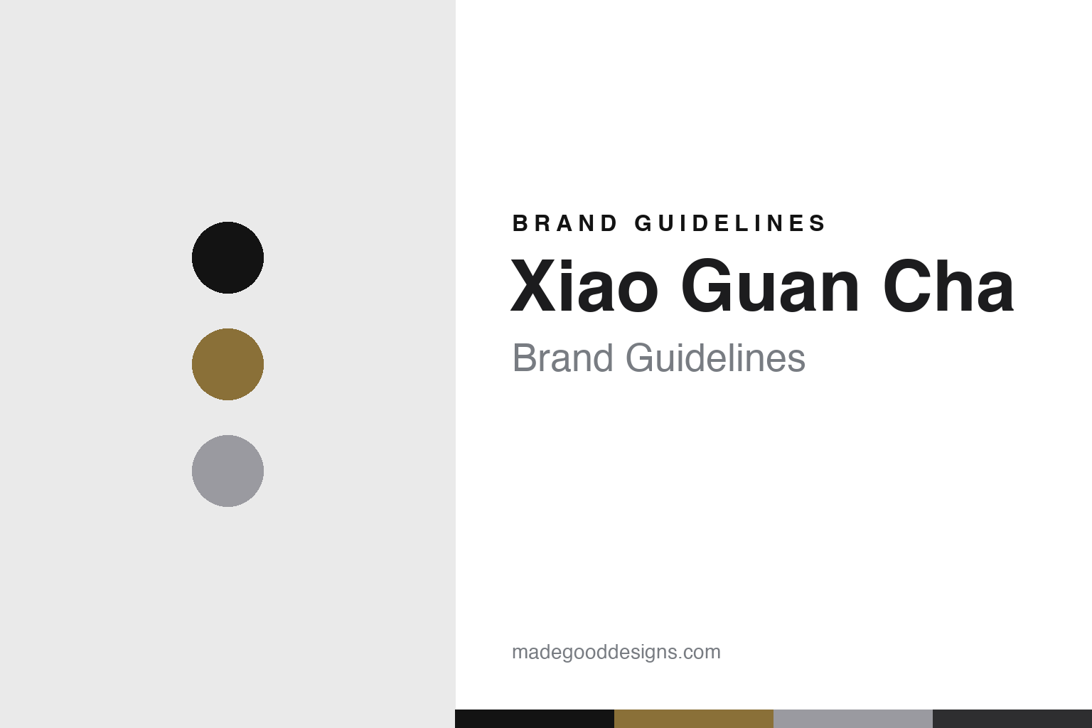
Xiao Guan Cha Brand Guidelines
One can, one brew.
Aa
Two constants: a gold-black-and-silver palette and a modern sans register. Abstract homage — not the Xiao Guan Cha packaging.
One can, one brew
Xiao Guan Cha standardised premium Chinese tea into one can.
Xiao Guan Cha is a lesson in standardisation as identity. Conceived in 2012 and registered as a company (Beijing Xiaoguan Tea Industry) in 2014 by Du Guoying, and taken to market around 2016, it positions itself as high-end Chinese tea — and its whole design idea is to bring order to a chaotic loose-leaf market.
Its identity is the uniform aluminium can: a small, matte, food-grade can holding one brew — “one can, one brew” — with every tea type (green Longjing, black, oolong Da Hong Pao, pu’er, white, jasmine) sold in the same minimalist can at a uniform grade, nitrogen-flushed and foil-sealed. The packaging was designed by the Japanese designer Hideo Kambara (a former design director at TOTO and Dentsu), reportedly over two to three years and thirteen drafts, with the metal-tube idea drawn from premium cigar tubes. Tiers run from the flagship gold can to a silver can and a multi-brew round can.
(Honest notes: the founder is Du Guoying (not “Du Guojian”), and the can was designed by Hideo Kambara — not Kashiwa Sato. The brand’s “eight masters / 大师作” campaign drew a viral 2019 controversy — the maths implied the masters couldn’t possibly hand-make every can — after which the company clarified the masters authored and oversaw the teas rather than personally making them, and in 2024 the founder publicly apologised for the slogan and open-sourced 135 tea-making patents. There’s no official brand hex, so these tones are an unofficial interpretation.)
Colour
Xiao Guan Cha lives in a gold-black-and-silver palette. Click a swatch to copy the hex.
Xiao Guan Cha’s identity is modern, uniform and premium — a can gold, a matte black, an aluminium silver, a graphite, and a cool white. The palette pairs a can gold with matte black, joined by an aluminium silver — the register of a precision-made can. It signals order and luxury rather than tradition. The honest caveat: with no published brand hex, these tones are an original, unofficial interpretation, not first-party values.
The lesson is gold, black and silver signal a standardised, premium product. Xiao Guan Cha’s world is a shelf of identical cans. For designers, it is a reminder that a restrained metallic palette reads as modern and premium — right for a brand selling order. The takeaways: unify the system (one can for every tea); pick a precise, metallic palette; let the object carry the brand; and — because a mid-gold can fail as small text — keep type dark and let the gold live in the can, palette and band; treat any single hex as unofficial.
Typography
The register is a modern sans — precise, uniform, premium.
Xiao Guan Cha’s identity carries a precise, uniform, premium spirit — an identical can for every tea. A clean modern sans captures the mood: it is neutral and exact, the register of a designed object. Set in a gold-black-and-silver palette, the modern sans feels precise and premium — exactly the personality Xiao Guan Cha carries. It is uniform rather than ornate, mirroring a matte can. (Xiao Guan Cha’s real can and wordmark are works we describe but do not reproduce, and the exact typeface is not ours to use.) Because it is not ours to use, the honest description is “a modern sans spirit,” shown here in a stand-in. The type behaves like the brand: precise, uniform and premium.
茶
A modern sans spirit — precise and uniform. (Specimen set in Noto Sans SC, a clean modern sans STAND-IN; NOT the Xiao Guan Cha packaging.)
Standardisation as identity
Xiao Guan Cha stands for order in a can.
Xiao Guan Cha is a lesson in making standardisation the identity. A gold-black-and-silver palette, a modern sans and a uniform can make order the whole brand — precise, uniform, premium. The standardisation is the differentiator. The differentiator is a one-can, one-brew identity.
For designers and brand-builders, Xiao Guan Cha offers a clear — and cautionary — takeaway: a system can be the design. The lessons: unify a fragmented category (one can, one grade); commission a serious designer (Hideo Kambara); let the object do the talking; and be honest in the marketing. It is also a reminder to stay accurate: the founder is Du Guoying, the designer is Kambara not Sato, the “eight masters” slogan drew a controversy and a later apology, and the palette here is an unofficial interpretation. Xiao Guan Cha made standardisation the brand — proof that order, honestly told, can be the difference.
Explore & save
Keep Xiao Guan Cha’s identity on hand — save it to a board in the Made Good inspiration library.
Xiao Guan Cha identity set
Pin the gold-black-and-silver palette and the modern-sans register to your own board.


