What Font Does Jameson Use?
Search the jameson font and you will find plenty of imitations, but the green-bottle wordmark itself is bespoke. Jameson’s identity rests on a calm, confident serif that signals craftsmanship without shouting, which is a very different strategy from the ornate Americana of Jack Daniel’s. This guide breaks down the style and points you to free serif fonts that get you close. Start with our famous brand fonts hub for the wider context.
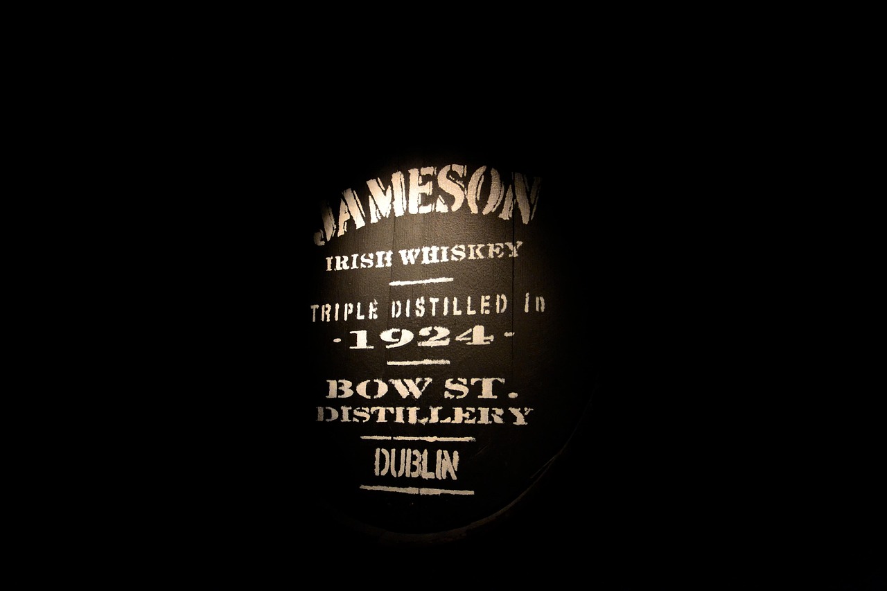
What font is the Jameson logo?
The “Jameson” wordmark is custom-drawn serif lettering with restrained, classical detailing: moderate stroke contrast, graceful bracketed serifs and even, generous spacing. It feels closer to a refined book serif scaled up than to a heavy display face. Some renderings of the brand also incorporate the “Sine Metu” motto and the family crest in supporting type. None of this is a single off-the-shelf typeface; it is trademarked lettering tuned specifically for the label.
The wordmark’s character comes as much from spacing as from the letterforms themselves. The capitals are set open enough to feel airy and considered, never crowded, which reads as confidence rather than urgency. The serifs are sharp but not dramatic, and the stroke contrast stays moderate so the name holds up at small sizes on a neck label as well as it does on a billboard. It is a study in how much elegance you can achieve by simply drawing a classical serif well and leaving it room to breathe.
What is Jameson’s brand typeface?
Across packaging and campaigns, Jameson tends to pair its serif wordmark with clean supporting type, balancing heritage with modern legibility. The exact families used in advertising have shifted over time and by market, so any single named font should be treated as unverified. The dependable takeaway is the register: classical, elegant and serif-led, the visual language of an established 18th-century distillery, refined rather than ornamental.
One reason the system works so well is the contrast between the serif wordmark and the simpler type around it. The brand often lets the elegant name carry the heritage signal while body copy, legal text and product descriptors sit in plainer, highly legible faces. That division of labor keeps labels uncluttered and modern without diluting the traditional centerpiece. It is a flexible approach that scales from a premium gift box to a digital ad while still feeling unmistakably like Jameson.
Free fonts that look like the Jameson font
You cannot reuse the trademarked wordmark, but the polished serif feel is easy to approximate with free, open-license families. Aim for refinement and even spacing rather than heavy ornament.
| Use case | Jameson uses | Free alternative |
|---|---|---|
| Logo / wordmark | Custom classical serif lettering | Playfair Display |
| Headlines | Refined high-readability serif | EB Garamond |
| Body / label | Even-spaced book serif | Cormorant Garamond |
Why does Jameson use this kind of type?
The serif choice is about quiet authority. Where some spirits crowd their labels with ornament, Jameson uses clean classical letterforms to suggest heritage, consistency and approachability at once. A refined serif reads as established and trustworthy, while the generous spacing keeps the wordmark feeling premium rather than cluttered. It is typography that invites the buyer in instead of overwhelming them, which suits a brand positioned as smooth and accessible.
There is a deliberate balance at play between old and new. Jameson is a centuries-old distillery, but much of its growth has come from younger, design-literate drinkers, so the type has to feel heritage-rich without reading as stuffy or dated. A clean, well-spaced classical serif threads that needle perfectly: it nods to history while staying contemporary enough to sit comfortably in modern bars and social feeds. That restraint is the whole point, and it is why the wordmark has aged so gracefully.
Can I use the Jameson font for my own project?
No. The Jameson wordmark, crest and motto lockup are protected trademarks, so copying them for your own branding is off-limits. The good news is that the underlying look, an elegant classical serif, is achievable with free fonts. Combine EB Garamond or Playfair Display with even letterspacing to echo the tone without infringing. Always confirm commercial use is permitted in our font licensing guide before publishing.
Frequently Asked Questions
Is there an official Jameson font I can download?
No. The Jameson wordmark is custom serif lettering created for the brand and never sold as a retail typeface. Files labeled “Jameson font” online are fan recreations, not the official artwork, and reproducing the trademarked wordmark for commercial work carries legal risk.
What kind of serif is the Jameson logo?
It is a refined classical serif with moderate stroke contrast, bracketed serifs and even spacing, more like an elegant book or display serif than a heavy slab. The styling leans toward old-world, heritage typography that signals the distillery’s long history.
What free font is closest to Jameson?
Playfair Display captures the elegant, higher-contrast feel of the wordmark, while EB Garamond and Cormorant Garamond work well for supporting and body text. Together they recreate Jameson’s polished serif register using freely licensed fonts.
Why does Jameson use a serif instead of a sans-serif?
Serifs read as traditional and trustworthy, which fits a whiskey brand built on centuries of heritage. The classical lettering reinforces craftsmanship and consistency, helping Jameson feel established and premium while still approachable to newer drinkers.
Can I use free serif fonts to mimic Jameson commercially?
Yes, as long as you avoid copying the trademarked wordmark, crest and motto. Use open-license serifs like EB Garamond or Playfair Display, confirm each font allows commercial embedding, and create your own distinct lettering rather than reproducing Jameson’s exact design.