What Font Does Casio Use?
From calculators to keyboards to indestructible watches, Casio is a byword for Japanese engineering — and its blocky, confident logo says so at a glance. If you want the exact casio font, the reality is that the wordmark is custom lettering, not a typeface you can install. But its bold, no-nonsense sans-serif style is easy to recreate with free fonts. Here is the breakdown of the logo, the brand type direction, and the best free alternatives. For more like this, head to our famous brand fonts hub.
What font is the Casio logo?
The Casio logo is the brand name in heavy, upright sans-serif capitals — solid strokes, minimal contrast, and a sturdy, mechanical feel. The letterforms read as engineered rather than decorative: the “C” is open and balanced, the “A” sits on a strong apex, and the overall word has the dense, planted weight of industrial signage. It is custom wordmark lettering, but it lives in the bold-grotesque and geometric-sans family that brands use to project reliability and tech credibility. Historically rendered in a deep blue or black, the mark communicates precision and toughness, fitting a company whose products are built to survive drops, water, and decades of daily use.
What is Casio’s brand typeface?
Across packaging, manuals, and digital channels, Casio pairs its bold wordmark with clean, highly legible sans-serifs that keep technical information clear. The company has not published an official corporate font, so any specific name is an educated estimate rather than confirmed fact. The visible direction favors neutral and geometric sans families — the kind that read well on small screens, watch faces, and dense spec sheets. Bold weights handle headlines and model names for impact, while regular weights carry body copy. The consistent priority is function over flourish, matching Casio’s reputation as a maker of dependable, value-driven electronics.
Free fonts that look like the Casio font
You cannot legally reproduce the trademarked wordmark, but its bold, technical sans look is easy to recreate with free, open-license fonts. The table maps each role to a downloadable option.
| Use case | Casio uses | Free alternative |
|---|---|---|
| Logo / wordmark | Custom bold sans caps | Archivo Black or Saira |
| Headlines | Bold geometric/grotesque sans | Rajdhani / Archivo |
| Body / dial | Clean technical sans | Saira or Inter |
Archivo Black delivers the dense, planted weight that gets you closest to the CASIO wordmark, while Saira offers a flexible technical family with multiple widths and weights. Rajdhani adds a slightly squared, instrument-panel character that suits model names and headlines. Want a more futuristic spin on this lane? Browse our best futuristic fonts guide, and compare Casio’s rugged sub-brand in our Tissot font watch-world breakdown.
Why does Casio use this kind of type?
Casio’s typography is engineered to signal durability, precision, and value. A heavy, upright sans-serif feels solid and trustworthy — the visual equivalent of a watch that survives a fall — and avoids any hint of fragility or fuss. The mechanical, even-weight letterforms echo the engineering inside the products, reinforcing Casio’s identity as a technology company first. Clean supporting sans type keeps dense spec sheets and manuals legible, which matters for gadgets packed with functions. There is no decorative serif or script here because Casio is not selling heritage glamour; it is selling reliable, accessible technology, and the bold sans does exactly that job.
Can I use the Casio font for my own project?
No. The Casio wordmark is a registered trademark, so reproducing it — even with a lookalike font — for your own branding can create legal exposure. You are free to borrow the style, though: pick a licensed bold sans like Archivo Black or Saira, set it in solid caps, and build your own technical-looking identity. Just confirm commercial-use rights before downloading; our font licensing guide explains desktop, web, and app embedding permissions. Because bold geometric sans-serifs are widely available under open licenses, you have plenty of safe, free choices.
Frequently Asked Questions
What free font looks most like the Casio logo?
Archivo Black is the closest free match for the dense, bold sans-serif weight of the CASIO wordmark. For more flexibility across widths and weights, Saira works well too. Both are free on Google Fonts and licensed for commercial use, making them safe foundations for a Casio-inspired technical design.
Is the Casio logo a real downloadable font?
No. The Casio logo is custom-drawn lettering created for the brand, not a commercial typeface. You cannot download it from any font site. Any file claiming to be the official Casio font is an unofficial recreation, and using it for branding risks trademark infringement.
What color is the Casio logo?
The Casio wordmark is most commonly rendered in a deep blue, though black and white versions appear depending on the product and context. The bold, solid lettering paired with strong color reinforces the brand’s image of durability and technical reliability across watches, calculators, and instruments.
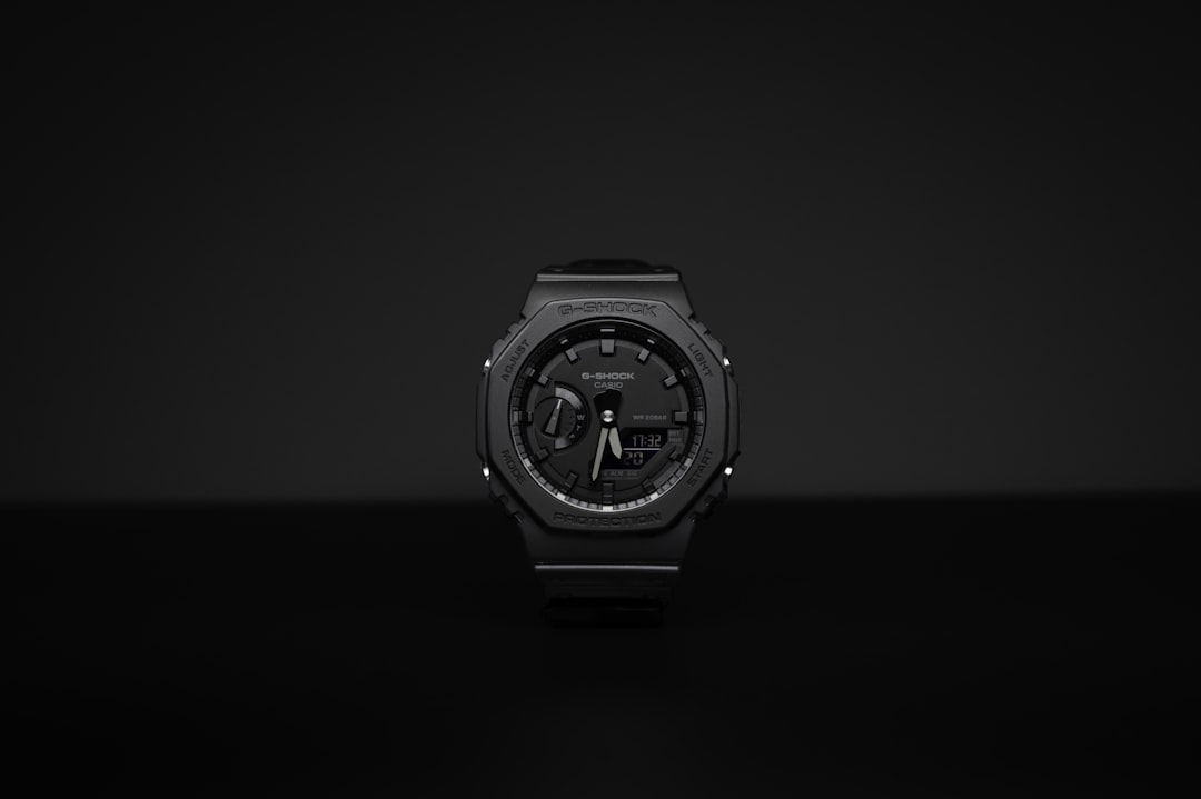
Does Casio use the same font as G-Shock?
They share a bold-sans family resemblance, but G-Shock’s lettering is more aggressive and industrial to match its rugged positioning, while the core Casio wordmark is cleaner and more corporate. Both project toughness, yet G-Shock leans further into a techno, squared style. See our dedicated G-Shock font guide for that breakdown.
What font pairs well with a Casio-style sans?
Pair a heavy display sans like Archivo Black for headlines with a clean technical sans such as Saira or Inter for body and specs. This keeps model names bold and impactful while detailed information stays legible — mirroring how Casio balances a strong wordmark with readable supporting type.


