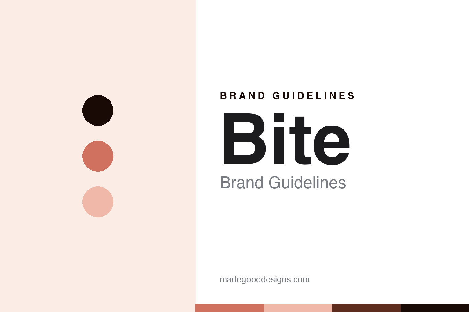
Bite Brand Guidelines
The plastic-free toothpaste that comes in bits.
Aa
Two constants: a coral palette and a plastic-free-sans register. Abstract homage — not a Bite product or mark.
The plastic-free toothpaste that comes in bits
Bite is the plastic-free oral-care brand built on toothpaste tablets in a refillable glass jar.
Bite brings the round a format change — the plastic-free oral-care brand that turned toothpaste into dry tablets, or bits, sold in a refillable glass jar, to cut out the plastic tube entirely. Bite makes plastic-free oral care, and its answer to a round about the design shelf is a rethink: not a better tube, but no tube at all. A brand, plastic-free.
Its identity is the plastic-free toothpaste that comes in bits. The format, the sustainability and the independence are the story here. A brand, plastic-free. The plastic-free toothpaste that comes in bits.
(Honest notes, so the story stays precise, and the claims stay the brand’s own. Bite, at bitetoothpastebits.com, makes plastic-free oral and personal care — its hero the Toothpaste Bits, dry tablets you chew and brush, in a refillable glass jar, plus mouthwash bits, whitening, floss and body care — and we report its sustainability and oral-care language as the brand’s own marketing and regulated positioning, not dental advice. It was founded around 2018 by Lindsay McCormick, based in Los Angeles, out of a plastic-free, do-it-yourself story that a viral video accelerated. On where it is made, a theme of this round, a country of manufacture is not documented, so we do not assert one. On ownership, a theme of this round, it is independent and founder-led, described as woman-owned; the founder appeared on a televised pitch show and reportedly declined offers to keep the company independent. It is a certified B Corporation, a third-party certification, which we frame as such. Its name, its Toothpaste Bits name and its refillable-jar packaging are IP we describe but do not reproduce; there is no official brand hex; these tones are an unofficial interpretation.)
Colour
Bite lives in a coral. Click a swatch to copy the hex.
Bite’s identity is plastic-free, warm and clean — a coral, an ink, a peach, a deep rust, and a paper. The palette leans coral and peach: a warm, friendly register that nods to a refillable jar and a plastic-free promise rather than a clinical palette. It signals a plastic-free oral-care brand. The honest caveat: with no published brand hex, these values are an original, unofficial interpretation, not first-party colours.
The lesson is a coral signals a plastic-free, warm identity. Bite’s world is a considered, made object. For designers, it is a reminder that a coral and a soft peach can carry an oral-care brand — the tone of a friendly, sustainable object. Because these tones can fail as small text, keep type dark and let the colour live in the accents, palette and band. The takeaways: rethink the format; refill the jar; report claims as marketing; and treat any single hex as unofficial.
Typography
The register is a plastic-free sans — plastic-free, plain, warm.
Bite’s identity carries a plastic-free, plain, warm spirit — a sustainable brand, not a drugstore. A plastic-free sans captures the mood: clean, warm and confident, the register of a rethink. Set in a coral palette, the plastic-free sans feels plastic-free and warm — exactly the personality Bite carries. It is a format rather than a logo, mirroring a tablet and a jar. (Bite’s real refillable jar is a thing we describe but do not reproduce, and the exact typeface is not ours to use.) Because it is not ours to use, the honest description is “a plastic-free-sans oral care,” shown here in a stand-in. The type behaves like the brand: plastic-free, plain and warm.
Aa
A plastic-free-sans oral care — plastic-free and warm. (Specimen set in Manrope, a plastic-free-sans STAND-IN; NOT the Bite logo.)
The design shelf
Bite stands for the plastic-free toothpaste that comes in bits.
Bite brings the round a format change. A coral palette, a plastic-free sans and a refillable jar make one thing — the plastic-free toothpaste that comes in bits — the whole identity: plastic-free, warm and clean. The format is the rethink, and the jar is the design. The point is not a better tube but no tube at all, tablets you chew and brush, refilled from a glass jar.
Put to work, the identity is a rethink told straight, as design — with the certification framed as third-party. A maker in this spirit would rethink the format, refill the jar, and report claims as marketing. A reader in this spirit would keep the facts right: Bite makes plastic-free oral care, its Toothpaste Bits the hero; it was founded around 2018 by Lindsay McCormick, in Los Angeles; a country of manufacture is undocumented; it is independent and founder-led, woman-owned, having reportedly declined televised investment; and it is a certified B Corporation, a third-party certification. Bite joins Davids on the round’s sustainability thread, and the US thread with Davids and Boka. The honest editorial moves are to date it to around 2018, to say the making is undocumented, to describe the independence, and to frame the B Corp status as third-party. The lesson Bite teaches is that a format change can be a whole identity, and framing the certification precisely keeps it credible.
For designers and brand-builders, Bite continues the design shelf: rethink the format — and refill the jar. The lessons: change the format, not just the packaging; make refill the model; report sustainability and oral-care language as your own; frame a certification as third-party; and never reproduce packaging. It is also a reminder to stay precise: Bite is the plastic-free oral-care brand built on toothpaste tablets in a refillable glass jar — with the palette here an unofficial interpretation. Read that way, Bite is less a tube than a rethink: no tube at all. The lesson for a brand is that a format and honest certification reinforce each other, and framing the B Corp status precisely keeps the story earned. Bite made the-plastic-free-toothpaste-that-comes-in-bits the identity — proof that a rethink can carry a brand. And it shows that the boldest design move is sometimes to change the form of a thing entirely, then to back the sustainability story with a third-party certification rather than a slogan.
Explore & save
Keep Bite’s identity on hand — save it to a board in the Made Good inspiration library.
Bite identity set
Pin the coral palette and the plastic-free-sans register to your own board.