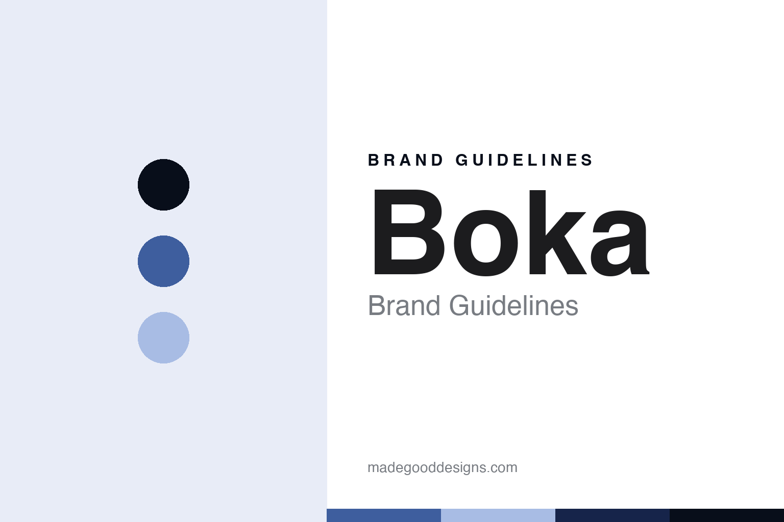
Boka Brand Guidelines
The modern toothpaste built on hydroxyapatite.
Aa
Two constants: a navy-blue palette and a modern-oral-sans register. Abstract homage — not a Boka product or mark.
The modern toothpaste built on hydroxyapatite
Boka is the modern, minimal oral-care brand built on nano-hydroxyapatite toothpaste.
Boka brings the round a modern premise — the minimal oral-care brand that built itself on nano-hydroxyapatite, a fluoride-free active it positions as its ingredient story, in clean, contemporary packaging. Boka makes modern oral care, and its answer to a round about the design shelf is an ingredient and a look: a science-forward paste in a minimal design. A brand, modern.
Its identity is the modern toothpaste built on hydroxyapatite. The ingredient, the minimal design and the honest gaps are the story here. A brand, modern. The modern toothpaste built on hydroxyapatite.
(Honest notes, so the story stays precise, and the claims stay the brand’s own, and we write around what is not documented. Boka, at boka.com, makes modern oral care — its hero a nano-hydroxyapatite toothpaste, plus electric toothbrushes, floss, mouthwash, whitening powder and a kids line — and we report its hydroxyapatite, fluoride-free and remineralisation language as the brand’s own marketing, not settled dental science or medical advice. Its founding story, positioned around hydroxyapatite instead of fluoride and a minimal design, is clear, but specific founder names, a founding year and a headquarters are not documented on its own pages, so we present a commonly-cited founding around 2018 in the US only as reported, and we do not assert them. On where it is made, a theme of this round, a country of manufacture is not documented, so we do not assert one. On ownership, a theme of this round, its ownership is not stated on its site, so we do not assert whether it is independent or investor-owned. Its name and product names are IP we describe but do not reproduce; there is no official brand hex; these tones are an unofficial interpretation.)
Colour
Boka lives in a navy blue. Click a swatch to copy the hex.
Boka’s identity is modern, clean and minimal — a navy blue, an ink, a periwinkle, a deep navy, and a paper. The palette leans navy blue and periwinkle: a clean, contemporary register that nods to a science-forward paste and a minimal design rather than a loud palette. It signals a modern oral-care brand. The honest caveat: with no published brand hex, these values are an original, unofficial interpretation, not first-party colours.
The lesson is a navy blue signals a modern, minimal identity. Boka’s world is a clean, made object. For designers, it is a reminder that a navy blue and a soft periwinkle can carry an oral-care brand — the tone of the contemporary. Because these tones can fail as small text, keep type dark and let the colour live in the accents, palette and band. The takeaways: lead with an ingredient; keep it minimal; report claims as marketing; and treat any single hex as unofficial.
Typography
The register is a modern-oral sans — modern, plain, minimal.
Boka’s identity carries a modern, plain, minimal spirit — a contemporary brand, not a drugstore. A modern-oral sans captures the mood: clean, minimal and confident, the register of a science-forward paste. Set in a navy-blue palette, the modern-oral sans feels modern and minimal — exactly the personality Boka carries. It is an ingredient rather than a logo, mirroring a paste and a mineral. (Boka’s real packaging is a thing we describe but do not reproduce, and the exact typeface is not ours to use.) Because it is not ours to use, the honest description is “a modern-oral-sans toothpaste,” shown here in a stand-in. The type behaves like the brand: modern, plain and minimal.
Aa
A modern-oral-sans toothpaste — modern and minimal. (Specimen set in Space Grotesk, a modern-oral-sans STAND-IN; NOT the Boka logo.)
The design shelf
Boka stands for the modern toothpaste built on hydroxyapatite.
Boka brings the round a modern premise. A navy-blue palette, a modern-oral sans and an ingredient story make one thing — the modern toothpaste built on hydroxyapatite — the whole identity: modern, clean and minimal. The ingredient is the story, and the minimal design is the look. The point is a fluoride-free, hydroxyapatite paste in contemporary packaging, sold on a science-forward positioning.
Put to work, the identity is an ingredient told straight, as design — with the claims kept as claims and the gaps written around. A maker in this spirit would lead with an ingredient, keep it minimal, and report claims as marketing. A reader in this spirit would keep the facts right: Boka makes modern oral care, its nano-hydroxyapatite toothpaste the hero; its founding is positioned around hydroxyapatite and minimal design, with a founding around 2018 in the US reported but not documented on its pages; a country of manufacture is undocumented; and its ownership is not stated. Boka joins Davids and Bite on the round’s US thread. The honest editorial moves are to present the founding as reported, to write around the undocumented facts, to say the making is undocumented, and to frame the hydroxyapatite claims strictly as marketing, not settled science. The lesson Boka teaches is that an ingredient and a look can be an identity, and writing around the undocumented keeps it credible.
For designers and brand-builders, Boka continues the design shelf: lead with an ingredient — and keep it minimal. The lessons: build a brand on a distinctive ingredient story; pair it with a minimal design; report hydroxyapatite and fluoride-free language as your own, not settled science; write around facts you cannot document; and never reproduce packaging. It is also a reminder to stay precise: Boka is the modern, minimal oral-care brand built on nano-hydroxyapatite toothpaste — with the palette here an unofficial interpretation. Read that way, Boka is less a paste than an ingredient: modern, and minimal. The lesson for a brand is that an ingredient and honest gaps reinforce each other, and framing the science as marketing keeps the story earned. Boka made the-modern-toothpaste-built-on-hydroxyapatite the identity — proof that an ingredient can carry a brand. And it is the round’s clearest test of discipline: an ingredient story is compelling precisely because it sounds like science, which is exactly why an honest guide reports it as marketing and writes plainly around the facts the brand does not disclose.
Explore & save
Keep Boka’s identity on hand — save it to a board in the Made Good inspiration library.
Boka identity set
Pin the navy-blue palette and the modern-oral-sans register to your own board.