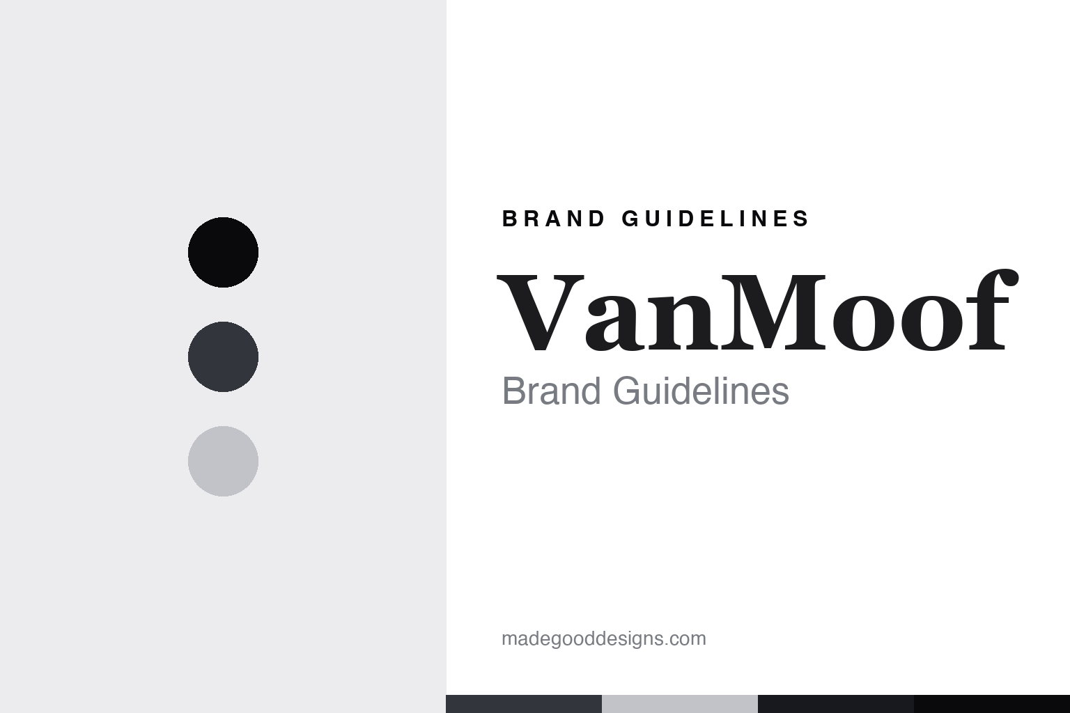
VanMoof Brand Guidelines
The design-darling e-bike that collapsed and came back.
Aa
Two constants: a charcoal-ink palette and a design-darling-serif register. Abstract homage — not a VanMoof product or mark; no bike, frame, or logo is reproduced.
The design-darling e-bike that collapsed and came back
VanMoof is the Dutch design-led e-bike brand that went bankrupt in 2023 and was revived under Lavoie.
VanMoof opens a fresh vein — the electric commute — as its marquee story: the Dutch design-led e-bike brand, all clean lines and integrated everything, that became a design darling, then collapsed into bankruptcy in twenty twenty-three, and was bought and revived. VanMoof makes connected commuter e-bikes, and its answer to a round about the electric commute is the sharpest boom-and-bust in the category — a beautifully designed bike, a spectacular failure, and a second life. A brand, revived.
Its identity is the design-darling e-bike that collapsed and came back. The design, the collapse and the rescue ownership are the story here. A brand, revived. The design-darling e-bike that collapsed and came back.
(Honest notes, so the story stays precise, and the reporting stays fair. VanMoof, at vanmoof.com, makes design-led connected commuter e-bikes, with its integrated commuter models — award-winning in design — as heroes, and we report its performance language as the brand’s own marketing. It was founded in 2009 by the brothers Taco and Ties Carlier in Amsterdam. On where it is made, the star theme of this round, its bikes are made in Taiwan. On who owns it, a theme of this round, this is the round’s clearest boom-and-bust: VanMoof went bankrupt in July twenty twenty-three and was acquired that August by Lavoie, a subsidiary of McLaren Applied, and continues to operate under that owner. We report the collapse and rescue as documented business events, not as a verdict. Its bike designs and integrated frame are IP we describe but do not reproduce; there is no official brand hex; these tones are an unofficial interpretation.)
Colour
VanMoof lives in a charcoal ink. Click a swatch to copy the hex.
VanMoof’s identity is design-led, minimal and revived, and our stand-in palette is a charcoal ink — a charcoal ink, an ink, a pale grey, a deep charcoal, and a paper. The palette leans charcoal ink and pale grey: a minimal, monochrome register that nods to a clean, integrated bike rather than a loud logo colour. It signals a design-led brand. The honest caveat: with no usable brand hex, these values are an original, unofficial interpretation.
The lesson is a charcoal ink signals a design-led, minimal identity. VanMoof’s world is a designed, integrated object. For designers, it is a reminder that a charcoal ink and a soft pale grey can carry a hardware brand — the tone of frame and circuit. Because these tones can fail as small text, keep type dark and let the colour live in the accents, palette and band. The takeaways: design the whole bike; report the collapse fairly; report claims as marketing; and treat any single hex as unofficial.
Typography
The register is a design-darling serif — design-led, editorial, minimal.
VanMoof’s identity carries a design-led, editorial, minimal spirit — a design brand, not a graphics label. A design-darling serif captures the mood: refined, confident and clean, the register of an award-winning design object. Set in a charcoal-ink palette, the design-darling serif feels design-led and minimal — exactly the personality VanMoof carries. It is a designed object rather than a logo, mirroring frame and circuit. (VanMoof’s real bikes are things we describe but do not reproduce, and the exact typeface is not ours to use.) Because it is not ours to use, the honest description is “a design-darling-serif brand,” shown here in a stand-in. The type behaves like the brand: design-led, editorial and minimal.
Aa
A design-darling-serif brand — design-led and minimal. (Specimen set in Playfair Display, a design-darling-serif STAND-IN; NOT the VanMoof logo or any bike.)
The electric commute
VanMoof stands for the design-darling e-bike that collapsed and came back.
VanMoof opens the electric-commute vein as its marquee story. A charcoal-ink palette, a design-darling serif and a collapse-and-rescue arc make one thing — the design-darling e-bike that collapsed and came back — the whole identity: design-led, minimal and revived. The design is the draw, and the boom-and-bust is the lesson. The point is a beautifully designed bike, a spectacular failure, and a second life under a new owner.
Put to work, the identity is a boom-and-bust told straight, as fair reporting — with the collapse and rescue stated as events. A maker in this spirit would design the whole bike, report the collapse fairly, and report claims as marketing. A reader in this spirit would keep the facts right: VanMoof makes design-led connected commuter e-bikes, its integrated models the heroes; it was founded in 2009 by Taco and Ties Carlier in Amsterdam; its bikes are made in Taiwan; and it went bankrupt in July twenty twenty-three and was acquired that August by Lavoie, a subsidiary of McLaren Applied, under which it operates. VanMoof opens the round’s boom-and-bust thread with Rad Power Bikes, sits with Cowboy on the app-first connected form, and stands on the rescue-ownership side of the who-owns thread. The honest editorial moves are to date it to 2009, to name the Carlier brothers, to state the collapse and rescue as documented events, and to name Lavoie and McLaren Applied. The lesson VanMoof teaches is that a collapse and a second life can be a whole identity, and reporting the boom-and-bust fairly keeps it credible.
For designers and brand-builders, VanMoof opens the electric commute: design the whole bike — and report the collapse fairly. The lessons: make integrated design the brand; report a bankruptcy and a rescue as documented events, not as a verdict; report performance language as marketing; name the owner that revived a brand; and never reproduce a bike or frame. It is also a reminder to stay precise: VanMoof is the Dutch design-led e-bike brand that went bankrupt in 2023 and was revived under Lavoie — with the palette here a deliberate non-brand interpretation. Read that way, VanMoof is less a bike than an arc: design-led, collapsed, revived. The lesson for a brand is that design and honest reporting reinforce each other, and stating the collapse and rescue keeps the story earned. VanMoof made the-design-darling-e-bike-that-collapsed-and-came-back the identity — proof that a boom-and-bust can open a round.
Explore & save
Keep VanMoof’s identity on hand — save it to a board in the Made Good inspiration library.
VanMoof identity set
Pin the charcoal-ink palette and the design-darling-serif register to your own board.