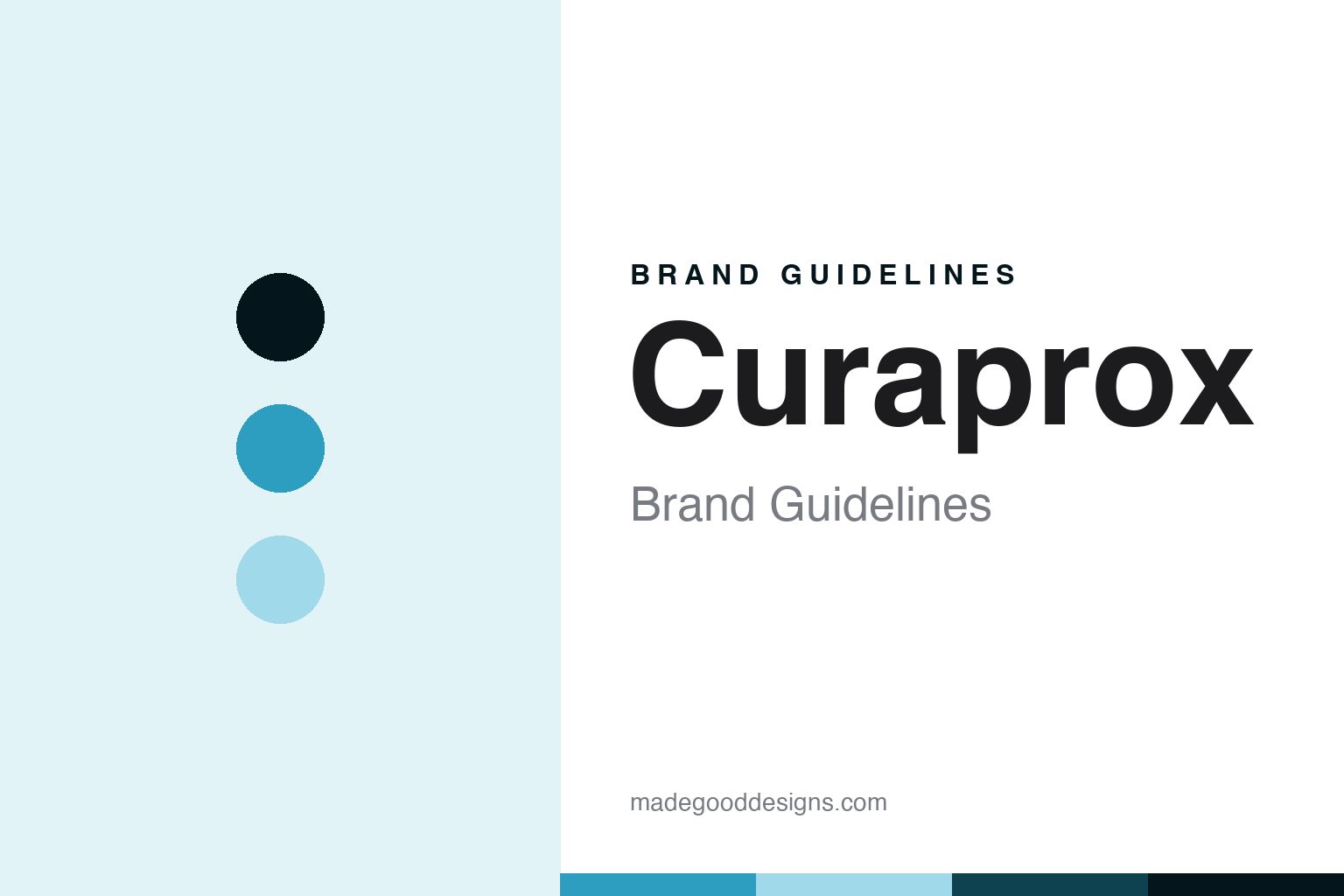
Curaprox Brand Guidelines
The Swiss design brand of the ultra-soft brush.
Aa
Two constants: a cyan palette and a Swiss-design-sans register. Abstract homage — not a Curaprox product or mark; not the colourful brush.
The Swiss design brand of the ultra-soft brush
Curaprox is the Swiss, design-led oral-care brand known for its ultra-soft toothbrush.
Curaprox brings the round Swiss design and dental credibility — the family-owned oral-care brand known for an ultra-soft toothbrush with thousands of fine filaments, sold in a rainbow of colours. Curaprox makes design oral care, and its answer to a round about the design shelf is engineering and colour: a clinically-minded brush turned into a design object. A brand, Swiss.
Its identity is the Swiss design brand of the ultra-soft brush. The engineering, the Swiss origin and the family ownership are the story here. A brand, Swiss. The Swiss design brand of the ultra-soft brush.
(Honest notes, so the story stays precise, and the late founder stays in the past tense. Curaprox, at curaprox.com, makes premium, design-led oral care — its hero an ultra-soft manual toothbrush with around five and a half thousand fine filaments, plus interdental brushes, a flavoured toothpaste line, mouthwash and an electric brush — and we report its efficacy language as the brand’s own marketing and a regulated positioning, not dental advice. It is made by Curaden, a family-owned Swiss company of the Breitschmid family, based near Lucerne, commonly dated to around 1972 and now run by its third generation; its founder died in 2025, so we refer to him respectfully and in the past tense. On where it is made, a star theme of this round, the brand positions itself as Swiss — dental care from Switzerland — which we report as its stated origin and positioning, without asserting a specific manufacture claim we could not confirm. On ownership, a theme of this round, it is family-owned and independent, present in many countries. Its colourful toothbrush is protected trade dress we describe but do not reproduce; there is no official brand hex; these tones are an unofficial interpretation.)
Colour
Curaprox lives in a cyan. Click a swatch to copy the hex.
Curaprox’s identity is Swiss, clean and colourful, and our stand-in is a single cyan, not the brand’s rainbow of brushes — a cyan, an ink, a sky, a deep marine, and a paper. We choose one cyan precisely because the colourful toothbrush range is protected trade dress we do not copy. The palette leans cyan and sky: a clean, clinical-yet-colourful register. The honest caveat: with no usable brand hex, these values are an original, unofficial interpretation, chosen to stay clear of the trade dress.
The lesson is a cyan signals a Swiss, clean identity — without copying the rainbow. Curaprox’s world is a design, made object. For designers, it is a reminder that a single cyan can evoke a clean, Swiss brand while avoiding its exact colours. Because these tones can fail as small text, keep type dark and let the colour live in the accents, palette and band. The takeaways: engineer the brush; colour it well; report claims as marketing; and never copy the trade dress.
Typography
The register is a Swiss-design sans — Swiss, plain, clean.
Curaprox’s identity carries a Swiss, plain, clean spirit — a design house, not a drugstore. A Swiss-design sans captures the mood: clean, precise and confident, the register of Swiss engineering. Set in a cyan palette, the Swiss-design sans feels Swiss and clean — exactly the personality Curaprox carries. It is engineering rather than a logo, mirroring a bristle and foam. (Curaprox’s real colourful brush is a thing we describe but do not reproduce, and the exact typeface is not ours to use.) Because it is not ours to use, the honest description is “a Swiss-design-sans oral care,” shown here in a stand-in. The type behaves like the brand: Swiss, plain and clean.
Aa
A Swiss-design-sans oral care — Swiss and clean. (Specimen set in Libre Franklin, a Swiss-design-sans STAND-IN; NOT the Curaprox logo or its colourful brush.)
The design shelf
Curaprox stands for the Swiss design brand of the ultra-soft brush.
Curaprox brings the round Swiss design and dental credibility. A cyan palette, a Swiss-design sans and an ultra-soft brush make one thing — the Swiss design brand of the ultra-soft brush — the whole identity: Swiss, clean and colourful. The engineering is the substance, and the colour is the design. The point is a clinically-minded brush, with thousands of fine filaments, turned into a colourful design object.
Put to work, the identity is engineering told straight, as design — with the founder in the past tense and the rainbow left uncopied. A maker in this spirit would engineer the brush, colour it well, and report claims as marketing. A reader in this spirit would keep the facts right: Curaprox makes design-led oral care, its ultra-soft brush the hero; it is made by Curaden, a family-owned Swiss company of the Breitschmid family, near Lucerne, dated to around 1972 and run by its third generation, its founder having died in 2025; it positions itself as Swiss, which we report as origin and positioning; and it is family-owned and independent. Curaprox joins Marvis on the round’s heritage-family and European-design threads. The honest editorial moves are to date it to around 1972, to refer to the late founder in the past tense, to report the Swiss origin as positioning without asserting a manufacture claim, and to reproduce none of the colourful brush. The lesson Curaprox teaches is that engineering and colour can define a design object, and getting the heritage right keeps it credible.
For designers and brand-builders, Curaprox closes the heritage side of the design shelf: engineer the brush — and colour it well. The lessons: turn a clinical product into a design object; make colour a system, not decoration; report efficacy language as regulated positioning; report an origin claim as positioning where manufacture is unconfirmed; and never reproduce a signature colourway. It is also a reminder to stay precise: Curaprox is the Swiss, design-led oral-care brand known for its ultra-soft toothbrush — with the palette here a deliberate non-brand interpretation. Read that way, Curaprox is less a brush than an engineering: Swiss, and colourful. The lesson for a brand is that engineering and honest origin reinforce each other, and reporting the Swiss claim as positioning keeps the story earned. Curaprox made the-Swiss-design-brand-of-the-ultra-soft-brush the identity — proof that engineering can carry a brand.
Explore & save
Keep Curaprox’s identity on hand — save it to a board in the Made Good inspiration library.
Curaprox identity set
Pin the cyan palette and the Swiss-design-sans register to your own board.