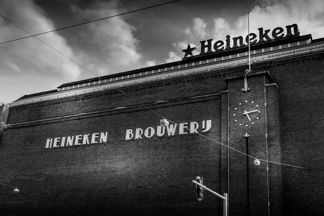
What Font Does Heineken Use?
The Heineken font is one of the most quietly clever pieces of lettering in beer branding, built around a single human idea: make the letters look happy. Those slightly back-tilted “e” shapes have been part of the identity for decades, turning a wordmark into a face. As with most beverage giants, the logo is bespoke artwork rather than a typed-out typeface. This guide, part of our famous brand fonts collection, walks through the wordmark, the reported brand type, and free fonts that get you in the neighborhood.
What font is the Heineken logo?
The Heineken logo is custom, trademarked lettering. Its defining feature is the “smiling e,” where each lowercase e is rotated slightly backward so the open counter tips upward like a grin. Founder-era brand lore credits this as a deliberate humanizing touch, and it has survived every refinement since. The rest of the wordmark is a softly humanist set of letters with even weight, modest contrast and rounded, approachable terminals, traditionally rendered in Heineken’s signature green with a red star accent. Because the proportions and the tilted e’s are hand-built, there is no off-the-shelf font that reproduces it exactly.
What is Heineken’s brand typeface?
Away from the logo, Heineken’s marketing and packaging use a broader type system that is best described, in hedged terms, as a clean humanist sans paired with heritage serif cues. Heineken does not publish its exact foundry fonts, and brand systems like this are usually licensed privately or partly custom. What is consistent is the tone: premium but warm, modern but rooted in a long brewing history. The practical takeaway is to combine an open, friendly sans for contemporary copy with an occasional refined serif when the brand leans into tradition and craft, rather than trying to name one definitive face.
Free fonts that look like the Heineken font
To echo Heineken without copying it, split the job: a humanist sans for the approachable modern voice, and a classic serif for heritage moments. Then add the brand’s green and the red star as the real signature.
| Use case | Heineken uses | Free alternative |
|---|---|---|
| Logo / wordmark | Custom humanist lettering with tilted “smiling” e’s (trademarked) | Lato as a base, manually rotating the e’s to suggest the smile |
| Headlines | Premium humanist sans | Lato (Bold) or Source Sans Pro |
| Body / packaging | Clean sans with optional heritage serif | Lato for sans; a free classic serif like EB Garamond for heritage lockups |
Why does Heineken use this kind of type?
Heineken sells global premium lager, so its type has to feel both world-class and likable. A humanist sans carries warmth and approachability that a colder geometric or grotesque face would lose, and the smiling e turns a corporate wordmark into something with personality and a wink. That emotional softness, paired with disciplined green-and-red restraint, is what lets the brand feel premium without feeling stiff. Other beer brands chase heritage through script or serif instead; you can compare strategies in our companion piece on the Budweiser font.
Can I use the Heineken font for my own project?
Not the real one. The Heineken wordmark, including the smiling e device, is a registered trademark and custom artwork, so there is no font to license and imitating it for another product invites legal trouble. For your own work, use a humanist sans like Lato, add a heritage serif if you want craft connotations, and build your own color story rather than borrowing Heineken green. If you are unsure where inspiration ends and infringement begins, our font licensing guide lays out the boundaries.
Frequently Asked Questions
Why do the e’s in the Heineken logo look like they are smiling?
Each lowercase e is tilted slightly backward so its opening points upward, reading as a grin. Brand lore attributes this to founder-era thinking about making the logo feel human and welcoming. The detail has been preserved through every redesign because it gives an otherwise simple wordmark a memorable, friendly personality that customers recognize instantly.
Is the Heineken font free to download?
No. The logo is custom trademarked lettering, and the wider brand fonts are licensed privately rather than released to the public. There is no official Heineken font file. Designers approximate the look using a humanist sans such as Lato and, where heritage is needed, a free classic serif, then add the green and red star as the real identifiers.
What color is the Heineken brand?
Heineken’s signature is a deep, slightly cool green paired with a red five-pointed star. That color combination, along with the smiling e’s, carries far more recognition than the letterforms alone. If you are evoking the brand legitimately for study or homage, the green-and-red relationship is the most defining visual cue to reference.
Which free font is closest to Heineken?
Lato is a strong free stand-in for the modern, humanist warmth of Heineken’s type. For moments where the brand leans into brewing heritage, pair it with a free classic serif like EB Garamond. Neither will reproduce the custom wordmark exactly, especially the hand-tuned smiling e’s, but together they capture the premium-yet-friendly tone.
Has the Heineken logo always used the same letters?
The wordmark has been refined several times, but the core humanist character and the smiling e device have remained constant. Refreshes tend to tidy spacing, weight and the star rather than overhaul the letterforms, which is why the brand has felt visually consistent across generations while still looking contemporary.