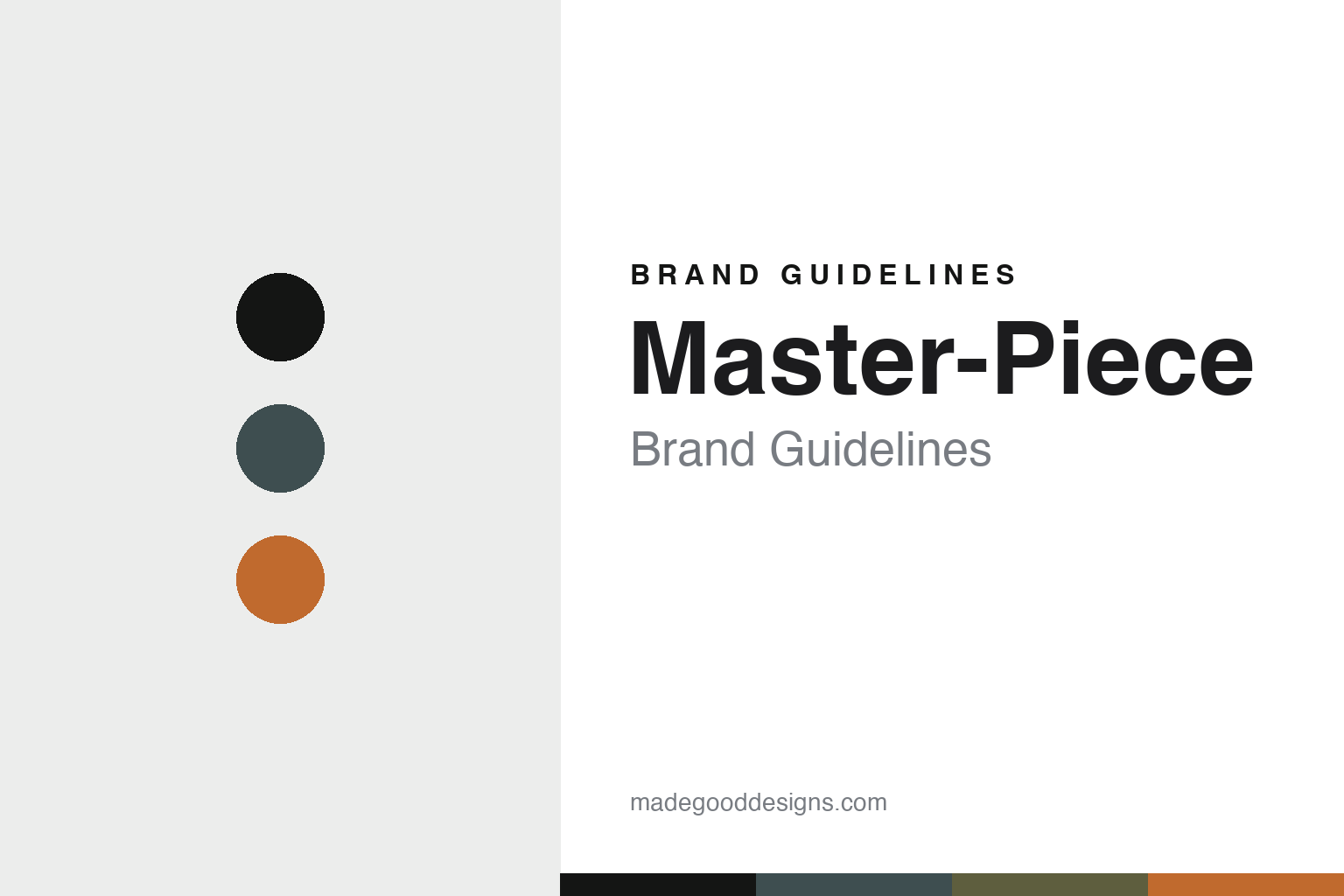
Master-Piece Brand Guidelines
The everyday carry.
Aa
Two constants: a graphite-and-orange palette and a precision sans register. Abstract homage — not the Master-Piece products or packaging.
The everyday carry
Master-Piece makes the daily bag a precise object.
Master-Piece is a lesson in craft in the everyday. Founded in 1994 in Osaka, the Japanese brand treats the ordinary carry bag with the seriousness usually reserved for clothing.
Its identity is functional, durable everyday-carry bags with Japanese precision. Backpacks, shoulder and tote bags, waist bags, wallets and travel pieces are built for “functional beauty that enriches daily life,” with utility placed just so and details that reveal themselves with use. Series like Link, Rise and Slick anchor the range, and the brand leans on Japanese manufacturing (its own Osaka production base). Not luggage — the daily bag, made precisely.
(Honest notes: 1994 and Osaka are well-corroborated; the founder’s name is single-sourced, so we hedge it. This is a bag maker, not a hard-shell suitcase brand — no rolling cases — so we frame it as everyday carry. Its official site blocks automated access (and there are unrelated “master-piece” domains we keep out); the made-in-Japan positioning is well-reported rather than something we could confirm first-party this session, so we avoid an absolute claim. There’s no official brand hex, so these tones are an unofficial interpretation. This is design commentary and does not promote any product.)
Colour
Master-Piece lives in a graphite-and-orange palette. Click a swatch to copy the hex.
Master-Piece’s identity is functional, durable and Japanese — a graphite teal, an ink, an olive, an orange, and a chalk. The palette pairs a graphite with an orange — the register of functional everyday-carry (the orange nods to the utilitarian accent inside many a well-made bag). It signals function and craft rather than novelty. The honest caveat: with no published brand hex, these tones are an original, unofficial interpretation, not first-party values.
The lesson is a graphite with an orange signals a precision everyday-carry brand. Master-Piece’s world is a hard-wearing daily bag. For designers, it is a reminder that the most ordinary object — the bag you carry every day — rewards real craft. Because a muted graphite reads best dark, keep type dark and let the accent live in the palette and band. The takeaways: take the everyday seriously; build for durability; hide the cleverness in the details; and treat any single hex as unofficial.
Typography
The register is a precision sans — functional, durable, Japanese.
Master-Piece’s identity carries a functional, durable, Japanese spirit — a hard-wearing daily bag. A clean Japanese-style sans captures the mood: it is neutral and precise, the register of functional craft. Set in a graphite-and-orange palette, the precision sans feels functional and durable — exactly the personality Master-Piece carries. It is understated rather than showy, mirroring an everyday-carry bag. (Master-Piece’s real products and lowercase-hyphen wordmark are works we describe but do not reproduce, and the exact typeface is not ours to use.) Because it is not ours to use, the honest description is “a precision sans spirit,” shown here in a stand-in. The type behaves like the brand: functional, durable and Japanese.
Aa
A precision sans spirit — functional and durable. (Specimen set in Zen Kaku Gothic New, a clean Japanese-style sans STAND-IN; NOT the Master-Piece packaging.)
Craft in the everyday
Master-Piece stands for precise everyday-carry bags.
Master-Piece is a lesson in bringing craft to the everyday. A graphite-and-orange palette, a precision sans and a hard-wearing daily bag make everyday craft the whole brand — functional, durable, Japanese. The craft is the differentiator. The differentiator is a daily bag made with real precision.
For designers and brand-builders, Master-Piece offers a clear takeaway: take the ordinary object seriously. The lessons: elevate the everyday; build for durability; hide the cleverness in the details; and be honest about the story. It is also a reminder to stay accurate: it’s a 1994 Osaka bag maker (founder single-sourced), a bag brand rather than a suitcase maker, with a made-in-Japan positioning we report rather than assert, and the palette here is an unofficial interpretation. Master-Piece made everyday craft the brand — proof that the daily bag can be the difference.
Explore & save
Keep Master-Piece’s identity on hand — save it to a board in the Made Good inspiration library.
Master-Piece identity set
Pin the graphite-and-orange palette and the precision-sans register to your own board.


