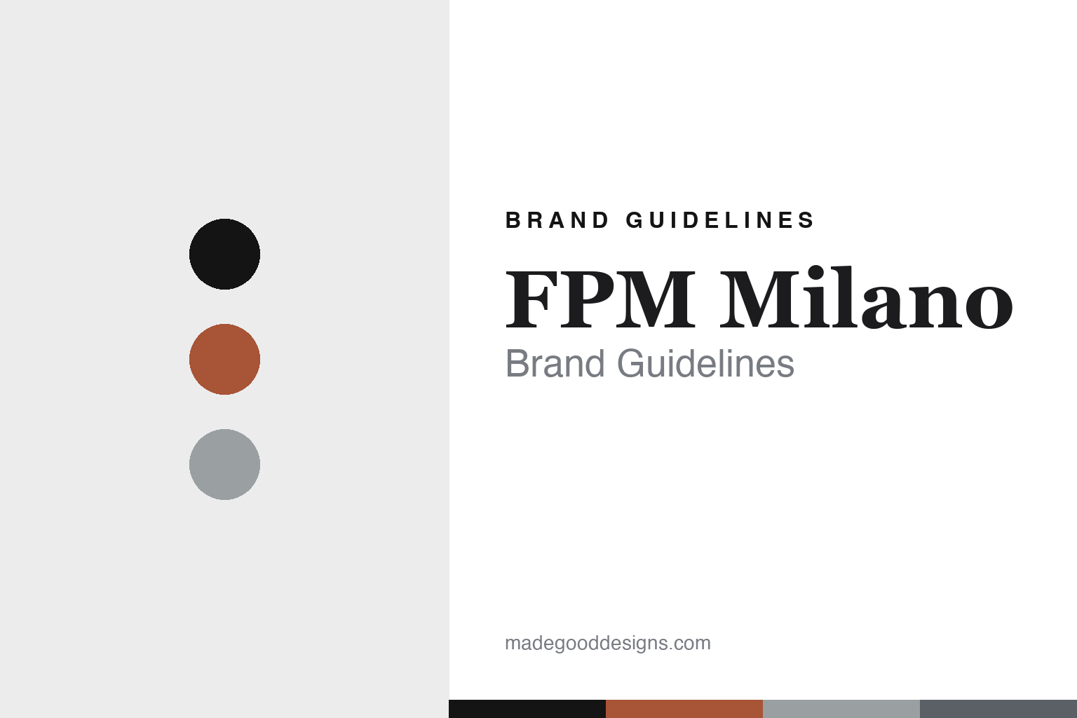
FPM Milano Brand Guidelines
The aluminium shell.
Aa
Two constants: an orange-and-aluminium palette and a Milanese serif register. Abstract homage — not the FPM products or packaging.
The aluminium shell
FPM Milano builds luggage from riveted aluminium.
FPM Milano is a lesson in a material as identity. Fabbrica Pelletterie Milano has made Italian leather goods since 1946, and in its modern era it built a luxury-luggage reputation on one thing: the aluminium shell.
Its identity is aluminium hardside luggage. The hero Bank collection is a shell of roughly 97% aluminium, assembled with 128 hand-inserted rivets — engineered metal turned into a design object, in bold anodized colourways, with a lighter Makrolon polycarbonate sub-line (Bank Light) beside it. The Bank was shaped by designer Marc Sadler, and FPM’s design programme has drawn in Nendo (the Kame collection), Jean-Marie Massaud and Marcel Wanders. Milanese metal, made luxurious.
(Honest notes: the 1946 founding is the brand’s own, well-supported tagline; the founder’s name and the 1975 revival story rest on a single secondary source, so we treat them as reported. The signature material is aluminium, not polycarbonate — the latter is only the lighter sub-line. The Bank’s designer is Marc Sadler, not Marc Newson; “Spinner” is a wheel type and “Butterfly” a latch style, not collections. Made-in-Italy is the brand’s claim. There’s no official brand hex, so these tones are an unofficial interpretation. This is design commentary and does not promote any product.)
Colour
FPM Milano lives in an orange-and-aluminium palette. Click a swatch to copy the hex.
FPM Milano’s identity is metallic, bold and Italian — an anodized orange, an ink, an aluminium, a steel grey, and a chalk. The palette pairs an orange with an aluminium — the register of anodized metal luggage. It signals material and craft rather than novelty. The honest caveat: with no published brand hex, these tones are an original, unofficial interpretation, not first-party values.
The lesson is an orange with an aluminium signals a metal-shell luggage house. FPM’s world is a riveted, anodized case. For designers, it is a reminder that owning a single material — aluminium — and executing it beautifully can be the whole identity. Because a bright orange can fail as small text, keep type dark and let the colour live in the accents, palette and band. The takeaways: own a material; make it a design object; bring in great designers; and treat any single hex as unofficial.
Typography
The register is a Milanese serif — metallic, luxurious, Italian.
FPM Milano’s identity carries a metallic, luxurious, Italian spirit — a riveted aluminium case. A refined Milanese serif captures the mood: it is elegant and considered, the register of Italian luxury. Set in an orange-and-aluminium palette, the Milanese serif feels metallic and luxurious — exactly the personality FPM carries. It is polished rather than plain, mirroring an anodized shell. (FPM’s real products and wordmark are works we describe but do not reproduce, and the exact typeface is not ours to use.) Because it is not ours to use, the honest description is “a Milanese serif spirit,” shown here in a stand-in. The type behaves like the brand: metallic, luxurious and Italian.
Aa
A Milanese serif spirit — metallic and luxurious. (Specimen set in Cormorant Garamond, a refined serif STAND-IN; NOT the FPM packaging.)
A material as identity
FPM Milano stands for the aluminium shell.
FPM Milano is a lesson in making a material the identity. An orange-and-aluminium palette, a Milanese serif and a riveted case make aluminium the whole brand — metallic, luxurious, Italian. The material is the differentiator. The differentiator is a luxury shell in anodized metal.
For designers and brand-builders, FPM offers a clear takeaway: own one material and perfect it. The lessons: own a material; make it a design object; bring in great designers; and be honest about the story. It is also a reminder to stay accurate: it’s a 1946 Milan house whose Bank shell is aluminium (designed by Marc Sadler, not Newson), and the palette here is an unofficial interpretation. FPM made aluminium the brand — proof that a material can be the difference.
Explore & save
Keep FPM Milano’s identity on hand — save it to a board in the Made Good inspiration library.
FPM Milano identity set
Pin the orange-and-aluminium palette and the Milanese-serif register to your own board.