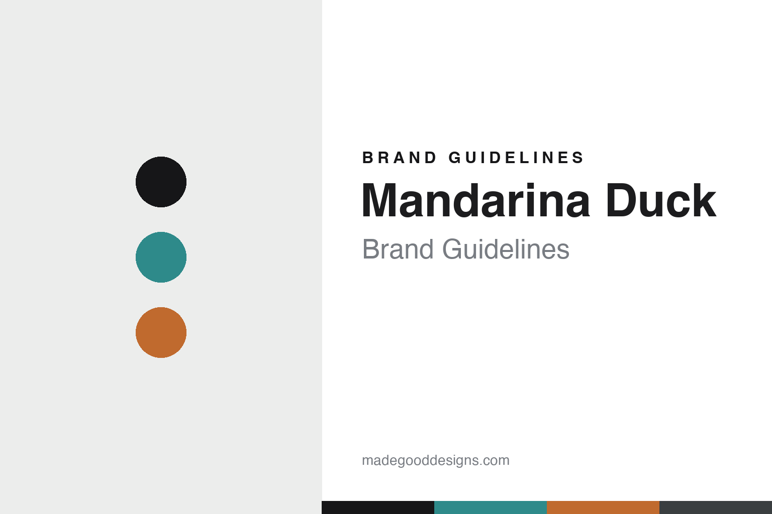
Mandarina Duck Brand Guidelines
The Utility colour.
Aa
Two constants: a teal-and-tangerine palette and a technical sans register. Abstract homage — not the Mandarina Duck products or packaging.
The Utility colour
Mandarina Duck made technical materials colourful.
Mandarina Duck is a lesson in material and colour as rebellion. Founded in 1977 in Bologna by cousins Paolo Trento and Pietro Mannato, it broke with the brown-and-black leather bags of its day.
Its identity is technical materials in bold colour. Its debut Utility collection put synthetic, technical fabrics in vivid, saturated colour — durable, waterproof, industrial-feeling bags in hues no leather house was using — an ethos the brand ties to the mandarin duck itself: colourful, resilient, waterproof. Colour and material, made the whole identity.
(Honest notes: 1977 Bologna and the founding cousins are confirmed via reference sources; the brand’s own site was unreachable, so details rest on those. Mandarina Duck is now reported to be owned by South Korea’s E-Land Group, with production externalised overseas — so we call it an Italian design house, not “Made in Italy.” We keep material descriptors general (technical/synthetic/coated) rather than dating a specific “rubberised” peak, and treat “MD20” as a reported line name. There’s no official brand hex, so these tones are an unofficial interpretation. This is design commentary and does not promote any product.)
Colour
Mandarina Duck lives in a teal-and-tangerine palette. Click a swatch to copy the hex.
Mandarina Duck’s identity is colourful, technical and Italian — a duck teal, an ink, a tangerine, a rubber black, and a chalk. The palette pairs a teal with a tangerine — the register of technical materials in vivid colour. It signals colour and material rather than novelty. The honest caveat: with no published brand hex, these tones are an original, unofficial interpretation, not first-party values.
The lesson is a teal with a tangerine signals a technical-material design house. Mandarina Duck’s world is a bright, waterproof, industrial bag. For designers, it is a reminder that pairing an unexpected material with unexpected colour can be a whole identity. Because bright hues fail as small text, keep type dark and let the colour live in the accents, palette and band. The takeaways: pick an unexpected material; put it in bold colour; tie it to a story (the duck); and treat any single hex as unofficial.
Typography
The register is a technical sans — colourful, industrial, Italian.
Mandarina Duck’s identity carries a colourful, industrial, Italian spirit — a bright, technical bag. A technical squared sans captures the mood: it is modern and engineered, the register of industrial design. Set in a teal-and-tangerine palette, the technical sans feels colourful and industrial — exactly the personality Mandarina Duck carries. It is functional rather than ornate, mirroring technical materials. (Mandarina Duck’s real products, wordmark and duck emblem are works we describe but do not reproduce, and the exact typeface is not ours to use.) Because it is not ours to use, the honest description is “a technical sans spirit,” shown here in a stand-in. The type behaves like the brand: colourful, industrial and Italian.
Aa
A technical sans spirit — colourful and industrial. (Specimen set in Saira, a technical squared sans STAND-IN; NOT the Mandarina Duck packaging.)
Material and colour as rebellion
Mandarina Duck stands for technical materials in bold colour.
Mandarina Duck is a lesson in making material and colour the identity. A teal-and-tangerine palette, a technical sans and a bright, technical bag make material-and-colour the whole brand — colourful, industrial, Italian. The rebellion is the differentiator. The differentiator is technical fabric in colour no leather house dared use.
For designers and brand-builders, Mandarina Duck offers a clear takeaway: break the category’s material-and-colour habit. The lessons: pick an unexpected material; put it in bold colour; anchor it in a story; and be honest about the present. It is also a reminder to stay accurate: it’s a 1977 Bologna house now reported to be Korean-owned with offshore production (an Italian design house, not “Made in Italy”), and the palette here is an unofficial interpretation. Mandarina Duck made material and colour the brand — proof that a technical rebellion can be the difference.
Explore & save
Keep Mandarina Duck’s identity on hand — save it to a board in the Made Good inspiration library.
Mandarina Duck identity set
Pin the teal-and-tangerine palette and the technical-sans register to your own board.


