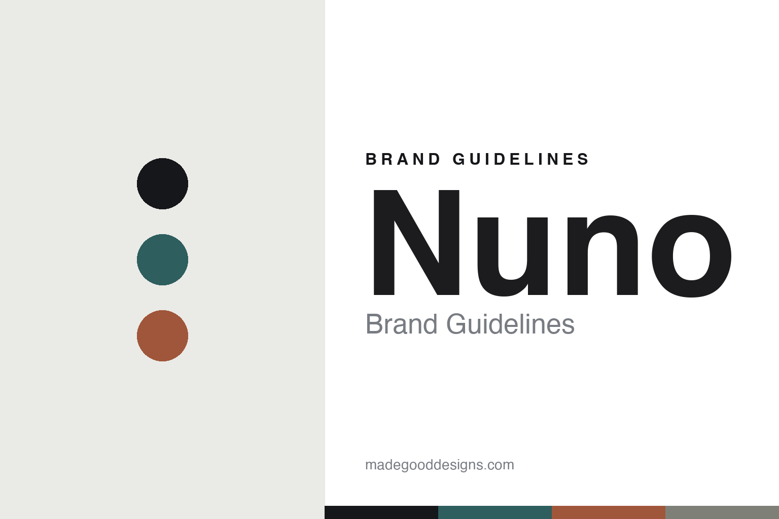
Nuno Brand Guidelines
The experimental cloth.
Aa
Two constants: a textural-neutral palette and an experimental sans register. Abstract homage — not the Nuno textiles or packaging.
The experimental cloth
Nuno treats textile as invention.
Nuno is a lesson in the textile as invention. Founded in 1984 in Tokyo — its shop opened in the Roppongi AXIS building — the company makes experimental Japanese textiles that fold unexpected materials and processes into cloth. “Nuno” means cloth in Japanese.
Its identity is the experimental cloth. Nuno is known for fabrics that integrate paper, feathers or aluminium with industrial methods like spatter-plating and chemical etching — old practices met with new technologies, usually the handiwork of an individual craftsperson. The idea of what a fabric can be, pushed further. A cloth that surprises you up close.
(Honest notes: Nuno was founded in 1984 in Tokyo by Junichi Arai (1932–2017), with Reiko Sudo involved from the outset and long its design director — so we credit Arai as founder and Sudo as the design lead, without claiming an equal-partner co-founding or fixing her exact title and start year. Its textiles are produced in Japan, with a production base in Kiryu, Gunma (not Nishijin), working with Japanese mills and craftspeople. Its work is held at MoMA (credited to Reiko Sudo / Nuno), and reportedly at the V&A, the Met and other museums, which we mark as reported. It is still operating and independent, with Sudo leading. There’s no official brand hex, and we reproduce no actual textile — these tones are an unofficial interpretation. This is design commentary and does not promote any product.)
Colour
Nuno lives in a textural-neutral palette. Click a swatch to copy the hex.
Nuno’s identity is experimental, subtle and Japanese — an ink teal, a charcoal, a rust, a pewter, and a chalk. The palette leans textural neutrals — the register of an engineered, material-led cloth. It signals process and texture rather than novelty. The honest caveat: with no published brand hex, these tones are an original, unofficial interpretation, not first-party values.
The lesson is textural neutrals signal an experimental textile house. Nuno’s world is a quiet, surprising cloth. For designers, it is a reminder that process and material — not loud colour — can be the whole identity, and that craft and technology can share one fabric. Because muted mid-tones can fail as small text, keep type dark and let the colour live in the accents, palette and band. The takeaways: experiment with material; blend craft and technology; let texture lead; and treat any single hex as unofficial.
Typography
The register is an experimental sans — subtle, precise, Japanese.
Nuno’s identity carries an experimental, precise, Japanese spirit — a material-led, engineered cloth. A clean, modern sans captures the mood: it is quiet and exact, the register of a material innovator. Set in a textural-neutral palette, the experimental sans feels subtle and precise — exactly the personality Nuno carries. It is understated rather than loud, mirroring a textured cloth. (Nuno’s real textiles and wordmark are works we describe but do not reproduce, and the exact typeface is not ours to use.) Because it is not ours to use, the honest description is “an experimental sans spirit,” shown here in a stand-in. The type behaves like the brand: subtle, precise and Japanese.
Aa
An experimental sans spirit — subtle and precise. (Specimen set in Manrope, a clean modern sans STAND-IN; NOT the Nuno packaging.)
The textile as invention
Nuno stands for the experimental cloth.
Nuno is a lesson in making invention the identity. A textural-neutral palette, an experimental sans and a material-led cloth make invention the whole brand — experimental, subtle, Japanese. The invention is the differentiator. The differentiator is folding unexpected materials and processes into a fabric, by hand.
For designers and brand-builders, Nuno offers a clear takeaway: make the material the idea. The lessons: experiment with material; blend craft and technology; let texture lead; and be honest about the story. It is also a reminder to stay accurate: it was founded in 1984 in Tokyo by Junichi Arai with Reiko Sudo as design lead, it produces in Japan (Kiryu), and its work is held at MoMA — the palette here is an unofficial interpretation. Nuno made invention the brand — proof that process can be the difference.
In application, material leads and colour recedes. The textural-neutral palette keeps a page calm, the charcoal carries the text, the experimental sans stays precise, and the fabric is evoked as texture — a sense of process — never reproduced. A designer working in this spirit would make the surface the subject: a single quiet field with a worked, engineered quality, type set exactly so the craft reads as intention rather than accident. The lesson Nuno teaches is that process and material can be an entire identity, and that restraint amplifies texture — the quieter the colour, the louder the making. It is a reminder that innovation and tradition can occupy the same cloth. As you borrow the approach, keep the record straight: Nuno was founded in 1984 in Tokyo by Junichi Arai, with Reiko Sudo long its design director; its textiles are produced in Japan, with a base in Kiryu, Gunma; and its work is held at MoMA — while the palette here is an unofficial interpretation, not first-party values.
Explore & save
Keep Nuno’s identity on hand — save it to a board in the Made Good inspiration library.
Nuno identity set
Pin the textural-neutral palette and the experimental-sans register to your own board.


