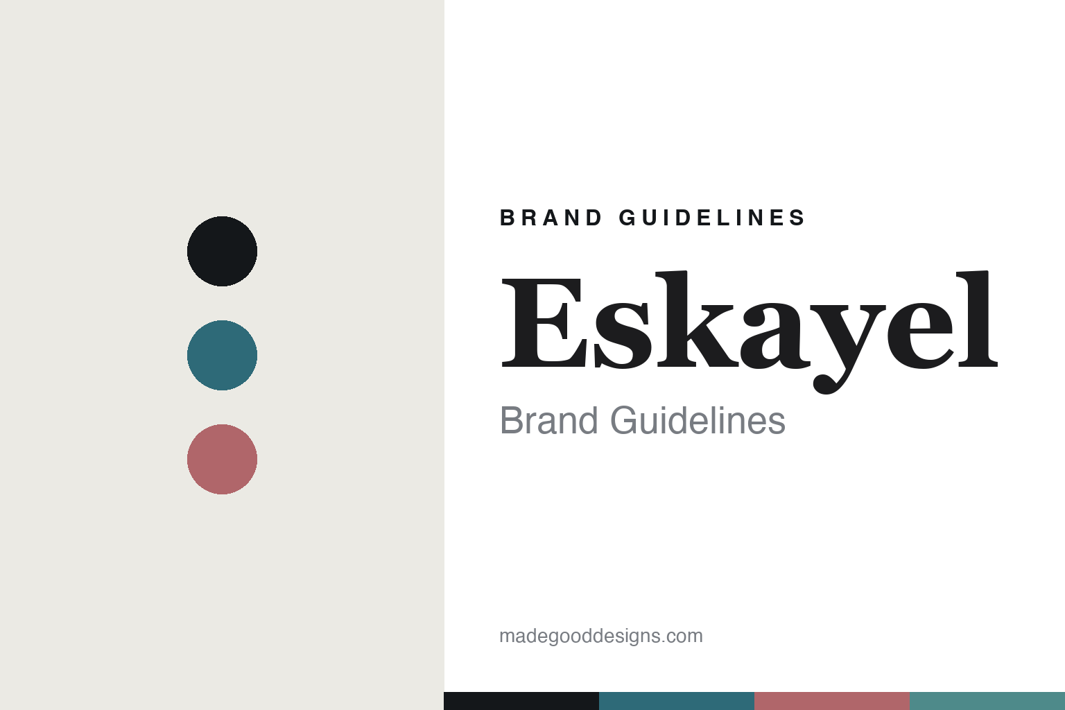
Eskayel Brand Guidelines
The watercolour print.
Aa
Two constants: a watery teal-and-blush palette and a painterly serif register. Abstract homage — not the Eskayel watercolours, prints or packaging.
The watercolour print
Eskayel turns paintings into surfaces.
Eskayel is a lesson in the painting as the surface. Launched in 2008 in Brooklyn by the painter Shanan Campanaro, the studio turns her original watercolours into wallpaper, fabric, rugs and home textiles — fluid, painterly, water-and-nature-inspired.
Its identity is the watercolour print. Eskayel is known for wallpaper (its signature), alongside fabric, hand-knotted rugs, pillows and art prints, all made to order from Campanaro’s original artwork. A watercolour, scaled onto a wall. Colour that still looks wet.
(Honest notes: Eskayel was launched in 2008 by the painter Shanan Campanaro — a 2009 Brooklyn Designs show was its trade debut, so we say “launched 2008.” It is Brooklyn-based and now also lists San Diego. The name is a phonetic spelling of the initials S-K-L of three art-school friends from an earlier London T-shirt venture — not Shanan’s own initials — which we hedge. On production: the wallpaper, fabric, pillows and prints are US-made (water-based inks, FSC paper, Belgian linen), while the hand-knotted rugs are made in Nepal (not India). It is founder-led, independent and woman-owned (by fact, not a certified badge). Its documented collaborations include ABC Home, Clé Tile and Mitchell Gold + Bob Williams; we don’t assert specific hotel or other collabs. There’s no official brand hex, and we reproduce no actual watercolour — these tones are an unofficial interpretation. This is design commentary and does not promote any product.)
Colour
Eskayel lives in a watery teal-and-blush palette. Click a swatch to copy the hex.
Eskayel’s identity is fluid, painterly and calm — a teal, an ink, a blush, an aqua, and a chalk. The palette pairs a teal with a blush — the register of a watercolour print. It signals paint and water rather than novelty. The honest caveat: with no published brand hex, these tones are an original, unofficial interpretation, not first-party values.
The lesson is a teal with a blush signals a watercolour-print house. Eskayel’s world is a soft, painterly surface. For designers, it is a reminder that an original painting — scaled and made to order — can be the whole identity. Because a mid teal can fail as small text, keep type dark and let the colour live in the accents, palette and band. The takeaways: start from a painting; make to order; own the medium; and treat any single hex as unofficial.
Typography
The register is a painterly serif — fluid, soft, artful.
Eskayel’s identity carries a fluid, soft, artful spirit — a painterly, water-drawn surface. A soft display serif captures the mood: it is warm and expressive, the register of a painter’s studio. Set in a teal-and-blush palette, the painterly serif feels fluid and soft — exactly the personality Eskayel carries. It is artful rather than rigid, mirroring a watercolour. (Eskayel’s real watercolours, prints and wordmark are works we describe but do not reproduce, and the exact typeface is not ours to use.) Because it is not ours to use, the honest description is “a painterly serif spirit,” shown here in a stand-in. The type behaves like the brand: fluid, soft and artful.
Aa
A painterly serif spirit — fluid and soft. (Specimen set in Fraunces, a soft display serif STAND-IN; NOT the Eskayel packaging.)
The painting as the surface
Eskayel stands for the watercolour print.
Eskayel is a lesson in making the painting the identity. A teal-and-blush palette, a painterly serif and a fluid surface make the watercolour print the whole brand — fluid, soft, artful. The painting is the differentiator. The differentiator is an original watercolour, scaled and made to order onto a surface.
For designers and brand-builders, Eskayel offers a clear takeaway: start from your own art. The lessons: start from a painting; make to order; own the medium; and be honest about the story. It is also a reminder to stay accurate: it was launched in 2008 by painter Shanan Campanaro, its wallpaper and fabric are US-made while its rugs are made in Nepal, and it is founder-led and woman-owned — the palette here is an unofficial interpretation. Eskayel made the watercolour the brand — proof that a painting can be the difference.
Put to work, the painting is the source. The watery teal-and-blush palette stays fluid, the ink carries the text, the painterly serif reads soft and artful, and the watercolour is described rather than reproduced. A designer working in this spirit would start from an original mark — a real brushstroke, a genuine wash — and scale it, letting colour bleed and pool rather than sit in hard fields, with type kept calm so the surface can breathe. The lesson Eskayel teaches is that an authentic medium, made to order, can be a whole identity: the work looks hand-made because it is. As you borrow the approach, keep the record straight: Eskayel was launched in 2008 in Brooklyn (now also San Diego) by the painter Shanan Campanaro, its name is the phonetic initials of three art-school friends, and its wallpaper and fabric are US-made while its hand-knotted rugs are made in Nepal — the palette here is an unofficial interpretation rather than first-party values.
Explore & save
Keep Eskayel’s identity on hand — save it to a board in the Made Good inspiration library.
Eskayel identity set
Pin the teal-and-blush palette and the painterly-serif register to your own board.


