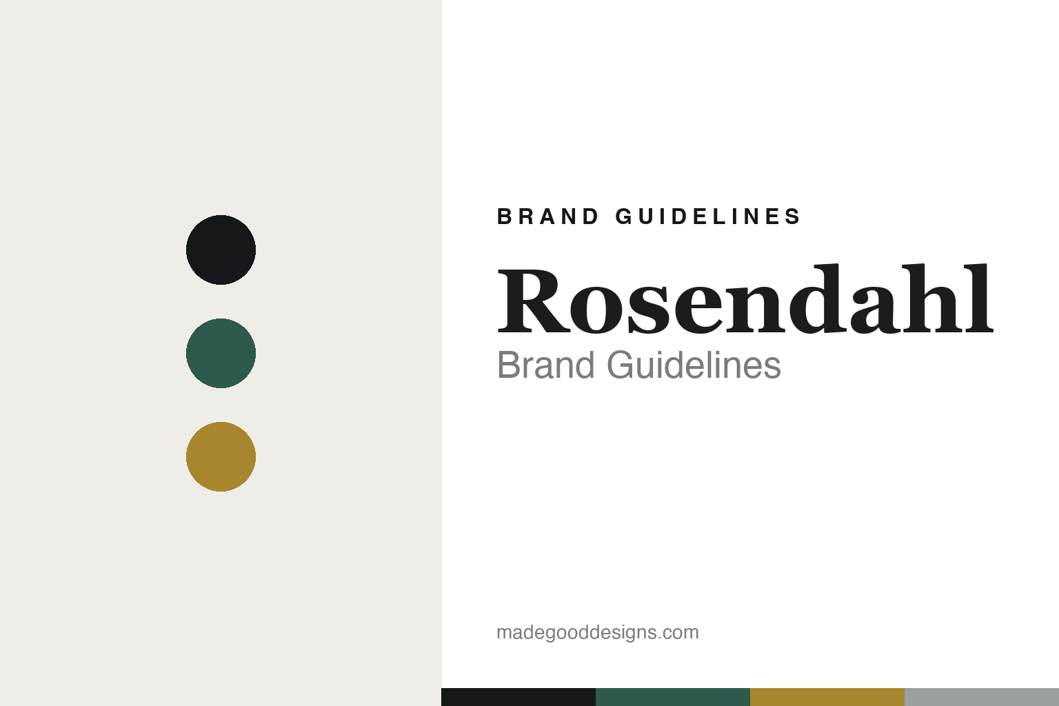
Rosendahl Brand Guidelines
The Grand Cru.
Aa
Two constants: a green-and-gold palette and a refined serif register. Abstract homage — not the Rosendahl products or packaging.
The Grand Cru
Rosendahl makes Danish design a whole portfolio.
Rosendahl is a lesson in a design house as a portfolio. A Danish design group founded by Erik Rosendahl in the 1980s, based in Hørsholm, it curates minimalist Scandinavian design across its own brand and a family of heritage names.
Its identity is Danish design, carried by Grand Cru. The Rosendahl own-brand’s Grand Cru line runs to more than a hundred pieces — its bar-and-wine assortment of glasses, corkscrews, openers and accessories being the barware heart of the brand. Around it sits a group that owns heritage Danish makers (Holmegaard, Lyngby Porcelæn, Kähler) and produces licensed classics (Kay Bojesen, Arne Jacobsen). Minimal, Scandinavian, curated.
(Honest notes: Rosendahl is a design group, not only a barware maker — Grand Cru is one own-brand line within a wide portfolio. Its founding year is contested in sources (1984 and 1975 both appear), so we say “the 1980s.” The Grand Cru designer is often credited to Erik Bagger, but we couldn’t confirm it, so we don’t assert it. Kay Bojesen and Arne Jacobsen are licensed heritage lines it produces, not Rosendahl inventions. There’s no official brand hex, so these tones are an unofficial interpretation. This is design commentary and does not promote any product.)
Colour
Rosendahl lives in a green-and-gold palette. Click a swatch to copy the hex.
Rosendahl’s identity is minimal, Danish and curated — a Grand Cru green, an ink, a gold, a stone, and a cream. The palette pairs a green with a gold — the register of a Scandinavian design house. It signals design and portfolio rather than novelty. The honest caveat: with no published brand hex, these tones are an original, unofficial interpretation, not first-party values.
The lesson is a green with a gold signals a Danish design-house line. Rosendahl’s world is a curated shelf of Scandinavian objects. For designers, it is a reminder that a single strong line — Grand Cru — can anchor a whole portfolio. Because a mid green can fail as small text, keep type dark and let the colour live in the accents, palette and band. The takeaways: anchor a portfolio with one line; keep it minimal; steward heritage brands with care; and treat any single hex as unofficial.
Typography
The register is a refined serif — minimal, Danish, curated.
Rosendahl’s identity carries a minimal, Danish, curated spirit — a shelf of Scandinavian design. A refined editorial serif captures the mood: it is elegant and quiet, the register of a design house. Set in a green-and-gold palette, the refined serif feels minimal and Danish — exactly the personality Rosendahl carries. It is understated rather than ornate, mirroring Scandinavian design. (Rosendahl’s real products and wordmark are works we describe but do not reproduce, and the exact typeface is not ours to use.) Because it is not ours to use, the honest description is “a refined serif spirit,” shown here in a stand-in. The type behaves like the brand: minimal, Danish and curated.
Aa
A refined serif spirit — minimal and Danish. (Specimen set in Newsreader, a refined editorial serif STAND-IN; NOT the Rosendahl packaging.)
A design house as a portfolio
Rosendahl stands for Danish design, carried by Grand Cru.
Rosendahl is a lesson in anchoring a portfolio with one line. A green-and-gold palette, a refined serif and a curated shelf make Grand Cru the barware heart of a design group — minimal, Danish, curated. The portfolio is the differentiator. The differentiator is a design house that stewards many brands.
For designers and brand-builders, Rosendahl offers a clear takeaway: let one strong line anchor the whole. The lessons: anchor with a hero line (Grand Cru); keep it minimal; steward heritage with care; and be honest about the story. It is also a reminder to stay accurate: it’s a Danish design group from the 1980s (founding year contested), the Grand Cru designer is only reported, and Kay Bojesen and Arne Jacobsen are licensed lines. Rosendahl made a portfolio the brand — proof that one line can be the difference.
Explore & save
Keep Rosendahl’s identity on hand — save it to a board in the Made Good inspiration library.
Rosendahl identity set
Pin the green-and-gold palette and the refined-serif register to your own board.


