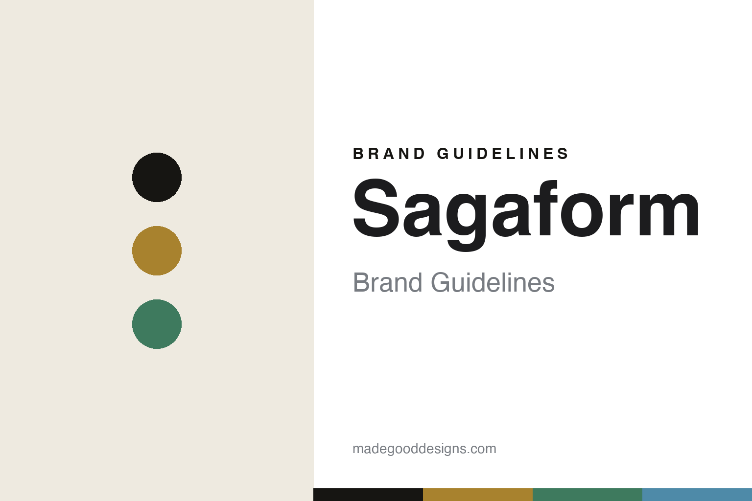
Sagaform Brand Guidelines
The shared table.
Aa
Two constants: an oak-and-pine palette and a friendly sans register. Abstract homage — not the Sagaform products or packaging.
The shared table
Sagaform designs for the shared table.
Sagaform is a lesson in accessible design as identity. Founded in 1996 in Borås — on a street called Sagagatan, which gave it its name — it makes “a Swedish original” for the kitchen, the table and the bar.
Its identity is accessible Scandinavian design for sharing. Working with leading Swedish designers, Sagaform makes warm, functional pieces built around “moments to share” — with oak as a genuine signature material across ranges like Oak, Nature and Coffee & More, plus a leisure and picnic side. Design that’s meant to be used, gifted and gathered around, not put behind glass.
(Honest notes: Sagaform is design-led and firmly gift/everyday — it’s owned by the New Wave Group and filed under “gifts and home furnishings,” so we frame it as accessible, retail-scaled Scandinavian design rather than luxury studio craft. Its founder isn’t named, and we don’t date the acquisition. We keep to verified ranges (Oak, Nature, Coffee & More) and don’t assert an unverified “Spinning” carafe. It’s Swedish-designed, with production not disclosed. There’s no official brand hex, so these tones are an unofficial interpretation. This is design commentary and does not promote any product.)
Colour
Sagaform lives in an oak-and-pine palette. Click a swatch to copy the hex.
Sagaform’s identity is warm, playful and Swedish — an oak, an ink, a pine, a sky, and a cream. The palette pairs an oak with a pine — the register of warm, accessible Scandinavian design. It signals sharing and everyday use rather than novelty. The honest caveat: with no published brand hex, these tones are an original, unofficial interpretation, not first-party values.
The lesson is an oak with a pine signals an accessible design brand. Sagaform’s world is a friendly, shared table. For designers, it is a reminder that “good design for everyone” — warm, affordable, giftable — is a legitimate identity, not a compromise. Because a mid oak can fail as small text, keep type dark and let the colour live in the accents, palette and band. The takeaways: design for sharing; use a warm signature material (oak); keep it accessible; and treat any single hex as unofficial.
Typography
The register is a friendly sans — warm, playful, Swedish.
Sagaform’s identity carries a warm, playful, Swedish spirit — a friendly, shared table. A rounded friendly sans captures the mood: it is approachable and soft, the register of accessible design. Set in an oak-and-pine palette, the friendly sans feels warm and playful — exactly the personality Sagaform carries. It is welcoming rather than austere, mirroring gift-ready design. (Sagaform’s real products and wordmark are works we describe but do not reproduce, and the exact typeface is not ours to use.) Because it is not ours to use, the honest description is “a friendly sans spirit,” shown here in a stand-in. The type behaves like the brand: warm, playful and Swedish.
Aa
A friendly sans spirit — warm and playful. (Specimen set in Quicksand, a rounded geometric sans STAND-IN; NOT the Sagaform packaging.)
Accessible design as identity
Sagaform stands for accessible Scandinavian design.
Sagaform is a lesson in making accessibility the identity. An oak-and-pine palette, a friendly sans and a shared table make accessible design the whole brand — warm, playful, Swedish. The accessibility is the differentiator. The differentiator is Scandinavian design meant to be used.
For designers and brand-builders, Sagaform offers a clear takeaway: accessible can be a real identity. The lessons: design for sharing; use a warm signature material; keep it affordable; and be honest about the story. It is also a reminder to stay accurate: it’s a 1996 Borås brand owned by the New Wave Group, its founder isn’t named, and unverified products are left out. Sagaform made accessibility the brand — proof that everyday, shared design can be the difference.
Explore & save
Keep Sagaform’s identity on hand — save it to a board in the Made Good inspiration library.
Sagaform identity set
Pin the oak-and-pine palette and the friendly-sans register to your own board.


