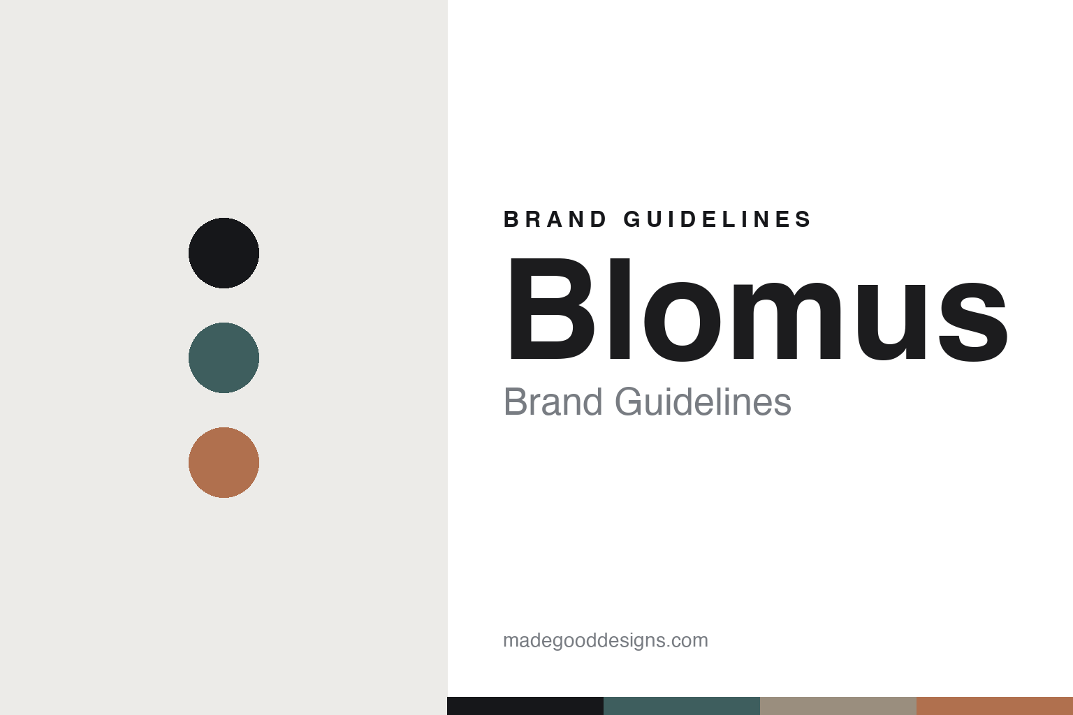
Blomus Brand Guidelines
The design object.
Aa
Two constants: a slate-and-terracotta palette and a minimal sans register. Abstract homage — not the Blomus products or packaging.
The design object
Blomus makes calm design objects for the home.
Blomus is a lesson in collaboration as identity. A German design house based in Sundern, in the Sauerland, it makes quiet “design objects for your home” — and does it by inviting designers in.
Its identity is designer-led design objects. Blomus works across bathroom, living, furniture, lighting, outdoor and kitchen, with pieces shaped by names like Sebastian Herkner, kaschkasch and Kazushige Miyake — a run of calm, often Japanese-influenced forms (PORTER, SUKOYA, KAMI, VOLOS) that have won Red Dot and German Design Awards. Its bar-and-wine world lives in the award-winning ILO wine accessories and KOYOI glassware. Design, by collaboration.
(Honest notes: Blomus is a design-objects house, not a barware specialist — so we frame its bar side honestly, through the verified ILO and KOYOI lines rather than a “stainless-barware” legacy we couldn’t confirm. Its founding year and founder aren’t verifiable from the current site, so we omit them, and a rumoured Flötotto parentage isn’t supported by the company’s own imprint, so we don’t assert it. It’s designed in Germany, with production not stated. There’s no official brand hex, so these tones are an unofficial interpretation. This is design commentary and does not promote any product.)
Colour
Blomus lives in a slate-and-terracotta palette. Click a swatch to copy the hex.
Blomus’ identity is calm, muted and considered — a slate teal, an ink, a taupe, a terracotta, and a chalk. The palette pairs a slate with a terracotta — the register of muted, contemporary design objects. It signals restraint and collaboration rather than novelty. The honest caveat: with no published brand hex, these tones are an original, unofficial interpretation, not first-party values.
The lesson is a slate with a terracotta signals a designer-collaboration house. Blomus’ world is a calm, curated home. For designers, it is a reminder that an identity can be built on who you invite in — a roster of designers — rather than a single product. The takeaways: make collaboration the model; keep the palette muted; let named designers shape the range; and treat any single hex as unofficial.
Typography
The register is a minimal sans — calm, muted, considered.
Blomus’ identity carries a calm, muted, considered spirit — a curated home of design objects. A clean minimal sans captures the mood: it is quiet and modern, the register of contemporary German design. Set in a slate-and-terracotta palette, the minimal sans feels calm and considered — exactly the personality Blomus carries. It is restrained rather than loud, mirroring muted design objects. (Blomus’ real products and lowercase wordmark are works we describe but do not reproduce, and the exact typeface is not ours to use.) Because it is not ours to use, the honest description is “a minimal sans spirit,” shown here in a stand-in. The type behaves like the brand: calm, muted and considered.
Aa
A minimal sans spirit — calm and considered. (Specimen set in Epilogue, a clean geometric sans STAND-IN; NOT the Blomus packaging.)
Collaboration as identity
Blomus stands for designer-led design objects.
Blomus is a lesson in making collaboration the identity. A slate-and-terracotta palette, a minimal sans and a curated home make designer collaboration the whole brand — calm, muted, considered. The collaboration is the differentiator. The differentiator is a roster of designers, not a single product.
For designers and brand-builders, Blomus offers a clear takeaway: let a roster define the brand. The lessons: make collaboration the model; keep the palette muted; name the designers; and be honest about the story. It is also a reminder to stay accurate: it’s a Sundern design-objects house (founding year unverified), its bar side is ILO and KOYOI (not a barware-specialist legacy), a Flötotto parentage isn’t confirmed, and the palette here is an unofficial interpretation. Blomus made collaboration the brand — proof that who you invite in can be the difference.
Explore & save
Keep Blomus’s identity on hand — save it to a board in the Made Good inspiration library.
Blomus identity set
Pin the slate-and-terracotta palette and the minimal-sans register to your own board.