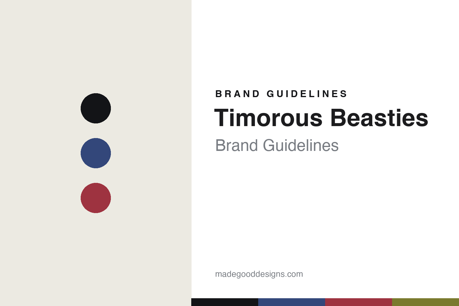
Timorous Beasties Brand Guidelines
The subversive toile.
Aa
Two constants: an indigo-and-blood palette and a subversive sans register. Abstract homage — not the Timorous Beasties toile, wallpaper or packaging.
The subversive toile
Timorous Beasties turns toile on its head.
Timorous Beasties is a lesson in tradition, subverted. Established in 1990 in Glasgow by Alistair McAuley and Paul Simmons — who met studying textile design at the Glasgow School of Art — the studio takes its name from Robert Burns’ poem “To a Mouse.”
Its identity is the subversive toile. Timorous Beasties makes fabrics and wallpapers, and is best known for turning the pastoral idyll of traditional toile de Jouy on its head — its 2004 “Glasgow Toile” swaps shepherds and gardens for gritty modern urban scenes. A centuries-old pattern format, filled with something unexpected. Beautiful and unsettling at once.
(Honest notes: Timorous Beasties was founded in 1990 in Glasgow by Alistair McAuley and Paul Simmons, who met at the Glasgow School of Art; the name comes from Burns. Its work is designed in Scotland and both hand-printed and digitally printed in Glasgow — so we don’t claim everything is hand-printed. It remains founder-led and independent, though we don’t assert a specific ownership structure, and sources differ on its exact showroom cities, so we keep that general. Its work is held by the V&A, the Cooper Hewitt and the Art Institute of Chicago, and it won Walpole awards in 2007 and 2010. There’s no official brand hex, and we reproduce no actual toile — these tones are an unofficial interpretation. This is design commentary and does not promote any product.)
Colour
Timorous Beasties lives in an indigo-and-blood palette. Click a swatch to copy the hex.
Timorous Beasties’ identity is witty, dark and Scottish — an indigo, an ink, a blood red, an acid, and a bone. The palette pairs an indigo with a blood red — the register of a subverted toile. It signals wit and edge rather than novelty. The honest caveat: with no published brand hex, these tones are an original, unofficial interpretation, not first-party values.
The lesson is an indigo with a blood red signals a subversive print studio. Timorous Beasties’ world is a familiar format turned strange. For designers, it is a reminder that keeping a traditional structure while inverting its content can be a whole identity. Because a mid indigo can fail as small text, keep type dark and let the colour live in the accents, palette and band. The takeaways: keep the format; invert the content; provoke, don’t decorate; and treat any single hex as unofficial.
Typography
The register is a subversive sans — witty, dark, contemporary.
Timorous Beasties’ identity carries a witty, dark, contemporary spirit — a subverted print. A confident geometric sans captures the mood: it is modern and a little wry, the register of a studio that unsettles as it charms. Set in an indigo-and-blood palette, the subversive sans feels witty and dark — exactly the personality Timorous Beasties carries. It is provocative rather than pretty, mirroring an inverted toile. (Timorous Beasties’ real toiles, wallpapers and wordmark are works we describe but do not reproduce, and the exact typeface is not ours to use.) Because it is not ours to use, the honest description is “a subversive sans spirit,” shown here in a stand-in. The type behaves like the brand: witty, dark and contemporary.
Aa
A subversive sans spirit — witty and dark. (Specimen set in Space Grotesk, a confident geometric sans STAND-IN; NOT the Timorous Beasties packaging.)
Tradition, subverted
Timorous Beasties stands for the subversive toile.
Timorous Beasties is a lesson in subverting a tradition. An indigo-and-blood palette, a subversive sans and an inverted toile make the subversion the whole brand — witty, dark, Scottish. The subversion is the differentiator. The differentiator is keeping the old format and changing everything inside it.
For designers and brand-builders, Timorous Beasties offers a clear takeaway: invert, don’t abandon. The lessons: keep the format; invert the content; provoke, don’t decorate; and be honest about the story. It is also a reminder to stay accurate: it was founded in 1990 in Glasgow by McAuley and Simmons, works are hand-printed and digital, and pieces sit in the V&A, Cooper Hewitt and Art Institute of Chicago — the palette here is an unofficial interpretation. Timorous Beasties made subversion the brand — proof that inverting a tradition can be the difference.
In application, the parts pull in one direction. The indigo-and-blood palette gives a page its edge, the ink keeps text readable, the subversive sans sets a wry, contemporary headline, and the toile idea stays in imagery — never reproduced, only referenced. A designer working in this spirit would keep the surface deceptively classical, then let one detail undercut it: a caption that turns dark, a motif that reads wrong on a second look, a grid that behaves and content that does not. The lesson Timorous Beasties teaches is that subversion needs a straight man — the more traditional the frame, the sharper the twist inside it lands. Keep the layout composed so the wit does the work. And it is worth restating the honest frame as you borrow the approach: the studio was founded in 1990 in Glasgow by Alistair McAuley and Paul Simmons, its work is hand-printed and digitally printed, and pieces sit in the V&A and Cooper Hewitt — while the palette here is an unofficial interpretation, not a set of first-party values.
Explore & save
Keep Timorous Beasties’s identity on hand — save it to a board in the Made Good inspiration library.
Timorous Beasties identity set
Pin the indigo-and-blood palette and the subversive-sans register to your own board.


