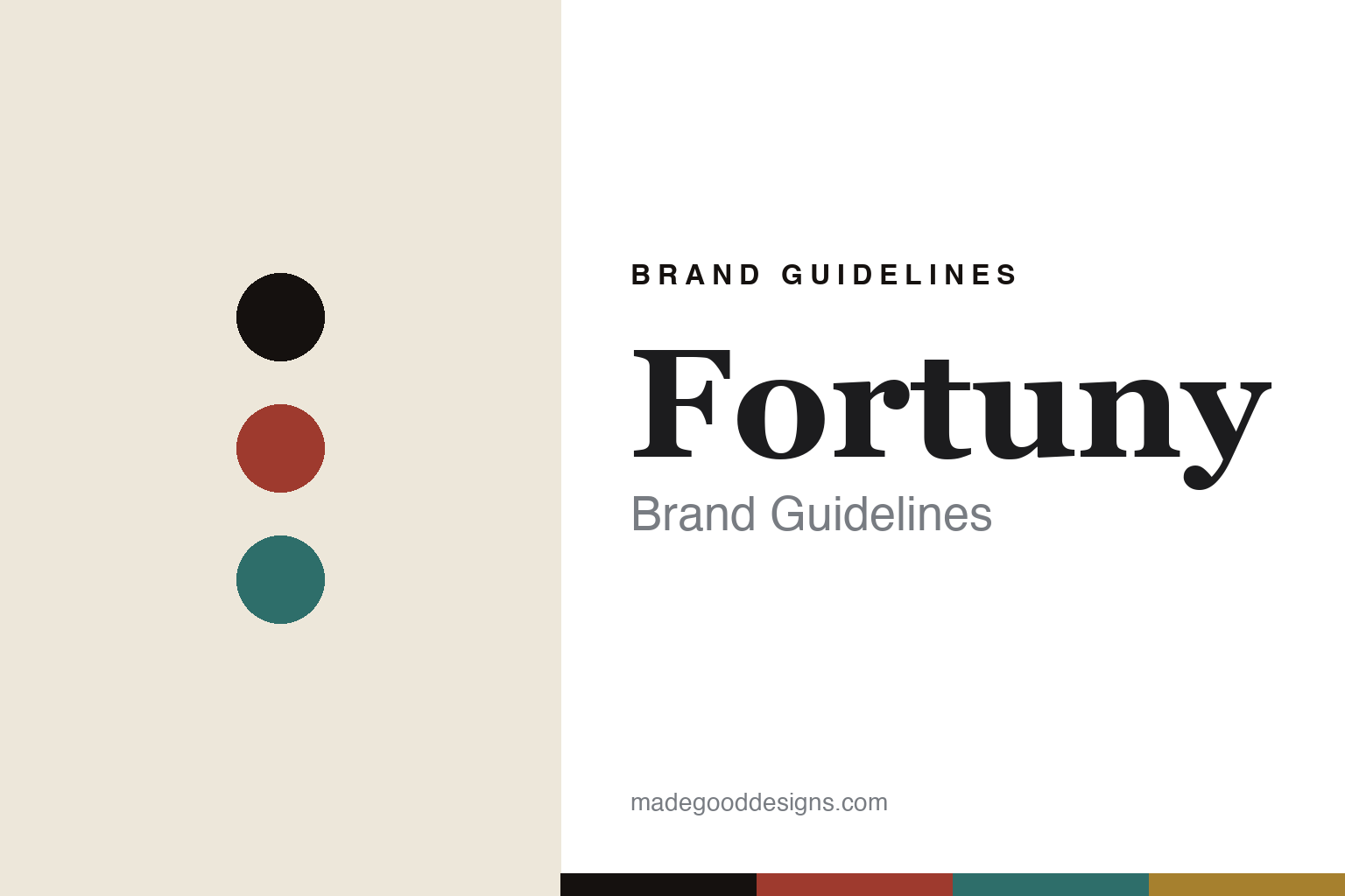
Fortuny Brand Guidelines
The printed velvet.
Aa
Two constants: a pomegranate-and-gold palette and a Venetian serif register. Abstract homage — not the Fortuny prints, velvets or packaging.
The printed velvet
Fortuny prints colour into Venetian cloth.
Fortuny is a lesson in the print as the identity. A Venetian textile house descended from the Spanish-born artist-inventor Mariano Fortuny y Madrazo, it makes printed cottons and velvets for interiors — colour and pattern hand-worked into cloth on the island of Giudecca.
Its identity is the printed velvet. Fortuny is known for richly printed fabrics produced at its historic Venice factory — described by the company as the last operating textile factory in the city — using a proprietary, multi-layer printing process it calls a closely guarded secret. Colour laid into velvet and cotton, made where it has always been made.
(Honest notes: the modern Fortuny is a printed-interiors-textile house, made at the Giudecca factory in Venice — that “made in Venice” claim is well supported. It is owned by the Riad family, who acquired the company in the late 1980s and today run it through brothers Mickey Riad (creative director) and Maury Riad. On dates, we hedge: the couture house began in 1906, the Venetian fabric house dates to the early 1920s, and the brand styles itself “Fortuny Venezia 1921.” Crucially, Mariano Fortuny’s famous Delphos pleated gown, his pleating and his stage lamp belong to his era — the modern company makes printed interior fabrics, not gowns or lamps, so we don’t imply otherwise. There’s no official brand hex, the printing process is secret, and we reproduce no actual print — these tones are an unofficial interpretation. This is design commentary and does not promote any product.)
Colour
Fortuny lives in a pomegranate-and-gold palette. Click a swatch to copy the hex.
Fortuny’s identity is rich, historic and Venetian — a pomegranate, an ink, a lagoon, a Venetian gold, and a parchment. The palette pairs a pomegranate with a gold — the register of printed velvet and old-world colour. It signals depth and craft rather than novelty. The honest caveat: with no published brand hex, these tones are an original, unofficial interpretation, not first-party values.
The lesson is a pomegranate with a gold signals a printed-velvet house. Fortuny’s world is a deep, worked cloth. For designers, it is a reminder that a printing process — and the place it happens — can be the whole identity. Because a deep pomegranate can fail as small text, keep type dark and let the colour live in the accents, palette and band. The takeaways: make the process the design; honour the place; guard the craft; and treat any single hex as unofficial.
Typography
The register is a Venetian serif — rich, historic, elegant.
Fortuny’s identity carries a rich, historic, elegant spirit — a printed Venetian cloth. A refined old-style serif captures the mood: it is graceful and heritage-minded, the register of a century-old atelier. Set in a pomegranate-and-gold palette, the Venetian serif feels rich and historic — exactly the personality Fortuny carries. It is timeless rather than trendy, mirroring worked velvet. (Fortuny’s real prints, velvets and wordmark are works we describe but do not reproduce — the process is secret — and the exact typeface is not ours to use.) Because it is not ours to use, the honest description is “a Venetian serif spirit,” shown here in a stand-in. The type behaves like the brand: rich, historic and elegant.
Aa
A Venetian serif spirit — rich and historic. (Specimen set in Cormorant Garamond, a refined old-style serif STAND-IN; NOT the Fortuny packaging.)
The print as the identity
Fortuny stands for the printed velvet.
Fortuny is a lesson in making the print the identity. A pomegranate-and-gold palette, a Venetian serif and a worked velvet make the printed cloth the whole brand — rich, historic, Venetian. The print is the differentiator. The differentiator is a secret process, practised in one place, over a century.
For designers and brand-builders, Fortuny offers a clear takeaway: own a process and a place. The lessons: make the process the design; honour the place; guard the craft; and be honest about the story. It is also a reminder to stay accurate: it’s a Venetian printed-textile house, made at the Giudecca factory and owned by the Riad family, while the Delphos gown, the pleating and the lamp belong to Mariano Fortuny’s own era — the palette here is an unofficial interpretation. Fortuny made the print the brand — proof that a process can be the difference.
In practice, the three parts reinforce each other. Put to work, the pomegranate-and-gold palette does the heavy lifting while the ink carries the text, the Venetian serif sets headlines and pull-quotes, and the printed-velvet idea lives in imagery and texture rather than in the type. A designer building a page in this spirit would let one deep, worked colour dominate a generous field, hold body copy in a near-black ink for legibility, and reserve the gold as a small, ceremonial accent — a rule number, a divider, a caption. The discipline is restraint: because the palette is rich, the layout should be quiet, letting the material read as luxury without ornament. It is worth repeating the honest frame as you borrow this: Fortuny is a printed-interiors house made in Venice and owned by the Riad family, its founding is best hedged to the early 1920s, and the Delphos gown and lamp belong to Mariano Fortuny’s own era — the tones here remain an unofficial interpretation, not first-party values.
Explore & save
Keep Fortuny’s identity on hand — save it to a board in the Made Good inspiration library.
Fortuny identity set
Pin the pomegranate-and-gold palette and the Venetian-serif register to your own board.


