SaaS Branding: Design for Software
SaaS branding is different from packaged-goods branding in one decisive way: your product UI is your brand. Users spend hours inside the app, not looking at a billboard. The interface — its type, color, spacing, illustration, and tone — does more brand work than your logo ever will. Get the system right and the marketing site, docs, and emails fall into place.
If you are still deciding how much identity work your stage warrants, start with our founder’s guide to startup branding. This article focuses specifically on software companies and how to make the product and the brand the same thing.
The Product UI Is the Brand
For a SaaS company, the strongest brand impression is the daily experience of using the product. A consistent, considered interface signals competence; a janky one undermines every marketing claim you make. That means brand decisions — primary color, type scale, button shapes, motion — must be made as product decisions, not handed down as a separate “brand layer” later.
The bridge between visuals and product is a design system: a single source of truth for the components and tokens that make the app feel coherent. For how this fits a broader identity, see our guide to visual identity design.
Building a Design System
A design system is not a 200-page document — it is a working library. At minimum, define design tokens (color, spacing, type, radius, shadow) once, then build components on top so a change propagates everywhere.
- Color tokens: primary, neutrals, plus semantic colors (success, warning, error) — all checked for WCAG AA contrast.
- Type scale: one UI typeface (Inter is a reliable, free, broad-coverage default), a defined set of sizes, and consistent line-heights.
- Spacing scale: a fixed step system (e.g. 4/8/12/16/24) so layouts feel rhythmic.
- Components: buttons, inputs, cards, modals, tables — each with states (hover, focus, disabled, error).
Build it in Figma with components and variables, and keep it in sync with whatever your engineers ship. A design system that drifts from the codebase is worse than none, because it lies.
The token approach is what makes a brand refresh survivable. If your primary color lives in one variable referenced everywhere, changing it is a single edit; if it is hard-coded across two hundred screens, a rebrand becomes a multi-month slog and the old color lingers in forgotten corners for years. Define tokens early even when the system is tiny — the discipline costs little at five components and pays off enormously at five hundred. Name tokens by role, not by value: call it color-primary, not blue-500, so swapping the actual hue later does not require renaming anything.
Typography for SaaS Products
UI type has to be legible at small sizes, dense, and language-flexible. Inter is the workhorse choice — high x-height, designed for screens, free, and broad in language coverage. If you want more personality in headlines, pair it with a distinctive display family but keep body and UI text in one neutral, readable face. Avoid more than two type families across the entire product and site.
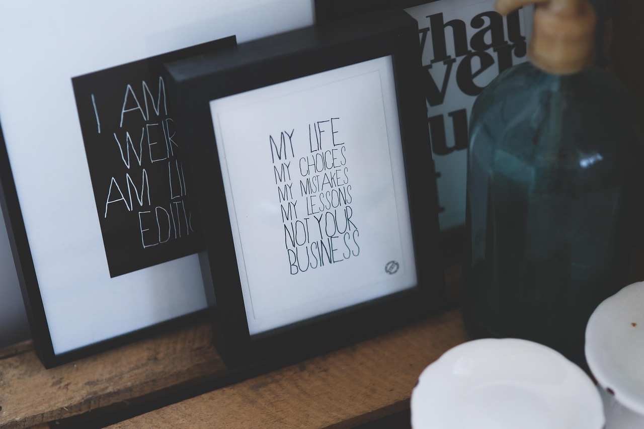
Illustration and Iconography Style
Illustration is where many SaaS brands find their personality. Decide on one consistent style — flat geometric, soft 3D, line-based, or hand-drawn — and apply it everywhere: empty states, onboarding, error pages, the marketing site. Inconsistent illustration is one of the fastest ways to look like several companies wearing one logo.
- Pick one illustration style and document it (palette, line weight, perspective).
- Use a single icon set with consistent stroke weight and corner radius.
- Reuse empty-state and error illustrations as brand moments, not afterthoughts.
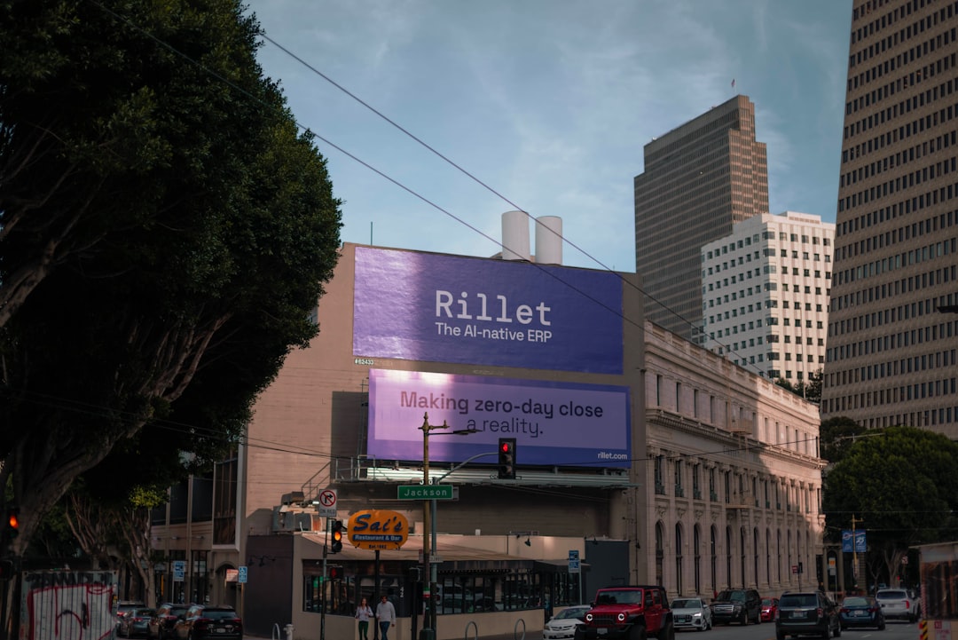
Marketing Site and Product Consistency
The most common SaaS branding failure is a gorgeous marketing site that looks nothing like the product behind the login. Prospects feel the whiplash. Use the same type, color tokens, button styles, and illustration system across the marketing site and the app so the transition from “interested” to “using it” is seamless.
| Surface | What must match the product |
|---|---|
| Marketing site | Type, color, buttons, illustration |
| Onboarding emails | Voice, color, logo lockup |
| Docs / help center | Type scale, code styling, links |
| App store listing | Icon, screenshot style, color |
If you ship a mobile app, that consistency extends to the store. Your icon and screenshots are part of the brand and a direct conversion surface — see our guide to app store screenshot design for how to make those first frames convert. For the symbol that anchors all of it, our tech logo design guide covers building a mark that survives at favicon and app-icon size.
Brand Voice in a Product
SaaS voice shows up in microcopy: button labels, empty states, error messages, tooltips. Write these as a person, not a system. “Something went wrong” is a missed opportunity; “We couldn’t save that — check your connection and try again” is on-brand and useful. Document three voice attributes and a handful of microcopy do/don’t examples so every engineer writes consistently.
The highest-leverage microcopy is the text people read when something fails or when a screen is empty, because those are the moments of friction where trust is won or lost. A good error message names what happened, why, and the next action — never just “error.” A good empty state teaches the user how to get value rather than apologizing for having nothing to show. Treating these states as brand surfaces rather than engineering placeholders is one of the clearest signals of a mature SaaS product.
Evolving the Brand Without a Full Rebrand
Software brands rarely need the dramatic overnight rebrands that physical-product companies do. Because the product is your primary brand surface and it ships continuously, you can evolve the identity incrementally — tighten the type scale this quarter, refresh the illustration style next, modernize the color tokens after that. Done well, the brand stays current without a jarring relaunch that confuses existing users.
- Ship changes through the design system so they propagate cleanly and consistently.
- Sequence updates rather than changing everything at once, which strains both the team and users.
- Watch for drift — incremental change without governance becomes incoherence; audit regularly.
The exception is a true repositioning — a new audience, a new category, a merger — where a deliberate, communicated rebrand makes sense. Short of that, let the system carry continuous improvement and reserve the big relaunch for when the company’s story has genuinely changed.
A Realistic Rollout
- Define tokens and core components in Figma.
- Sync them with the codebase so design and product agree.
- Standardize one illustration style and one icon set.
- Align the marketing site to the product’s visual language.
- Write voice guidelines and rewrite your worst microcopy first.
- Audit every surface — emails, docs, store — for drift quarterly.
Frequently Asked Questions
What is the difference between SaaS branding and a design system?
Branding is the whole identity — name, voice, color, logo, and feeling. A design system is the working component library that makes the product UI express that brand consistently. For SaaS, the two are tightly linked because the product interface is the primary place users experience the brand.
What typeface should a SaaS product use?
Inter is the reliable default — free, designed for screens, high x-height, and broad language coverage, which matters for dense UI. Pair it with a distinctive display face for headlines if you want personality, but keep all body and UI text in one neutral, readable family.
Why does my marketing site feel disconnected from my app?
Usually because they were designed separately with different type, color, and button styles. Fix it by sharing one set of design tokens and components across both. Prospects who feel visual whiplash moving from the site into the product trust the company less, even if they cannot name why.
How big does my company need to be for a design system?
Even a two-person team benefits from defining color, type, and spacing tokens once — it speeds up every screen you build. Start small with tokens and a few core components in Figma, then grow the system as the product and team scale rather than documenting everything upfront.
How important is illustration to SaaS branding?
Very, because it often carries the personality your neutral UI typeface cannot. Pick one consistent illustration style and use it across empty states, onboarding, error pages, and the marketing site. Inconsistent illustration is one of the fastest ways for a SaaS brand to look fragmented and unprofessional.