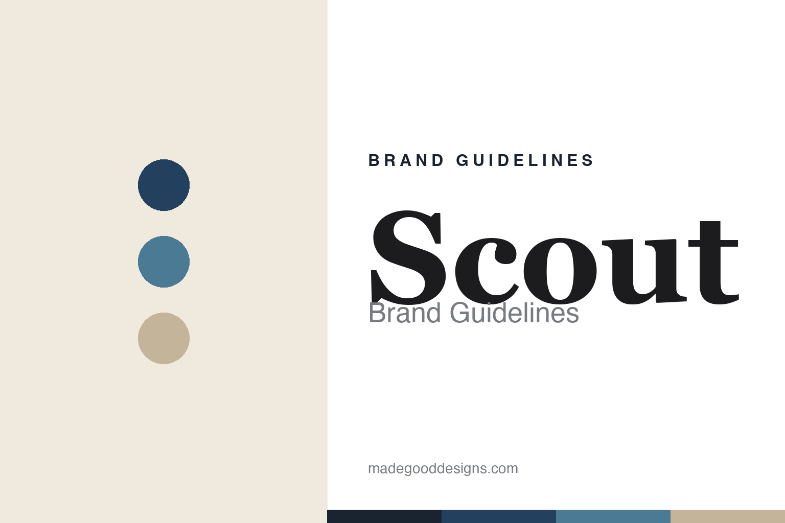
Scout Brand Guidelines
Tinned fish, refined.
Aa
Two constants: a coastal navy palette and a refined serif wordmark. Abstract homage — not the Scout wordmark or tin.
Tinned fish, refined
Scout made tinned seafood quietly elegant.
Scout is a lesson in restraint in a maximalist category. Founded in the late 2010s (kitchen experiments ~2014, commercial ~2018, retail ~2020) by Canadian chef Charlotte Langley (of Prince Edward Island), it makes premium, responsibly and traceably sourced tinned seafood — Atlantic Canadian lobster, rainbow trout, PEI mussels, wild tuna — positioned like charcuterie for the sea.
Where much of the tinned-fish renaissance goes loud and illustrated, Scout goes the other way: a clean, refined, coastal identity in navy and sea-blue with white and cream, sparse nautical cues, generous whitespace and restrained typography. It’s the quiet, elegant end of the category.
(Honest notes: Scout is a Canadian-origin brand (Toronto/PEI) now US-headquartered in Sausalito, California. And a status caveat: as of 2026 its direct web store is paused (“we’ve gone fishing,” everything sold out online) — but it’s still sold via Walmart, Amazon, Thrive and retail, so it’s retail-focused, not defunct. No official brand hex is published.)
Colour
Scout lives in coastal navy and cream. Click a swatch to copy the hex.
Scout’s identity is refined, coastal and calm — a navy, a sea blue, a sand, a cream, and an ink. The palette is deep coastal navy and sea-blue with cream and sand — the register of a quiet seaside, not a loud market. It signals premium, restrained, sustainable seafood rather than maximalist illustration. The honest caveat: with no published brand hex, these tones are an original, unofficial interpretation, not first-party values.
The lesson is coastal navy and cream read as refined and premium. Scout’s world is a calm shoreline. For designers, it is a reminder that in a category rushing toward bold illustration, restraint — deep navy, sea-blue, whitespace — can feel more premium and distinctive precisely because it’s quiet. The takeaways: use coastal navy and cream for calm premium; lean on whitespace and restraint; and treat any single hex as unofficial — using a deep navy for small text so the coastal tones stay refined.
Typography
The wordmark spirit is a refined serif — coastal and elegant.
Scout’s identity carries a refined, elegant, coastal spirit — navy and cream with sparse nautical cues. A warm, refined serif captures the mood: it is calm and considered, the register of premium, quiet seafood. Set against coastal navy and cream, the serif feels elegant and coastal — exactly the refined personality Scout carries. It is restrained rather than loud, mirroring whitespace-forward packaging. (Scout’s real wordmark and tin are trademarks and trade dress we describe but do not reproduce, and the exact typeface is not published, so we don’t assert it.) Because the specific mark is not ours to use, the honest description is “a refined serif spirit,” not the Scout logo. The type behaves like the brand: refined, elegant and coastal.
Aa
A refined serif spirit — coastal and elegant. (Specimen set in Lora, a refined serif; NOT the Scout logo, which is a trademark.)
Quiet as premium
Scout stands for refined coastal restraint.
Scout is a lesson in standing out by going quiet. In a tinned-fish renaissance defined by loud, illustrated tins, Scout’s refined navy-and-cream coastal restraint reads as more premium and grown-up — the calm at the other end of the shelf. The restraint is the differentiator. The differentiator is refined, coastal, premium calm.
For designers and brand-builders, Scout offers a clear takeaway: restraint can be a positioning. The lessons: when a category zigs loud, consider zagging quiet; use a calm coastal palette and whitespace; and let a chef-founder’s credibility carry the substance. It is also a reminder to stay accurate: Scout is Canadian-origin but US-based, and its DTC store is currently paused while it stays on retail shelves — with the palette here an unofficial interpretation. Scout made tinned fish refined — proof that quiet can be the difference.
Explore & save
Keep Scout’s identity on hand — save it to a board in the Made Good inspiration library.
Scout identity set
Pin the coastal navy palette and the refined-serif spirit to your own board.


