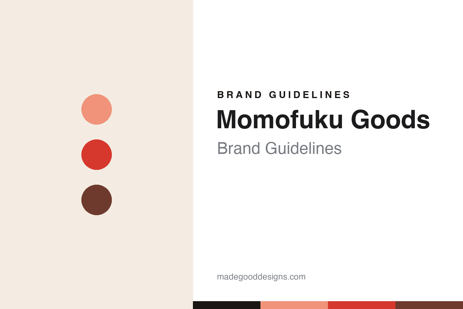
Momofuku Goods Brand Guidelines
Peach & punch.
Aa
Two constants: a peach-and-chili palette and a bold sans wordmark. Abstract homage — not the Momofuku wordmark or packaging.
Peach and punch
Momofuku Goods put a restaurant’s attitude in a jar.
Momofuku Goods is a lesson in a restaurant brand’s attitude, packaged. The consumer-goods arm of David Chang’s Momofuku (whose restaurants date to 2004), the pantry line launched around 2020 and made its name with Chili Crunch — a chili-crisp condiment — before expanding into noodles, seasoned salts, soy sauce and tamari.
The design is bold, modern and product-forward: a punchy, minimalist system anchored by a distinctive warm peach/salmon brand tone and a strong clean wordmark. It reads like the food — confident, contemporary, a little irreverent.
(Honest notes: Momofuku Goods is independent and private (David Chang is the founder and public face; day-to-day leadership sat with CEO Marguerite Zabar Mariscal). And there’s a real caveat to state neutrally: in early 2024 Momofuku sent cease-and-desist letters over its “Chili Crunch” trademark to smaller, often Asian-owned makers, drawing significant backlash; on April 12, 2024, David Chang apologised and the company said it would not enforce the trademark. No official brand hex is published.)
Colour
Momofuku Goods lives in peach and chili. Click a swatch to copy the hex.
Momofuku Goods’ identity is warm, bold and appetising — a peach, a chili red, a deep brown, a cream, and an ink. The signature is a warm peach/salmon tone paired with a chili red and rich browns — food-forward and confident. It signals a modern, punchy pantry brand rather than muted “gourmet” restraint. The honest caveat: with no published brand hex, these tones are an original, unofficial interpretation, not first-party values.
The lesson is a warm, appetising palette carries a food brand. Momofuku Goods’ world is a bold kitchen. For designers, it is a reminder that an unexpected but warm signature colour (peach) plus food-appetising accents (chili red, browns) can make a pantry brand feel contemporary and craveable — the design equivalent of the flavour. The takeaways: pick a warm, ownable signature tone; add appetising accents; and treat any single hex as unofficial — using a chili red for small text so the peach stays warm.
Typography
The wordmark spirit is a bold sans — confident and modern.
Momofuku Goods’ identity carries a bold, confident, modern spirit — a strong wordmark in a warm, punchy system. A bold grotesque sans captures the mood: it is assertive and contemporary, the register of a restaurant brand that carries its swagger into the grocery aisle. Set against peach and chili, the bold sans feels confident and modern — exactly the product-forward personality Momofuku Goods carries. It is punchy rather than precious, mirroring bold food packaging. (Momofuku’s real wordmark and packaging are trademarks and trade dress we describe but do not reproduce, and the exact typeface is not published, so we don’t assert it.) Because the specific mark is not ours to use, the honest description is “a bold sans spirit,” not the Momofuku logo. The type behaves like the brand: bold, confident and modern.
Aa
A bold sans spirit — confident and modern. (Specimen set in Archivo, a bold grotesque; NOT the Momofuku logo, which is a trademark.)
Attitude, in the aisle
Momofuku Goods stands for a chef’s swagger.
Momofuku Goods is a lesson in translating a restaurant’s voice to the shelf. A warm peach palette, bold type and a craveable hero (Chili Crunch) carry David Chang’s confident, contemporary sensibility into the pantry. The attitude is the differentiator. The differentiator is a bold, chef-driven, product-forward identity.
For designers and brand-builders, Momofuku Goods offers a clear takeaway: a strong voice can travel from restaurant to retail. The lessons: pick a warm, ownable signature colour; keep type bold and product-forward; and let a genuine hero product lead. It is also a reminder to stay accurate: Momofuku is David Chang-led, and the 2024 Chili Crunch trademark dispute ended with an apology and a decision not to enforce — with the palette here an unofficial interpretation. Momofuku brought swagger to the aisle — proof that a chef’s attitude can be the difference.
Explore & save
Keep Momofuku Goods’s identity on hand — save it to a board in the Made Good inspiration library.
Momofuku Goods identity set
Pin the peach-and-chili palette and the bold-sans spirit to your own board.


