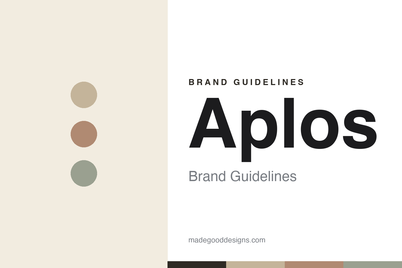
Aplós Brand Guidelines
Calm, uncorked.
Aa
Two constants: a warm-muted-neutral palette and an elegant geometric sans wordmark. Abstract homage — not the Aplós bottle or wordmark.
Calm, uncorked
Aplós made a non-alc spirit feel like calm.
Aplós is a lesson in designing a feeling, sober. Founded in 2020 in New York by Emily Onkey, David Fudge and Jessica Manley, it makes a non-alcoholic “functional spirit” and apéritif — botanical, adult, made to “calm and uplift without the negative effects of alcohol.” Its flagship, Calme, was billed as the first hemp-infused non-alcoholic spirit.
The design is minimalist, elegant and calm: soft, warm, muted neutrals (off-white, cream, earthy tones), a tall slim frosted bottle and a pared-back label — quiet, premium and mindful, the visual of a deep breath.
(Honest notes: Aplós is a functional line — the flagship Calme is hemp-infused, while newer ready-to-drink cans (Ume Spritz, Mandora Negroni) use adaptogens like lion’s mane and magnesium; so it’s hemp-anchored with a broader functional range, not hemp-free. Its calm/functional benefit claims are marketing positioning, not FDA-evaluated, and hemp beverages sit in an evolving US regulatory space. No official brand hex is published.)
Colour
Aplós lives in warm, muted neutrals. Click a swatch to copy the hex.
Aplós’ identity is calm, warm and muted — a warm sand, a clay, a sage grey, a cream, and an ink. The palette is a set of soft, warm, muted neutrals — sand, clay, sage-grey — the register of quiet, mindful calm. It signals sophisticated, sober-curious wellness rather than bright or clinical design. The honest caveat: with no published brand hex, these tones are an original, unofficial interpretation, not first-party values.
The lesson is warm muted neutrals signal calm. Aplós’ world is a mindful, warm-lit ritual. For designers, it is a reminder that soft, warm neutrals — sand, clay, sage — plus minimalism can make a drink feel calming and premium, the opposite of a loud energy brand. The takeaways: use warm muted neutrals for calm; keep the design minimal and tactile; and treat any single hex as unofficial — using a warm brown for small text so the neutrals stay soft.
Typography
The wordmark spirit is an elegant geometric sans — calm and refined.
Aplós’ identity carries a calm, refined, mindful spirit — a pared-back label on a frosted bottle. An elegant geometric sans captures the mood: it is quiet and sophisticated, the register of a calm, adult wellness ritual. Set against warm muted neutrals, the elegant sans feels calm and refined — exactly the mindful personality Aplós carries. It is quiet rather than loud, mirroring a minimalist label. (Aplós’ real bottle and wordmark are trademarks and trade dress we describe but do not reproduce, and the exact typeface is not published, so we don’t assert it.) Because the specific mark is not ours to use, the honest description is “an elegant geometric sans spirit,” not the Aplós logo. The type behaves like the brand: calm, refined and mindful.
Aa
An elegant geometric sans spirit — calm and refined. (Specimen set in Jost, a geometric sans; NOT the Aplós logo, which is a trademark.)
Calm as the product
Aplós stands for the mindful non-alc ritual.
Aplós is a lesson in selling calm. Warm muted neutrals, a frosted bottle and a functional, botanical non-alcoholic spirit turn “not drinking” into a sophisticated, mindful ritual — quiet, adult, premium. The calm design is the differentiator. The differentiator is a warm, minimal, mindful non-alc identity.
For designers and brand-builders, Aplós offers a clear takeaway: a palette can sell a feeling (calm). The lessons: match the palette to the emotion (warm, muted, calm); keep the object minimal and tactile; and let a functional concept give it substance. It is also a reminder to stay accurate: Aplós is NY-based (founded 2020), its flagship is hemp-infused with a broader adaptogen line, and its calm claims are marketing, not FDA — with the palette here an unofficial interpretation. Aplós designed calm — proof that a feeling can be the difference.
Explore & save
Keep Aplós’s identity on hand — save it to a board in the Made Good inspiration library.
Aplós identity set
Pin the warm-neutral palette and the elegant-sans spirit to your own board.


