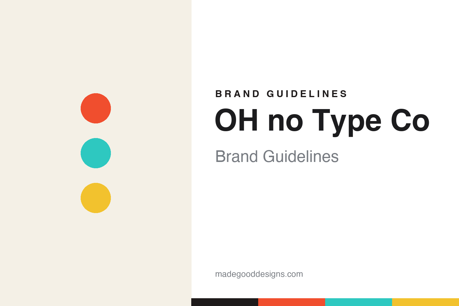
OH no Type Co Brand Guidelines
Type with a voice.
Aa
Two constants: an expressive, loud palette and a playful type register. Abstract homage — not the OH no wordmark or its typefaces.
Type with a voice
OH no makes type — and jokes — with personality.
OH no Type Co is a lesson in voice as the whole brand. Founded in 2015 by James Edmondson and now based in Oakland, California, the independent foundry is behind Degular (its 2020 commercial breakthrough), Obviously, Hobeaux, Covik Sans, Swear and the expressive display face Cheee — even the font names (Cheee, Regrets, Forevs) are part of the joke.
Its brand is defined less by a colour than by a playful, irreverent, self-deprecating voice — Edmondson’s first-person writing, funny and vulnerable, running through every specimen. The design philosophy is just as human: “organic over geometric, lively over perfect, and good spacing above all else,” and the famous line, “we don’t make fonts to make money, we make money to make more fonts.”
(Honest notes: the styling is “OH no Type Co” — lowercase “no,” the interjection — not “Oh No.” It’s Oakland, California (not Berkeley or San Diego). Edmondson is widely reported to have worked at House Industries earlier and to have co-founded the “buy fonts in progress” marketplace Future Fonts; we mention these as reported rather than over-specifying. And there is no single official brand hex, so the colours here are an unofficial interpretation.)
Colour
OH no lives in loud, expressive colour. Click a swatch to copy the hex.
OH no Type Co’s identity is loud, expressive and playful — a vermilion, a turquoise, a yellow, a panel, and an ink. Rather than one fixed brand colour, OH no goes bright and ever-changing, each specimen getting its own loud palette. It signals a foundry that is fun, human and unafraid of personality. The honest caveat: with no published brand hex, these tones are an original, unofficial interpretation, not first-party values.
The lesson is loud, expressive colour matches a playful voice. OH no’s world is a joyful, joke-filled specimen. For designers, it is a reminder that personality — a distinct voice, expressive colour, a sense of humour — can be more memorable than any polished, neutral system. The takeaways: let colour be loud and per-project; match it to a genuine voice; and treat any single hex as unofficial — using a strong vermilion for small text so the brights stay expressive.
Typography
The register is a playful sans — expressive and human.
OH no Type Co’s identity carries a playful, expressive, human spirit — a funny voice and loud colour. A playful, friendly sans captures the mood: it is warm and expressive, the register of a foundry that jokes as it works. Set against loud colour, the playful sans feels expressive and human — exactly the irreverent personality OH no carries. It is fun rather than solemn, mirroring a joke-filled specimen. (OH no’s real wordmark and its retail typefaces — Degular, Cheee, Obviously and the rest — are commercial products and trademarks we name but do not reproduce or set text in; the exact brand typeface is not ours to use.) Because those faces are not ours to set, the honest description is “a playful sans spirit,” shown here in a stand-in. The type behaves like the brand: playful, expressive and human.
Aa
A playful sans spirit — expressive and human. (Specimen set in Fredoka, a rounded sans STAND-IN; NOT OH no’s wordmark or any OH no retail typeface, which are trademarks.)
Voice as the brand
OH no stands for playful, human type.
OH no Type Co is a lesson in making personality the product. A funny, first-person voice, loud expressive colour and joke-named typefaces turn a foundry into a genuinely human brand — memorable because it sounds like a person, not a corporation. The voice is the differentiator. The differentiator is a playful, expressive, voice-first identity.
For designers and brand-builders, OH no offers a clear takeaway: a distinct voice can outshine a polished system. The lessons: write like a human, with humour and honesty; let colour be loud and expressive; and let genuine personality lead. It is also a reminder to stay accurate: it’s Oakland (not Berkeley/San Diego), the name is lowercase “no,” the House Industries and Future Fonts links are reported, and the palette here is an unofficial interpretation. OH no made voice the brand — proof that personality can be the difference.
Explore & save
Keep OH no Type Co’s identity on hand — save it to a board in the Made Good inspiration library.
OH no Type Co identity set
Pin the expressive palette and the playful register to your own board.


