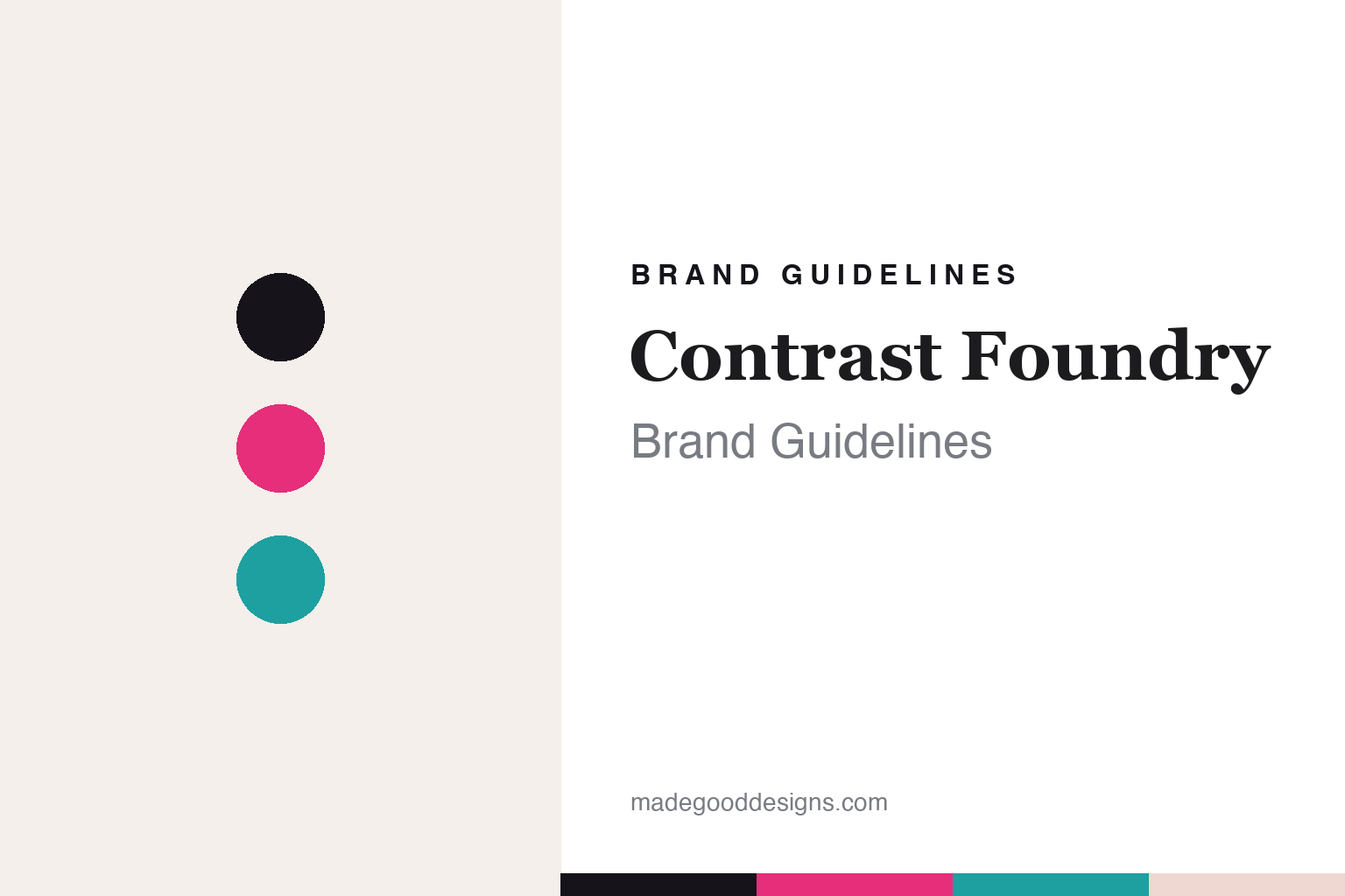
Contrast Foundry Brand Guidelines
High contrast.
Aa
Two constants: a bold, expressive palette and a high-contrast register. Abstract homage — not the CoFo wordmark or its typefaces.
High contrast
Contrast Foundry made high-contrast type its name.
Contrast Foundry (CoFo) is a lesson in high-contrast, expressive display type. Led by Maria Doreuli (a TypeMedia KABK graduate) with CEO Liza Rasskazova, and now based in the San Francisco Bay Area, the independent foundry is behind striking display faces — its signature reverse-contrast CoFo Chimera, the brutal industrial CoFo Peshka, and the multi-script workhorse CoFo Sans Pro (spanning seven-plus scripts).
Its brand identity is bold, expressive and display-led — a woman-led studio with strong Cyrillic-and-Latin craft and a witty, personable voice. As the name promises, high contrast is the through-line.
(Honest notes: CoFo is independent and today based in the SF Bay Area — it originated in a Moscow context but isn’t Moscow- or Amsterdam-based now. Its founding year is best hedged (around the mid-to-late 2010s). CoFo Robert is by Liza Rasskazova, not Doreuli, and Kazimir and Wremena are not CoFo faces. And there’s no official brand hex, so the colours here are an unofficial interpretation.)
Colour
Contrast Foundry lives in bold, expressive colour. Click a swatch to copy the hex.
Contrast Foundry’s identity is bold, expressive and high-contrast — an ink, a magenta, a teal, a blush, and a paper. Rather than one fixed brand colour, CoFo leans on bold, expressive colour that matches its dramatic display faces. It signals energy, personality and high-contrast drama rather than restraint. The honest caveat: with no published brand hex, these tones are an original, unofficial interpretation, not first-party values.
The lesson is bold colour matches high-contrast display type. CoFo’s world is a dramatic, expressive specimen. For designers, it is a reminder that bold, high-contrast colour amplifies expressive display type (like reverse-contrast Chimera) while a multi-script workhorse (CoFo Sans) does the daily lifting. The takeaways: use bold, expressive colour for display type; pair drama with a workhorse; and treat any single hex as unofficial — using ink for small text so the brights stay expressive.
Typography
The register is a reverse-contrast serif — dramatic and expressive.
Contrast Foundry’s identity carries a dramatic, expressive, high-contrast spirit — striking display type at its heart. A high-contrast display serif captures the mood: it is bold and expressive, the register of dramatic, attention-grabbing type (CoFo’s signature reverse-contrast work). Set against bold colour, the high-contrast serif feels dramatic and expressive — exactly the personality Contrast Foundry carries. It is dramatic rather than plain, mirroring an expressive specimen. (CoFo’s real wordmark and its retail typefaces — CoFo Chimera, CoFo Peshka and the rest — are commercial products and trademarks we name but do not reproduce or set text in; the exact brand typeface is not ours to use.) Because those faces are not ours to set, the honest description is “a reverse-contrast serif spirit,” shown here in a stand-in. The type behaves like the brand: dramatic, expressive and high-contrast.
Aa
A reverse-contrast serif spirit — dramatic and expressive. (Specimen set in Playfair Display, a high-contrast STAND-IN; NOT CoFo’s wordmark or any CoFo retail typeface, which are trademarks.)
Contrast as identity
Contrast Foundry stands for expressive high-contrast type.
Contrast Foundry is a lesson in making a single idea (contrast) the identity. A bold, expressive palette, striking display faces and a woman-led, multi-script craft make high-contrast type the whole brand — dramatic, expressive, distinctive. The high contrast is the differentiator. The differentiator is a bold, expressive, display-led identity.
For designers and brand-builders, Contrast Foundry offers a clear takeaway: a clear idea can name and define a brand. The lessons: own a concept (contrast); use bold colour and expressive display type to express it; and back it with real multi-script craft. It is also a reminder to stay accurate: it’s SF-based today, CoFo Robert is Rasskazova’s not Doreuli’s, and the palette here is an unofficial interpretation. Contrast Foundry made contrast the brand — proof that an idea can be the difference.
Explore & save
Keep Contrast Foundry’s identity on hand — save it to a board in the Made Good inspiration library.
Contrast Foundry identity set
Pin the bold expressive palette and the high-contrast register to your own board.


