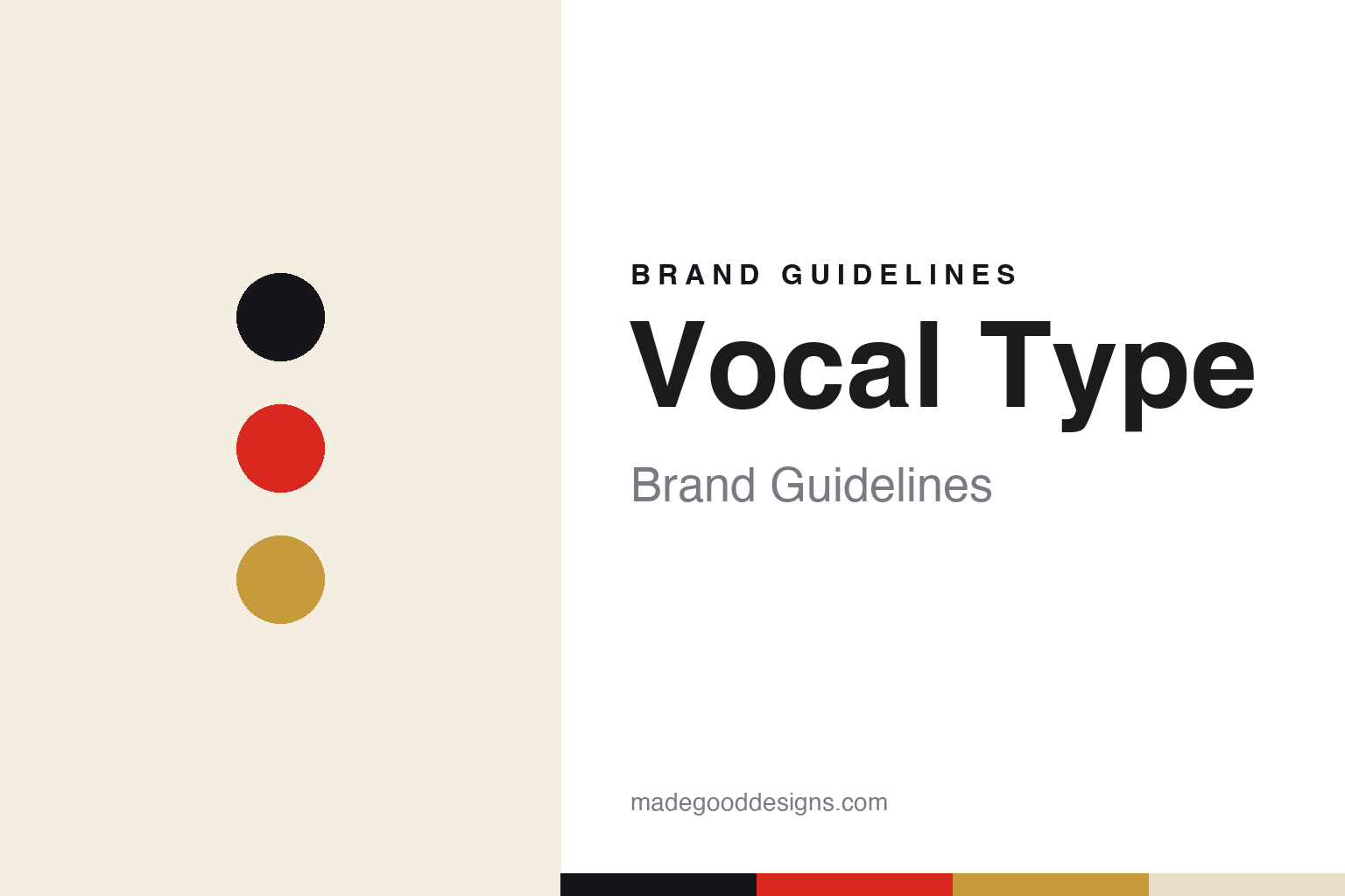
Vocal Type Brand Guidelines
Type with purpose.
Aa
Two constants: a bold, purposeful palette and a bold gothic register. Abstract homage — not the Vocal Type wordmark or its typefaces.
Type with purpose
Vocal Type draws typefaces from protest history.
Vocal Type is a lesson in type with a purpose. Founded in 2016 by Tré Seals in the Washington, D.C. area, the independent, Black-owned foundry does something singular: every retail typeface is revived from the lettering of a specific protest, movement or underrepresented figure — Martin (Dr. King and the 1968 Memphis “I AM A MAN” sanitation strike), Bayard (Bayard Rustin and the 1963 March on Washington), Marsha (Marsha P. Johnson and Stonewall) and Du Bois (from W.E.B. Du Bois’s 1900 Paris Exposition infographics) among them.
Its brand identity is bold, purposeful and protest-rooted — a largely black-and-white editorial system where the typefaces, at large scale, and the documentary histories behind them carry everything. The foundry’s mission is explicit: to spur diversity and empathy in design, founded on the fact that only a small share of US designers are Black.
(Honest notes: Vocal Type is independent — its fonts are distributed through Adobe Fonts and Google Fonts, but that’s distribution, not ownership; it is not Monotype-owned. Its roster is international (Eva Perón, Tiananmen’s “Tank Man,” Anton de Kom), not US-only, and each face is named by the figure’s first name. And there’s no official brand hex, so the tones here are an unofficial interpretation.)
Colour
Vocal Type lives in a bold, purposeful palette. Click a swatch to copy the hex.
Vocal Type’s identity is bold, purposeful and high-contrast — an ink, a signal red, a gold, a bone, and a paper. The palette leans on strong ink, a protest red and a dignified gold — the register of placards, mastheads and movement graphics. It signals purpose, history and gravity rather than decoration. The honest caveat: with no published brand hex, these tones are an original, unofficial interpretation, not first-party values.
The lesson is a bold, high-contrast palette carries purpose. Vocal Type’s world is a protest poster and a history book. For designers, it is a reminder that a strong, restrained palette — ink, a signal red, a gold — can convey seriousness and mission, letting powerful type and real histories lead. The takeaways: use a bold, high-contrast palette for purpose-driven work; let the type and its story carry the meaning; and treat any single hex as unofficial — using ink for small text so the red stays a signal.
Typography
The register is a bold gothic — purposeful and strong.
Vocal Type’s identity carries a bold, purposeful, historical spirit — type drawn from protest lettering. A bold gothic captures the mood: it is strong and declarative, the register of a placard or masthead. Set in a purposeful palette, the bold gothic feels strong and declarative — exactly the personality Vocal Type carries. It is declarative rather than quiet, mirroring a protest sign. (Vocal Type’s real wordmark and its retail typefaces — Martin, Bayard, Marsha and the rest — are commercial products and trademarks we name but do not reproduce or set text in; the exact brand typeface is not ours to use.) Because those faces are not ours to set, the honest description is “a bold gothic spirit,” shown here in a stand-in. The type behaves like the brand: bold, purposeful and strong.
Aa
A bold gothic spirit — purposeful and strong. (Specimen set in Archivo, a bold grotesque STAND-IN; NOT Vocal Type’s wordmark or any Vocal Type retail typeface, which are trademarks.)
Purpose as identity
Vocal Type stands for type with meaning.
Vocal Type is a lesson in making purpose the whole identity. A bold palette, a documentary approach and typefaces drawn from real protest history turn a foundry into a form of storytelling and representation — purpose and history as the brand. The mission is the differentiator. The differentiator is a purposeful, history-rooted, representative identity.
For designers and brand-builders, Vocal Type offers a clear takeaway: a genuine mission can be the brand. The lessons: let a real purpose lead; back it with documented history and craft; and use a bold, serious palette to match. It is also a reminder to report carefully and respectfully: each face honours a specific figure or movement, the roster is international, and Adobe/Google are distributors, not owners — with the palette here an unofficial interpretation. Vocal Type made purpose the brand — proof that meaning can be the difference.
Explore & save
Keep Vocal Type’s identity on hand — save it to a board in the Made Good inspiration library.
Vocal Type identity set
Pin the bold purposeful palette and the bold-gothic register to your own board.


