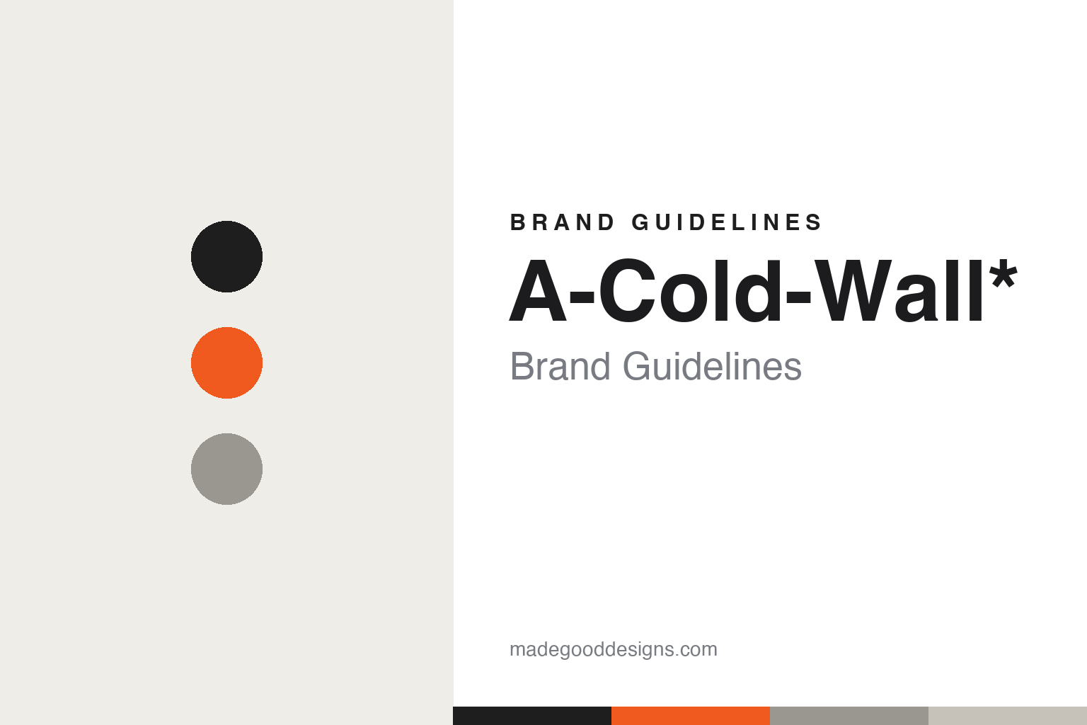
A-Cold-Wall* Brand Guidelines
The legacy of industry.
Aa
Two constants: an industrial palette and a technical mono register. Abstract homage — not the A-Cold-Wall* wordmark or its logo.
The legacy of industry
A-Cold-Wall* turned British industry into fashion.
A-Cold-Wall* is a lesson in industrial materiality as fashion. Founded around 2014–2015 by Samuel Ross — who was Virgil Abloh’s first design assistant — in London, the brand builds a conceptual, brutalist language it calls “material study for social architecture,” under the tagline “the legacy of British Industry.”
Its brand identity is industrial, brutalist and utilitarian — concrete and construction materiality, deconstructed workwear, and a signature palette of cement grey and hi-vis safety orange. The name itself carries a trailing asterisk: A-COLD-WALL*.
(Honest notes: Ross remains the founder and creative force, but A-Cold-Wall* was acquired by the investment group Tomorrow Ltd. in 2024, so it isn’t wholly independent — though it’s actively trading. He worked under Abloh, but A-Cold-Wall* is his own label, not an Off-White offshoot; his industrial-design studio SR_A is separate. And there’s no official brand hex, so the tones here are an unofficial interpretation.)
Colour
A-Cold-Wall* lives in an industrial palette. Click a swatch to copy the hex.
A-Cold-Wall*’s identity is industrial, brutalist and utilitarian — an ink, a hi-vis orange, a cement grey, a concrete, and a paper. The palette is built on cement and concrete tones with a hi-vis safety-orange accent — the register of a construction site and British industry. It signals materiality, utility and conceptual rigour rather than luxury polish. The honest caveat: with no published brand hex, these tones are an original, unofficial interpretation, not first-party values.
The lesson is an industrial palette signals materiality and utility. A-Cold-Wall*’s world is a construction site reimagined. For designers, it is a reminder that cement greys plus a hi-vis orange accent read as industrial, brutalist and conceptual — a fashion language drawn from workwear and building sites. The takeaways: use cement tones with a hi-vis accent; foreground materiality; and treat any single hex as unofficial — using ink for small text so the orange stays a signal.
Typography
The register is a technical mono — industrial and precise.
A-Cold-Wall*’s identity carries an industrial, brutalist, precise spirit — concrete materiality and utility. A technical monospace captures the mood: it is engineered and industrial, the register of specs, labels and construction. Set in an industrial palette, the technical mono feels precise and industrial — exactly the personality A-Cold-Wall* carries. It is engineered rather than decorative, mirroring a material study. (A-Cold-Wall*’s real wordmark and logo are trademarks we describe but do not reproduce, and the exact brand typeface is not ours to use.) Because the mark is not ours to use, the honest description is “a technical mono spirit,” shown here in a stand-in. The type behaves like the brand: industrial, brutalist and precise.
Aa
A technical mono spirit — industrial and precise. (Specimen set in Space Mono, a monospace STAND-IN; NOT the A-Cold-Wall* wordmark or logo, which are trademarks.)
Materiality as identity
A-Cold-Wall* stands for industrial materiality.
A-Cold-Wall* is a lesson in making materiality the identity. An industrial palette, a brutalist language and a conceptual “social architecture” framing make raw materiality the whole brand — cement, hi-vis, utility, meaning. The materiality is the differentiator. The differentiator is an industrial, brutalist, conceptual identity.
For designers and brand-builders, A-Cold-Wall* offers a clear takeaway: a material concept can be a brand. The lessons: build a coherent material language (concrete, workwear, hi-vis); tie it to a genuine idea (British industry, social architecture); and let a signature accent (safety orange) signal it. It is also a reminder to stay accurate: it’s Samuel Ross’s own label (not Off-White), now under Tomorrow Ltd. (2024), and the palette here is an unofficial interpretation. A-Cold-Wall* made materiality the brand — proof that a material idea can be the difference.
Explore & save
Keep A-Cold-Wall*’s identity on hand — save it to a board in the Made Good inspiration library.
A-Cold-Wall* identity set
Pin the industrial palette and the technical-mono register to your own board.


