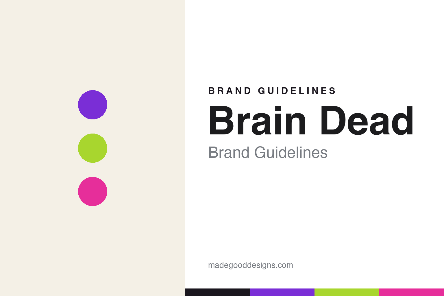
Brain Dead Brand Guidelines
Beautiful disorder.
Aa
Two constants: a loud, maximalist palette and a quirky grotesque register. Abstract homage — not the Brain Dead wordmark or logo.
Beautiful disorder
Brain Dead thrives on creative chaos.
Brain Dead is a lesson in chaos as a creative engine. Founded in 2014 by Kyle Ng and Ed Davis in Los Angeles, it is less a label than an independent creative collective — “a meeting place connecting contemporary subcultures” — that thrives on disorder, pulling from skate flyers, punk zines, cult cinema and every corner of the counterculture map.
Its brand identity is psychedelic, maximalist and collage-heavy — graphic-dense, illustration-driven pieces that reject conventional streetwear rules. Brain Dead spans clothing, objects and artworks, and even runs Brain Dead Studios, its own cult/arthouse cinema in LA — a cultural platform, not just a clothing brand.
(Honest notes: it’s co-founded by Kyle Ng and Ed Davis — credit both. It frames itself as a collective and cultural platform, not merely a clothing label. And there’s no single brand colour — the identity is deliberately varied and loud, changing per drop and collaborator — so the colours here are an unofficial interpretation.)
Colour
Brain Dead lives in loud, maximalist colour. Click a swatch to copy the hex.
Brain Dead’s identity is loud, maximalist and psychedelic — a purple, an acid green, a hot pink, a panel, and an ink. Rather than one fixed brand colour, Brain Dead goes bright, clashing and ever-changing, matching its collage-heavy, disorder-loving aesthetic. It signals counterculture energy, play and creative chaos rather than restraint. The honest caveat: with no published brand hex, these tones are an original, unofficial interpretation, not first-party values.
The lesson is loud, clashing colour signals creative chaos. Brain Dead’s world is a psychedelic collage. For designers, it is a reminder that a bright, deliberately clashing palette — purple, acid green, hot pink — can express counterculture energy and refuse the tidy, minimal streetwear default. The takeaways: use loud, clashing colour for maximalist energy; let it change per project; and treat any single hex as unofficial — using ink for small text so the brights stay loud.
Typography
The register is a quirky grotesque — playful and maximalist.
Brain Dead’s identity carries a playful, maximalist, counterculture spirit — collage, illustration and disorder. A quirky, contemporary grotesque captures the mood: it is characterful and irreverent, the register of a zine and a collage. Set against loud colour, the quirky grotesque feels playful and maximalist — exactly the personality Brain Dead carries. It is irreverent rather than tidy, mirroring a chaotic graphic. (Brain Dead’s real wordmark and logo are trademarks we describe but do not reproduce, and the exact brand typeface is not ours to use.) Because the mark is not ours to use, the honest description is “a quirky grotesque spirit,” shown here in a stand-in. The type behaves like the brand: playful, maximalist and counterculture.
Aa
A quirky grotesque spirit — playful and maximalist. (Specimen set in Bricolage Grotesque, a quirky STAND-IN; NOT the Brain Dead wordmark or logo, which are trademarks.)
Chaos as identity
Brain Dead stands for counterculture chaos.
Brain Dead is a lesson in making creative chaos the identity. A loud, maximalist palette, a collage aesthetic and a collective spanning clothing, art and cinema make counterculture energy the whole brand — dense, playful, subcultural. The disorder is the differentiator. The differentiator is a loud, maximalist, collective identity.
For designers and brand-builders, Brain Dead offers a clear takeaway: a coherent chaos can be a brand. The lessons: embrace density and collage; build a cultural platform (art, cinema, community); and let colour be loud and ever-changing. It is also a reminder to stay accurate: it’s co-founded by Kyle Ng and Ed Davis, it’s a collective (not just clothing), and the palette here is an unofficial interpretation. Brain Dead made chaos the brand — proof that disorder can be the difference.
Explore & save
Keep Brain Dead’s identity on hand — save it to a board in the Made Good inspiration library.
Brain Dead identity set
Pin the loud maximalist palette and the quirky-grotesque register to your own board.


