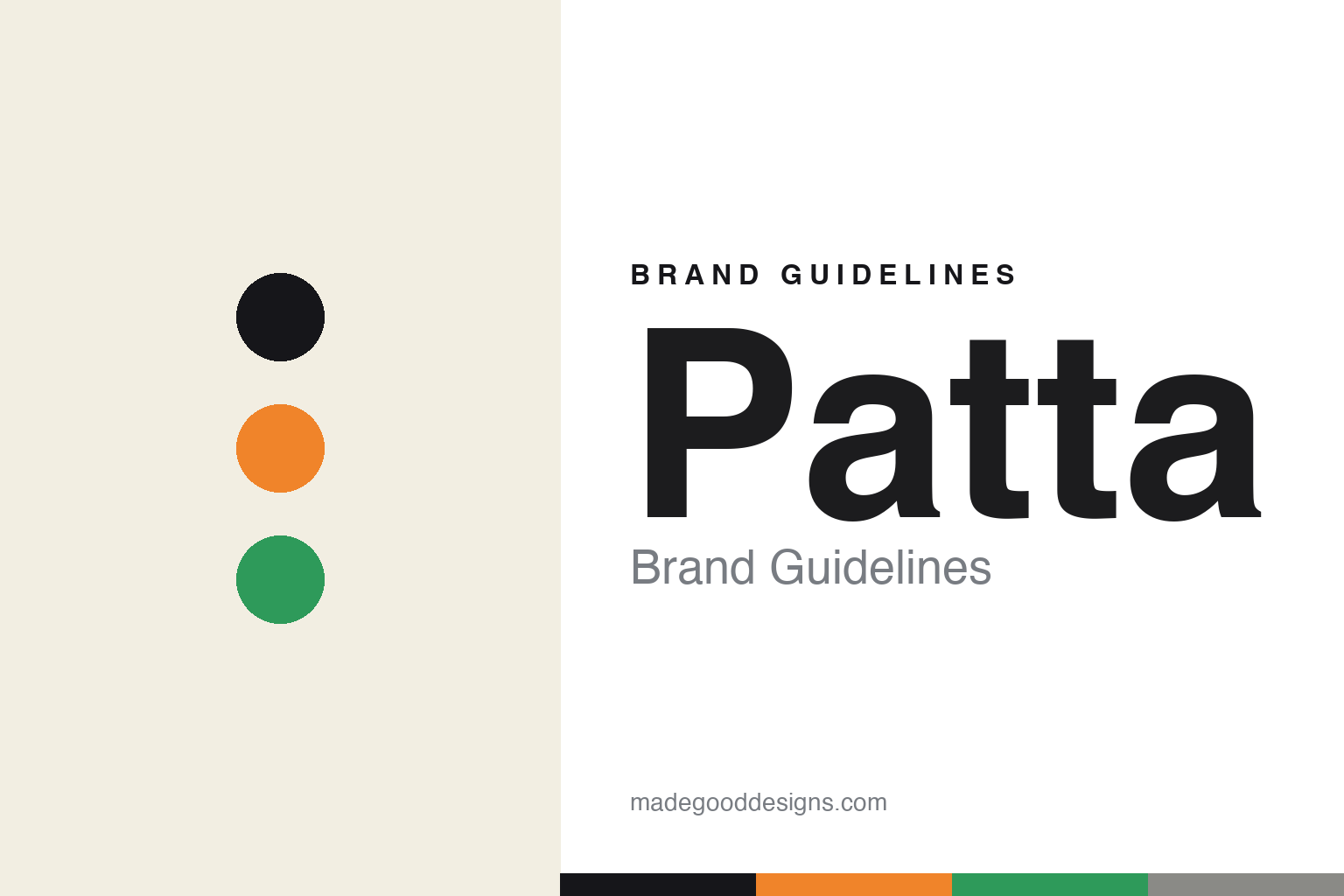
Patta Brand Guidelines
Love & necessity.
Aa
Two constants: a bold, community palette and a bold sans register. Abstract homage — not the Patta wordmark or logo.
Love & necessity
Patta built European streetwear from community.
Patta is a lesson in community as the foundation of a brand. Founded in 2004 by Edson Sabajo and Guillaume “Gee” Schmidt in Amsterdam, the pioneering, black-owned streetwear institution grew out of the founders bringing sneakers and gear back for their community — “out of love and necessity rather than profit and novelty.” Its name is Surinamese slang for “shoe,” a nod to the founders’ heritage.
Its brand identity is community-driven, culturally rooted and bold — grounded in hip-hop, football and sport, with flagships in Amsterdam, London, Milan and Lagos, and sub-brands like the Patta Running Team, Patta Soundsystem and the Patta Foundation (“each one teach one”).
(Honest notes: Patta is independent, founder-led and black-owned. It has a Lagos flagship too — not just Amsterdam/London/Milan — underscoring its pan-African reach. Its youth work runs through the Patta Foundation (not a “Patta Academy”). Its Nike Air Max 1 collaborations are its signature partnership. And there’s no official brand hex, so the colours here are an unofficial interpretation.)
Colour
Patta lives in a bold, community palette. Click a swatch to copy the hex.
Patta’s identity is bold, community-rooted and cultural — an ink, an orange, a green, a grey, and a paper. Rather than one fixed brand colour, Patta pairs bold black-and-white wordmarks with vivid, cultural colour (football and collab hues). It signals community, culture and confidence rather than corporate polish. The honest caveat: with no published brand hex, these tones are an original, unofficial interpretation, not first-party values.
The lesson is bold, cultural colour signals community. Patta’s world is a community institution rooted in hip-hop and football. For designers, it is a reminder that bold black-and-white type plus vivid cultural colour reads as community-driven and confident, right for a brand built from and for its people. The takeaways: pair bold wordmarks with vivid cultural colour; root the brand in a real community; and treat any single hex as unofficial — using ink for small text so the colour stays bold.
Typography
The register is a bold sans — confident and community.
Patta’s identity carries a bold, confident, community spirit — hip-hop, football and belonging. A bold, confident sans captures the mood: it is strong and welcoming, the register of a cultural institution. Set in a bold community palette, the sans feels confident and community — exactly the personality Patta carries. It is confident rather than corporate, mirroring a bold wordmark. (Patta’s real wordmark and logo are trademarks we describe but do not reproduce, and the exact brand typeface is not ours to use.) Because the mark is not ours to use, the honest description is “a bold sans spirit,” shown here in a stand-in. The type behaves like the brand: bold, confident and community.
Aa
A bold sans spirit — confident and community. (Specimen set in Poppins, a bold sans STAND-IN; NOT the Patta wordmark or logo, which are trademarks.)
Community as identity
Patta stands for culture and community.
Patta is a lesson in making community the identity. A bold, cultural palette, deep hip-hop and football roots and sub-brands built for people (running team, foundation, sound system) make community the whole brand — rooted, cultural, generous. The community is the differentiator. The differentiator is a community-driven, culturally-rooted identity.
For designers and brand-builders, Patta offers a clear takeaway: genuine community can be a brand. The lessons: build from and for a real community; root the brand in living culture (hip-hop, football); and give back (foundation, teaching). It is also a reminder to stay accurate: Patta is black-owned and independent, with a Lagos flagship and the Patta Foundation, and the palette here is an unofficial interpretation. Patta made community the brand — proof that culture can be the difference.
Explore & save
Keep Patta’s identity on hand — save it to a board in the Made Good inspiration library.
Patta identity set
Pin the bold community palette and the bold-sans register to your own board.


